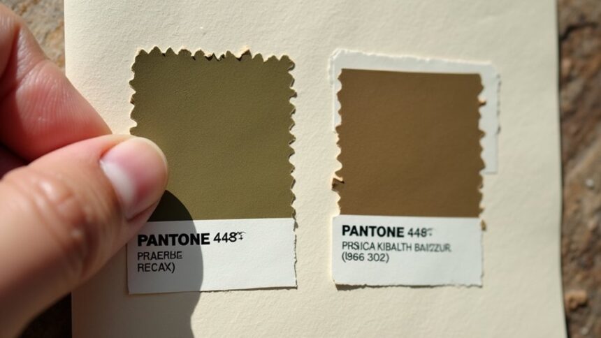
Pantone 448C, a murky greenish-brown, holds the infamous title of “world’s ugliest color.” Research with smokers linked it to dirt, tar, and death, making it perfect for discouraging cigarette purchases in Australia. However, color perception varies wildly across cultures—what’s repulsive in one country might symbolize earth and stability in another. Fashion designers and brands increasingly embrace these “ugly” colors to stand out. The line between ugliness and beauty blurs more than most people realize.
Key Takeaways
- Pantone 448C, a greenish-brown shade, was scientifically determined to be the “world’s ugliest color” through research with smokers.
- Color perceptions vary significantly across cultures, making “ugliness” subjective rather than universal.
- Strategic use of “ugly” colors can effectively influence consumer behavior, as seen in cigarette packaging reducing sales.
- Historical color preferences have evolved through different art periods, challenging traditional notions of beauty.
- Fashion and design industries increasingly embrace unconventional colors, reflecting cultural shifts toward authenticity over conventional aesthetics.
The Notorious Pantone 448C: The Science Behind “Ugliness”
Disgust is a powerful emotion that designers sometimes harness for specific purposes, and no color exemplifies this better than Pantone 448C.
This murky, greenish-brown shade earned its notorious title as the world’s “ugliest color” in 2012 when Australian researchers went hunting for the most repulsive hue imaginable. Why? To slap it all over plain cigarette packaging!
Over 1,000 smokers participated in surveys that confirmed what designers suspected—this color makes people think of dirt, tar, and death. Yuck! The psychological impact was exactly what health officials wanted.
The drab hue triggers visceral associations with filth and mortality—precisely the repulsive reaction health authorities aimed to achieve.
Since Australia pioneered this olive-brown wasteland on tobacco products, cigarette sales have dropped, and other countries like the UK and France have jumped on the ugly-color bandwagon.
Cultural Perceptions of Color: Why Ugly Varies Across Borders
While Pantone 448C may have earned the “world’s ugliest color” title in Australia, this murky greenish-brown doesn’t necessarily make everyone’s skin crawl across the globe.
Cultural perceptions of color beauty vary wildly from country to country! What’s considered the ugliest colour in one place might be perfectly fine—even attractive—somewhere else.
The Australian government specifically chose this yucky shade for cigarette packaging to discourage smoking, and the UK followed suit.
But here’s the funny thing: that same “ugly” color appears in fashionable clothes and home décor in other countries!
When GfK researchers surveyed smokers about unappealing colors, they discovered that personal and cultural biases heavily influenced the results.
A color that screams “dirty” or “gross” to some might represent earth, stability, or richness to others.
The Psychology of Repulsion: How Colors Impact Consumer Behavior
Why do certain colors make us instantly reach for our wallets while others make us cringe and look away? The answer lies in color psychology, the fascinating science behind our emotional responses to different hues.
Studies show that a whopping 85% of consumers make purchasing decisions based on color alone!
Color isn’t just decoration—it’s the silent salesperson convincing your brain what to buy before you even realize it.
Pantone 448C, officially deemed the world’s ugliest color, proves just how powerful these reactions can be. This muddy, greenish-brown was deliberately chosen for cigarette packaging to make smoking less appealing.
It works because our brains associate this shade with dirt and decay—gross, right?
Smart companies use this knowledge to their advantage, either attracting customers with appealing colors or, in some cases, intentionally repelling them.
Consumer behavior experts aren’t surprised—our color preferences might seem personal, but they’re more predictable than you think!
Design Applications: Using “Ugly” Colors for Strategic Impact
While often shunned in aesthetic applications, “ugly” colors like Pantone 448C have proven remarkably effective in strategic design scenarios.
Australia’s use of this muddy greenish-brown on cigarette packaging dramatically reduced sales, confirming that repulsive design can achieve specific behavioral goals.
Beyond health campaigns, strategically chosen unappealing colors can grab attention in a crowded marketplace, creating memorable brand experiences that stick with consumers long after prettier designs fade from memory.
Repulsive Design Works
Designers harness the repulsive power of “ugly” colors to create strategic impact in various applications. The infamous Pantone 448C, widely considered the ugliest color in existence, perfectly demonstrates how repulsive design works in real-world scenarios.
When Australia needed to discourage smoking, they didn’t ban cigarettes—they made them look gross! This muddy, greenish-brown shade was deliberately chosen to make tobacco products look as unappealing as possible, and it worked brilliantly.
Other countries quickly followed suit, recognizing how this color triggers negative feelings.
What’s fascinating is that 85% of shoppers make decisions based on color alone! This shows why “ugly” colors can be powerful tools. By intentionally designing products to repel certain audiences, designers can influence behaviors more effectively than with words or warnings alone.
Strategic Attention Grabbing
How can an “ugly” color become your secret weapon in design? In a world where 85% of shoppers decide what to buy based on color alone, the power of unpleasant shades like Pantone 448C is simply undeniable!
This muddy, greenish-brown—officially dubbed the world’s ugliest color—is actually grabbing major attention in strategic design.
Colour psychology explains why this works so brilliantly. When designers dare to use “ugly” colors, they’re not just being weird—they’re being smart! Products instantly stand out in crowded store shelves, making shoppers notice them immediately.
It’s like wearing mismatched socks on purpose—people can’t help but look!
The cigarette industry learned this lesson the hard way when Pantone 448C on packaging helped decrease smoking rates.
Ugly can be effective, memorable, and surprisingly powerful!
Tobacco Deterrent Success
The most remarkable success story of “ugly” color design comes straight from Australia’s public health battlefield.
When officials needed to make cigarettes less appealing, they turned to Pantone 448C, a murky olive-brown that makes you wrinkle your nose just looking at it! This color wasn’t randomly chosen—over 1,000 smokers rated it the absolute worst color imaginable for packaging.
The plain packaging strategy, featuring this revolting shade, has been so effective that cigarette sales actually dropped in Australia.
Talk about the power of color psychology! The tobacco deterrent worked so well that the UK and France quickly followed suit with their own ugly-packaging laws.
Who knew something as simple as an unattractive color could help save lives? Sometimes being ugly serves a beautiful purpose!
Historical Evolution of Color Preferences in Visual Arts
Throughout the centuries of human artistic expression, color preferences have shifted dramatically, painting a fascinating picture of our evolving visual tastes.
What was once considered the most beautiful colour in the world could later be viewed as garish or dull. The Pantone colour institute wasn’t around when Renaissance painters used specific hues to represent emotions, but they’d surely have appreciated the symbolism!
- Renaissance artists used colors symbolically, with blue often representing divinity and red signaling both love and danger.
- The 1800s brought synthetic pigments that let artists experiment with brighter, bolder colors than ever before.
- Bauhaus designers in the 1920s studied how colors affect our feelings and moods.
- Today’s artists mix unexpected color combinations that might have been called “ugly” in the past.
Breaking Aesthetic Norms: When “Ugly” Colors Become Trendy
What our ancestors might have deemed visually offensive has strangely found its way into today’s trendy design spaces! Pantone 448C, officially labeled the ugliest colour in the world, now appears in high-end fashion collections and chic apartments. This opaque, muddy brown-green defies traditional beauty standards while making a bold statement.
The fashion world loves breaking aesthetic norms, turning so-called “ugly” into fascinating design elements that grab attention and spark conversation.
| Design Area | “Ugly” Color Use | Consumer Response |
|---|---|---|
| Fashion | Runway collections featuring Pantone 448C | Surprising popularity |
| Home Décor | Accent walls and furniture in unusual tones | Perceived as unique and authentic |
| Branding | Unconventional color palettes | Higher brand recall and distinctiveness |
This trend reflects our growing desire for authenticity over conventional prettiness!
Frequently Asked Questions
What Is the Most Unattractive Colour?
Color perception differences suggest Pantone 448C is widely considered most unattractive. However, color psychology implications and cultural color associations reveal attractiveness judgments remain subjective across societies and individuals.
What Is the Ugliest Color Hex Code?
The ugliest color hex code #5B4B3A (Pantone 448C) reflects cultural perceptions and design trends. This drab brown was identified through color psychology research specifically to discourage consumer behavior toward targeted products.
Why Is Pantone 448 C the Ugliest Color?
Pantone 448 C’s designation stems from cultural perceptions associating its drab brown hue with dirt, death, and tar. Research-backed design choices leveraged this color symbolism specifically to deter cigarette purchases.
What Is a Disgusting Color?
A disgusting color emerges from complex interplay of color psychology, cultural associations, and personal preferences. What repulses one person may appeal to another, as emotional responses vary across individuals and societies.
Conclusion
Color “ugliness” remains both personal and cultural, shifting across time and borders. What repels us—like Pantone 448C—can serve important purposes in design, advertising, and art. The most “offensive” shades often break boundaries and challenge norms in unexpected ways. Understanding our reactions to colors helps us recognize our biases and appreciate the complex emotions behind what we find beautiful or ugly in our visual world.


Leave a Reply