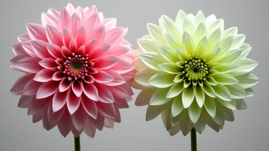
Pink’s opposite is mint green on the color wheel, creating a vibrant, eye-catching combination. These complementary colors make spaces pop in home decor when used on accent walls or throw pillows. Fashion lovers can pair pink tops with mint accessories for a fresh look. Artists use this combo to create dramatic contrast in paintings. Event planners love these colors for spring celebrations and modern branding. These playful opposites offer endless creative possibilities waiting to be explored.
Key Takeaways
- Light green or mint green is the opposite of pink on the color wheel, creating dramatic visual contrast when paired together.
- Combining pink and mint green evokes feelings of trust, excitement, comfort, and youthfulness, making spaces feel both energetic and balanced.
- Use this complementary color pairing in interior design to make small spaces feel larger or add visual drama to rooms.
- In fashion, pink and mint green create fresh looks through pink dresses with mint accessories or forest green pants with soft pink blouses.
- This color combination works beautifully for spring/summer events, weddings, and brand designs that need to stand out and evoke positive emotions.
Understanding the Color Wheel and Complementary Relationships
The color wheel serves as a magical roadmap for artists and designers everywhere. It’s not just a pretty circle of hues—it’s actually a powerful tool that shows how colors relate to each other!
The color wheel reveals the secret language of visual harmony, guiding creative souls through the universe of possible combinations.
Complementary colors sit directly opposite each other on this wheel, creating the most dramatic contrast possible.
When we look at pink (a lighter version of red) on the color wheel, we discover its opposite is light green. Isn’t that cool?
In the RGB model used for digital design, pink’s complement is specifically mint green. This relationship isn’t just random—it’s color theory in action!
When placed side by side, these colors make each other appear brighter and more vibrant, which is why designers love using them together.
The Science Behind Pink’s Opposite: Mint Green
Now that we comprehend how the color wheel works, let’s examine what makes pink and mint green such perfect partners!
In the RYB color model, mint green stands proudly as pink’s complementary color. It’s no random pairing—this relationship is based on solid color theory!
Pink, being a lighter version of red, naturally finds its opposite in a lighter shade of green. When placed side by side, these complementary colors create an eye-popping visual effect that artists and designers absolutely love! The contrast is stunning, yet somehow perfectly balanced.
Here’s something cool: if you mix pink and mint green together, they’ll actually neutralize each other, creating brownish or grayish tones.
This color relationship isn’t just pretty—it’s science in action, showing how opposites truly attract in the colorful world around us!
Using Pink and Green in Interior Design
Interior designers often create stunning spaces by balancing pink and green elements, using the vibrant contrast between these colors to create visual excitement.
This color pairing works magic in rooms of all sizes, making small spaces feel more open when lighter shades are used, or adding drama to larger rooms with deeper tones.
The strategic placement of these complementary colors—whether through painted walls, furniture pieces, or decorative accents—can transform an ordinary room into an extraordinarily inviting environment that feels both energetic and harmonious.
Balance Through Contrast
Pink and green, when paired together, create a magical balance that transforms ordinary rooms into extraordinary spaces. The striking visual perception of these complementary colors works because they sit opposite each other on the color wheel, creating a dynamic that’s both exciting and calming at the same time.
Interior designers often use this pair to build spaces that feel completely alive with color!
Here’s why this combo makes rooms pop:
- The warm, cheerful energy of pink balances the cool, invigorating vibe of green
- Their contrast creates visual interest that guides your eyes around the room
- Together, they create a perfect tension that feels both balanced and exciting
- The pairing works in any light, making spaces feel different throughout the day
Space-Enhancing Color Schemes
Four brilliant ways to enhance any space involve strategically using pink and green color schemes throughout your home. These complementary colors create magic when paired together, making rooms feel bigger, brighter, and bursting with personality!
Pink walls with green furniture can transform a boring room into an exciting hangout spot. The contrast between these colors tricks your eyes, making spaces seem larger than they really are!
| Room Type | Pink Element | Green Element | Visual Effect | Mood Created |
|---|---|---|---|---|
| Living Room | Blush Sofa | Mint Accent Wall | Expands Space | Energetic |
| Bedroom | Rose Bedding | Sage Curtains | Heightens Ceiling | Calming |
| Kitchen | Pink Backsplash | Green Cabinets | Widens Room | Playful |
| Bathroom | Pink Tiles | Green Plants | Brightens Area | Invigorating |
| Office | Coral Accessories | Emerald Chair | Deepens Perspective | Inspiring |
Fashion Forward: Styling With Pink and Its Complement
When it comes to creating fashion-forward looks that pop, the combination of pink and its complementary green offers endless possibilities for style-conscious individuals.
This vibrant and dynamic duo creates a perfect balance between soft femininity and fresh energy. Designers regularly pair these complementary colors to craft eye-catching outfits that stand out in any crowd.
Want to try this trend yourself? Here are four exciting ways to rock pink and green:
- Pair a bright pink dress with mint green accessories for a fresh summer look
- Try forest green pants with a soft pink blouse for office-ready sophistication
- Add a pop of pink to a mint green outfit with statement jewelry or shoes
- Layer different shades of both colors for a trendy, dimensional effect
Creating Eye-Catching Art With Complementary Colors
Artists can create stunning artwork by placing pink next to its complementary color, light green, which creates a dynamic contrast that instantly grabs attention.
The vibrant interplay between these opposite colors creates a visual excitement that makes paintings, drawings, and designs pop with energy and life.
Balancing these bold contrasts with careful composition helps artists achieve a harmonious result, where the eye-catching quality doesn’t overwhelm but instead leads viewers through the artwork in a pleasing, intentional way.
Dynamic Contrasts
The vibrant clash of complementary colors creates a visual magic that can make artwork pop right off the canvas!
When artists place pink next to light green, the colors seem to intensify, creating a dynamic tension that draws the eye immediately. This powerful contrast helps create depth and visual interest that might be missing in more harmonious color schemes.
Color pairs like pink and yellow-green can evoke different emotions:
- Excitement – The vibrant contrast creates an energetic, lively feel
- Balance – Opposing colors create natural harmony through their opposition
- Movement – Eyes naturally bounce between complementary colors
- Depth – The visual tension creates a sense of space and dimension
Artists who master complementary colors transform ordinary compositions into extraordinary visual experiences that practically vibrate with energy!
Harmonious Balance
While dynamic contrast creates visual excitement, achieving harmonious balance with complementary colors requires a thoughtful approach. Artists who pair pink with light green often utilize the 7-Step Chromatic Scale method to create a range of de-saturated shades that flow beautifully together, rather than clash. This technique transforms potential visual tension into pleasing harmony!
Many creators keep complementary color charts in their studios as quick reference tools. These handy guides help artists guarantee their work maintains visual appeal while avoiding overwhelming contrasts that might distract viewers.
The emotional impact of balanced pink and light green combinations can be surprisingly powerful—evoking feelings of tranquility, growth, and joy all at once. It’s like giving your artwork a secret superpower that speaks directly to people’s emotions without them even realizing why!
Pink and Green in Branding and Marketing
Striking a perfect balance between warmth and vibrancy, pink and green have become powerful tools in the marketing world.
These complementary colors create an eye-catching contrast that helps brands stand out in crowded marketplaces. T-Mobile and Barbie leverage pink to evoke playfulness, while adding green elements brings a modern, invigorating twist.
When brands use this color combination, they tap into four key emotional responses:
- Trust – The harmony between these colors suggests reliability
- Excitement – The visual contrast creates energy and interest
- Comfort – Soft pinks paired with mint greens feel soothing
- Youthfulness – Both colors connect with younger audiences
Fashion designers often pair pink and green for bold statements that grab attention and stick in consumers’ minds, making this color duo a marketing powerhouse!
Seasonal Applications for Pink and Mint Green Pairings
During spring and summer months, pink and mint green pairings burst onto the scene, capturing the essence of renewal and fresh beginnings. These complementary colors create a vibrant yet soothing atmosphere that’s perfect for weddings, garden parties, and seasonal celebrations.
Imagine a wedding with bridesmaids in soft pink dresses surrounded by mint green foliage—absolutely gorgeous!
The perfect pastel symphony unfolds when tender pink silhouettes dance against nature’s mint green backdrop.
Event planners love working with this color combination because it’s versatile and crowd-pleasing. The contrast between pink and mint green creates visual excitement while maintaining harmony.
Floral arrangements featuring pink roses or peonies with mint-tinted eucalyptus make stunning centerpieces that practically scream “summer fun!”
Even outdoor picnics benefit from these invigorating hues—think pink lemonade served in mint green cups! When temperatures rise, this color pairing delivers a cool, invigorating vibe that’s impossible to resist.
Frequently Asked Questions
What Is the Opposite of Complementary Color Scheme?
The opposite of a complementary color scheme is an analogous color scheme. In color theory basics, analogous schemes use adjacent colors on the wheel, creating harmony principles that produce subtle, cohesive visual impact through color psychology.
What Color Contrasts With Pink?
Green forms the strongest contrast with pink, creating a complementary relationship. Blue and pink produce a cool contrast, while yellow and pink offer a warmer, analogous pairing with less dramatic tension.
What Color Does Not Go With Pink?
Colors that clash with pink include muddy browns and bright oranges. Pink color psychology suggests avoiding overly muted tones. In fashion and interior design, olive green and saturated yellows create disharmonious combinations with pink.
What Are the 3 Main Complementary Color Schemes?
Color theory basics include three main complementary color schemes: RGB (red-cyan, green-magenta, blue-yellow), RYB (red-green, yellow-purple, blue-orange), and CMYK (magenta-green, yellow-blue, cyan-red). These color harmony principles create striking visual impact.
Conclusion
Mastering complementary colors like pink and mint green opens up a world of creative possibilities! Whether you’re redecorating your bedroom, planning an outfit, or designing a poster, these color pairs create eye-catching magic that’s both scientific and fun. Next time you’re looking to make something pop, remember that opposites really do attract—especially on the color wheel. The bold contrast of complementary colors might just be your new secret weapon!


Leave a Reply