
Twelve easy doodle watercolor ideas include squiggly line patterns, rainbow blobs with doodles, abstract shape clusters, dramatic splatter effects, mixing colors straight on the paper, surprise doodles over wet paint, and repeating triangles or circles. Try layering vivid color blocks, drawing thick or thin lines for fun texture, or filling empty space with little marks. Let paint puddles and blooms do their thing, then add bold doodles on top. There’s even more quirky inspiration up ahead—don’t blink!
Key Takeaways
- Combine doodled squiggly lines and patterns over dried watercolor washes for playful, eye-catching textures.
- Layer bold color blocks and add simple geometric shapes like circles, triangles, or squares for easy abstract designs.
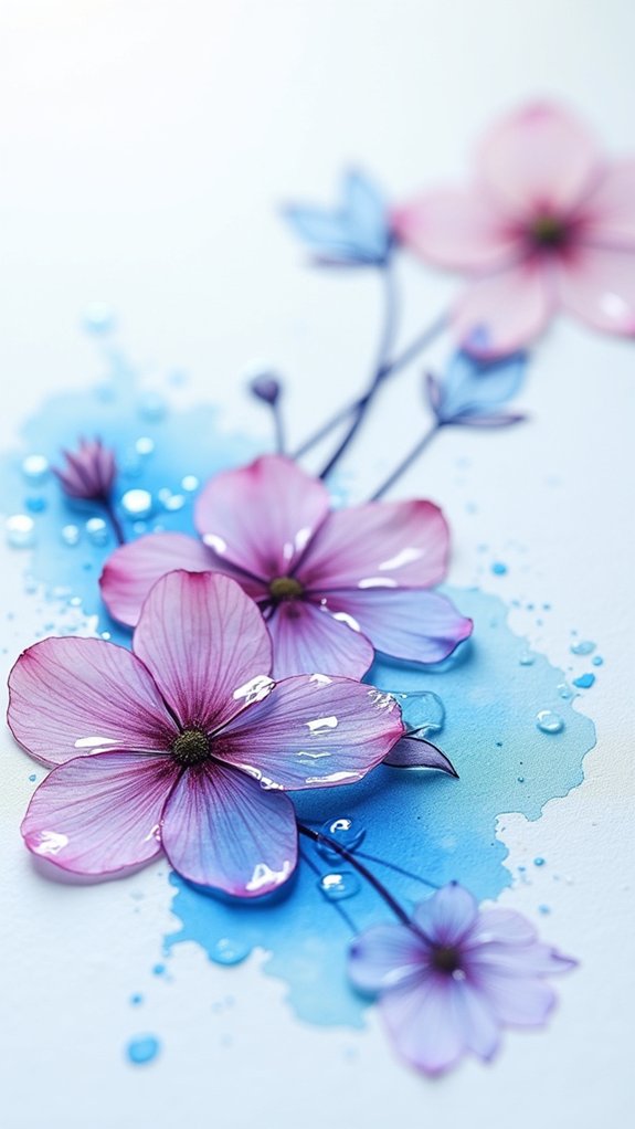
- Paint loose florals or leaf shapes, then outline with waterproof pen to create fresh, whimsical botanical art.
- Use repeating patterns—such as dots, zigzags, or wavy lines—on layered backgrounds for visually dynamic results.
- Balance vibrant watercolor areas with untouched negative space, enhancing doodles with thicker lines for added emphasis and interest.
Playful Squiggly Line Patterns

There’s something wild and fun about doodling playful squiggly line patterns on a blank page. It’s like the page suddenly comes alive with energy!
These squiggly lines can wiggle, loop, or zigzag however you want—there are no rules. Try mixing up the thickness of your lines to give your art a cool, textured look. Go for a different color in each section, or let your favorite markers battle it out for attention.
When it’s time to bring in the watercolor paints, there’s a whole new level of awesome. Add the paint over your squiggly lines or color some lines in after—the results are full of surprises. Toss in shapes or dots on top if you’re feeling extra creative.
Colorful Abstract Shape Fields
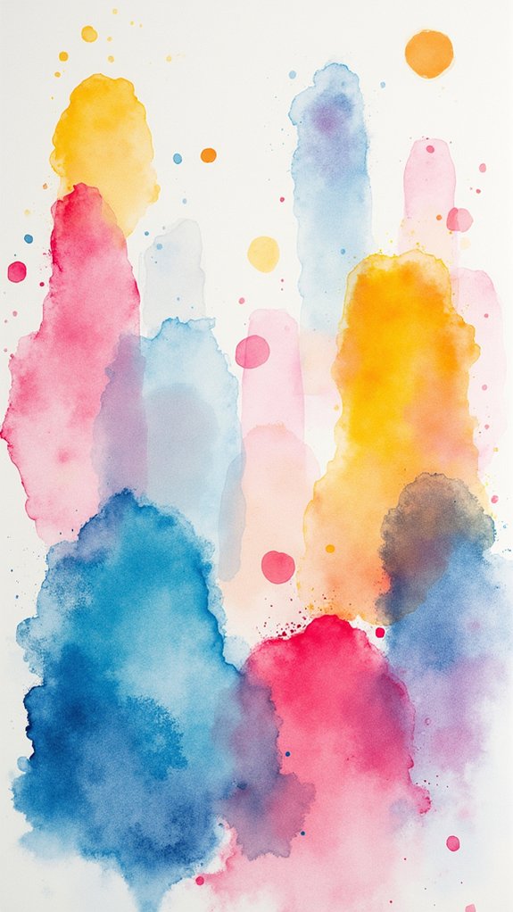
Colorful abstract shape fields are all about creating balance between the bold painted areas and the untouched spaces, so the page feels full but not crowded.
Layering bright patches of color side by side, then doodling squiggly or zigzag textures over everything, makes these shapes pop like they’re having their own secret party.
Mixing extra details into the empty spots is like inviting wallflowers to dance—suddenly, even the quiet parts of your painting shine.
Balancing Positive and Negative
When it comes to making abstract doodles pop, balancing positive and negative space can feel a little like playing a game of tug-of-war—with your eyeballs acting as the referee! It’s all about letting geometric shapes and fun patterns shine, but not take over the entire field. Imagine filling a page with squiggly lines, tossing in circles or triangles, and then stepping back to check if the empty spaces help your shapes stand out even more. Want some imagery? Here’s a simple chart you can picture in your mind:
| Geometric Shapes | Filled Spaces | Empty (Negative) Spaces |
|---|---|---|
| Bold Triangles | Bright Watercolor Blob | Crisp White Corners |
| Soft Circles | Splattered Paint | Calm, Blank Gaps |
| Wavy Lines | Patterned Dots | Open Breathing Room |
| Sprinkled Squares | Mixed Colors | Still Silence |
This dynamic makes everything extra eye-catching!
Layering Vivid Color Blocks
A handful of juicy, vivid color blocks can completely take watercolor doodles to a new level—think more “wild party,” less “quiet afternoon.”
Imagine this: dabs of phthalo blue and gleaming quinacridone gold deep splashed onto wet paper, swirling together like they’re showing off at a paintball match.
Layering is key here. I’ve always enjoyed the way letting each color dry just a bit before adding a little more creates these crazy, rich fields that practically sizzle off the page.
Any artist would love to see how the blocks dance and overlap, making wild abstract shapes.
- Don’t be afraid to go bold—big color blocks win attention.
- Overlap layers for extra depth and dreamy effects.
- Remember, balance shapes and colors so nothing feels left out!
Adding Doodled Texture
While some artists might think watercolor doodles are finished once the color dries, that’s when things really start to get interesting. This is the perfect moment for doodle layering techniques—start by adding squiggly lines and zigzags with a waterproof pen right over those colorful abstract shape fields. Mix up your line thicknesses for some awesome texture contrast exploration, and don’t be afraid to repeat patterns to keep the piece looking tight. Add a splash of unpredictability—try splattering or dripping more watercolor onto the doodles. Suddenly, simple marks burst with life, blending classic abstract doodle styles with pure fun. See how these marks evoke energy and connection:
| Motion | Surprise | Joyful Chaos |
|---|---|---|
| Spirals | Drips | Zigzags |
| Dots | Uneven Splats | Twists |
| Bold Outlines | Messy Layers | Random Streaks |
Watercolor Splatter and Drip Effects
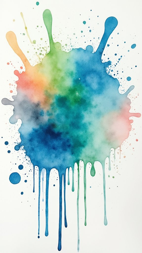
Splatter and drip effects in watercolor are all about letting loose and seeing what surprising color patterns show up on your paper, almost like a wild paint party.
With a good flick or a brush tap, textures appear everywhere—some speckled, some streaky—all adding excitement and depth that plain washes just can’t match.
These bold moves keep things lively, and honestly, sometimes it’s the unexpected splotch that makes the whole artwork pop!
Creating Spontaneous Color Patterns
If watercolor painting ever needed a wild side, splatter and drip effects are definitely it! Creating spontaneous color patterns is as fun as it sounds—there’s no telling where the next splash will land or how the pigments might mix.
Start by brushing water onto your paper, then splatter or drip paint so the colors begin swirling together in unpredictable patterns. Mastering these blending techniques is more about letting loose than following the rules, which is why experimenting is key.
Some artists:
- Flick different brushes to see how drops and splashes change
- Layer more drips after an area dries for exciting color depth
- Push limits on cheap watercolor paper so mistakes become happy accidents
Embrace the chaos. The wilder you go, the brighter your art gets!
Enhancing Art With Texture
Let’s be honest—sometimes a painting just feels a little flat, like it’s missing that wild burst of energy only watercolor textures can bring.
That’s where texture techniques like splattering and dripping come into play, turning plain doodles into chaotic masterpieces. To make vibrant splashes, all you need is a loaded, stiff brush and maybe just a bit of courage. Flick it at the paper and watch paint interactions create wild patterns you couldn’t have planned if you tried.
For even more drama, tilt your paper after applying wet paint—suddenly, colors run together, and you’ve got beautiful drips adding movement and depth.
Don’t forget to experiment with water-to-paint ratios. Whether you want bold splotches or soft washes, texture opens doors to playful adventure.
Layered Washes With Bold Doodles
A painted background can feel like magic when it’s made with layered watercolor washes. To start, students lay down a base wash using the wet-on-wet method, watching colors swirl and blend in real time—kind of like making potions, but less messy!
Using creative layering, they can add even more depth by experimenting with bold, contrasting colors. Color harmony is key, so combos like burnt sienna and phthalo blue really pop.
Once the background dries, it’s time for those bold doodles. Waterproof pens make every squiggle and wobbly star shine against the colors. This is where doodle techniques come alive!
For best results, try to:
- Add more layers for complexity
- Use playful shapes and lines
- Combine dark and light tones for unity
Mixing Colors Directly on Paper
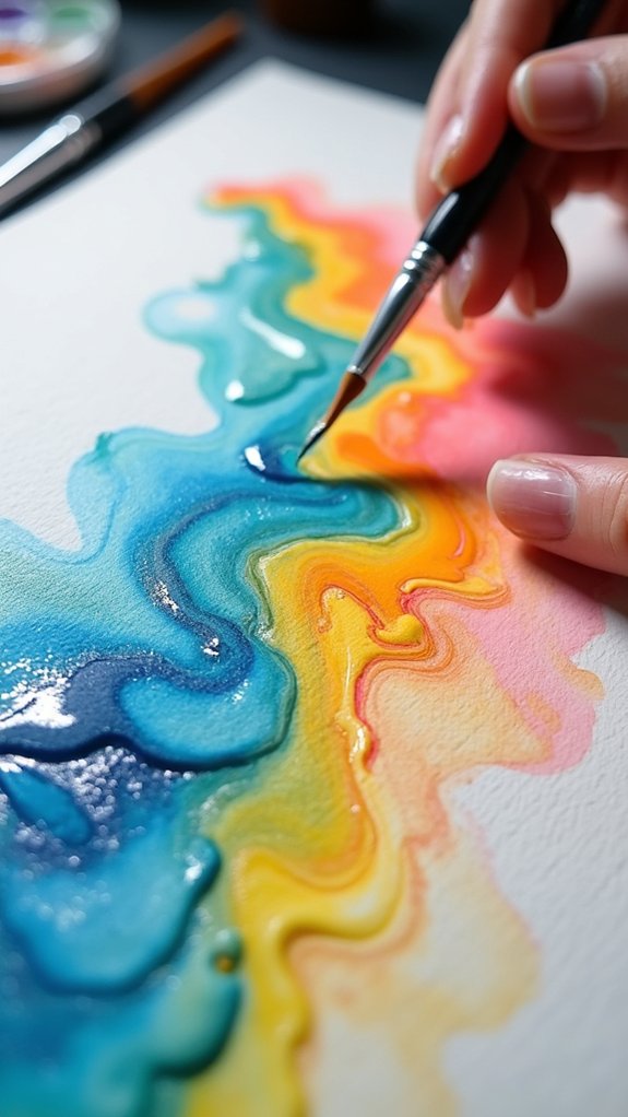
Sometimes, the real magic in watercolor doodles happens when colors are mixed right on the paper instead of in a paint palette. Imagine dropping blobs of paint into watery puddles and seeing them swirl, merge, and dance—these are playful color interactions that can’t be planned! By using color harmony techniques, artists get unique blends and super cool effects that really pop. Spontaneous blending methods, like wet-on-wet, let colors slip into each other, making soft edges and dreamy looks. Want more depth? Let one layer dry just a bit, then add a second color—voilà, instant complexity!
Here’s a quick look at how mixing colors directly on paper works:
| Technique | Result | Fun Factor |
|---|---|---|
| Wet-on-wet | Soft blends | High |
| Layering colors | Deep textures | Medium |
| Squiggly doodles | Fun patterns | Off the charts! |
Repeating Geometric Motifs
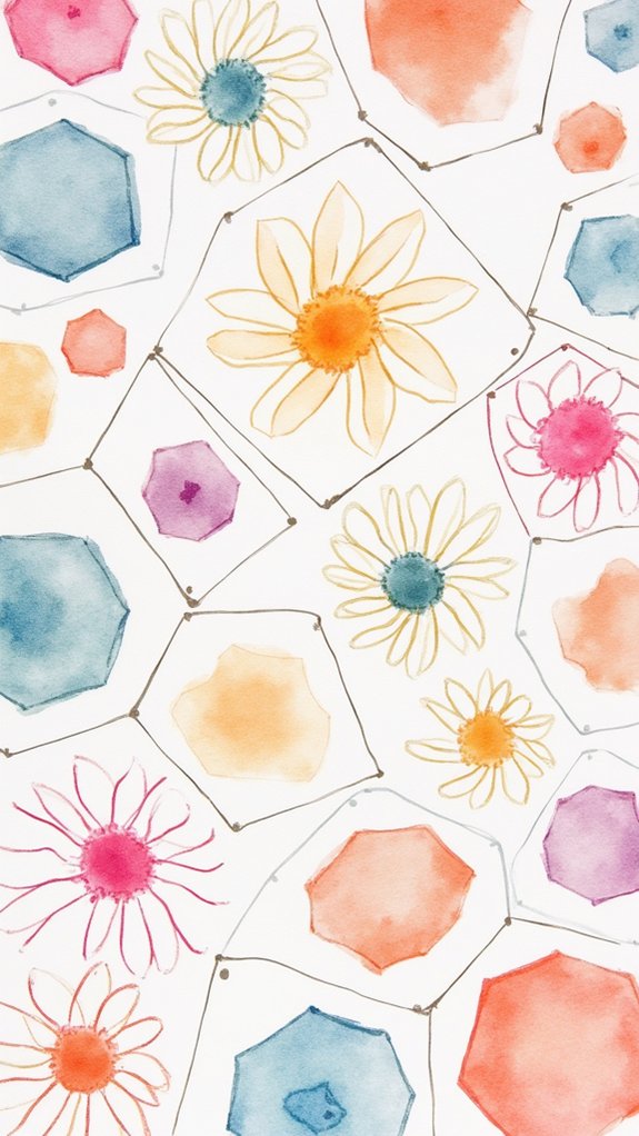
Repeating geometric motifs can totally jazz up a watercolor doodle, but figuring out which shapes to use is part of the fun—should it be tiny triangles, bold circles, or squares in all sizes marching across the page?
Getting the placement just right, so patterns don’t get too crowded or too empty, feels a bit like hosting a party where everyone needs their own space to dance.
Experimenting with different shapes and how you spread them out can turn a simple doodle into something super eye-catching, and hey, even a wonky hexagon deserves a spot in the spotlight.
Exploring Shape Variations
Every so often, diving into repeating geometric motifs in watercolor feels like revealing a secret code to endless creativity.
Playing with shape variations—mixing big, bold circles with tiny triangles and squares—can totally transform a simple doodle into a wild pattern adventure. These explorations let artists try out all sorts of tricks, like using shape contrast techniques to make each part pop, shape overlap effects to add new shades, and wild shape interaction dynamics to keep things lively.
Want your art to feel even more playful? Toss in some squiggly lines inside those shapes!
- Experiment with large and small shapes for exciting contrasts.
- Layer shapes for surprising color mixes and shadow effects.
- Tilt or flip shapes to find unexpected, fun combinations.
Shape variations keep everyone guessing, and that’s the real magic.
Balancing Pattern Placement
Mastering where to place patterns is like being the conductor of a wild, dancing orchestra—except the instruments are triangles, circles, and squares splashed in watercolor! To achieve pattern harmony in doodle watercolor art, artists experiment with motif variation and smart spatial arrangement. Bigger shapes act like “anchors” holding everything together, while smaller motifs nestle into gaps, letting the eye jump from spot to spot. Don’t forget your negative space—that’s the quiet in the song, giving your patterns room to shine. To make things pop, add contrasting colors or try switching up textures within your repeating motifs. Check out this quick guide for balancing your placement:
| Pattern Element | Balancing Tip |
|---|---|
| Large Motifs | Anchor in key spots for stability |
| Small Motifs | Fill spaces for visual flow |
| Color & Texture | Add contrast for depth and interest |
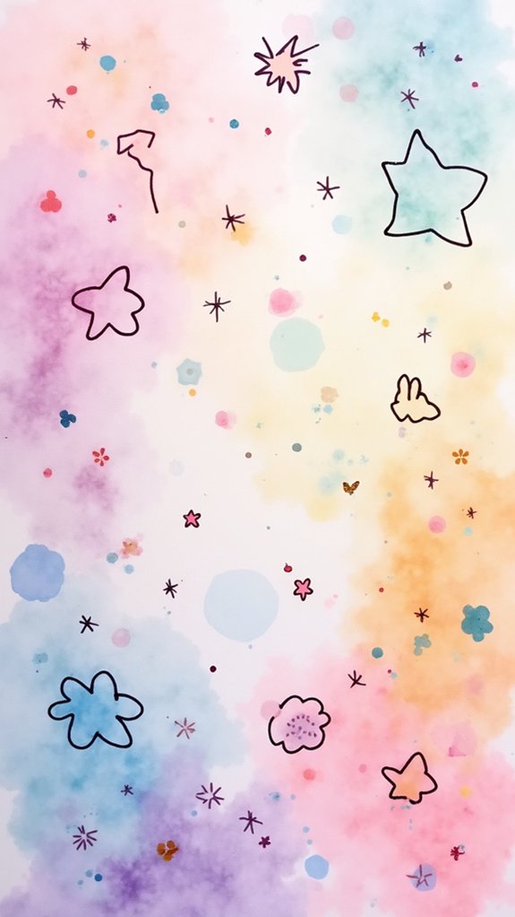
Organic Watermark Texture Art
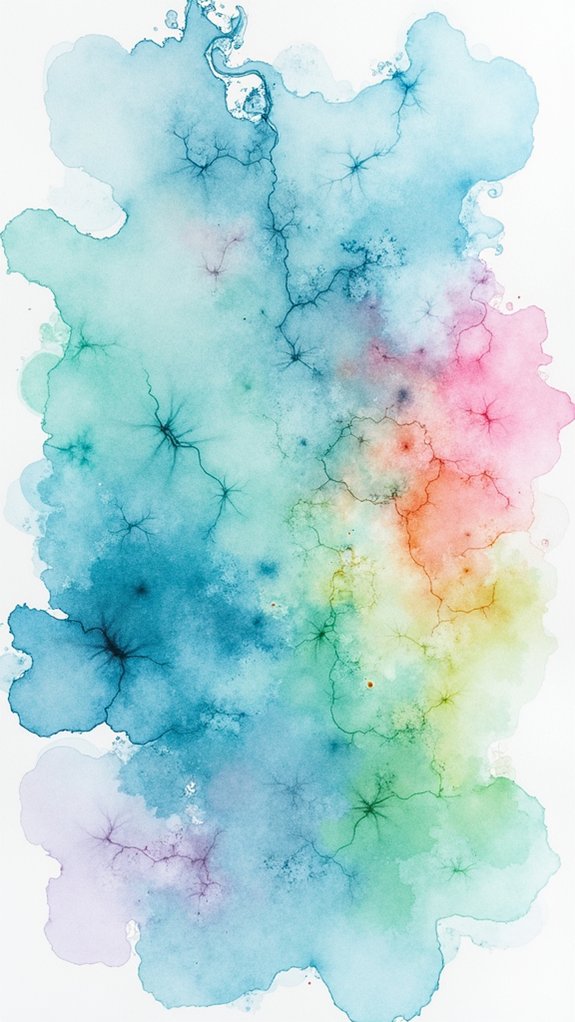
Experimentation is at the heart of organic watermark texture art, where you let watercolors run wild across the page like rivers after a huge rainstorm.
With this style, the fun begins by brushing a watery layer onto thick watercolor paper, then dropping in splotches of color and letting them mingle freely. Weird shapes, crazy color blending, and artistic layering all happen right before your eyes!
Don’t be afraid to add extra splashes or drips; randomness is the name of the game.
Try these tricks to create awesome effects:
- Mix your paints right on the wet page for surprising swirls.
- Flick or drip colors onto wet areas to get wild, organic edges.
- Layer waterproof pen doodles on top for extra contrast and pop.
Trust the process—the results are always exciting!
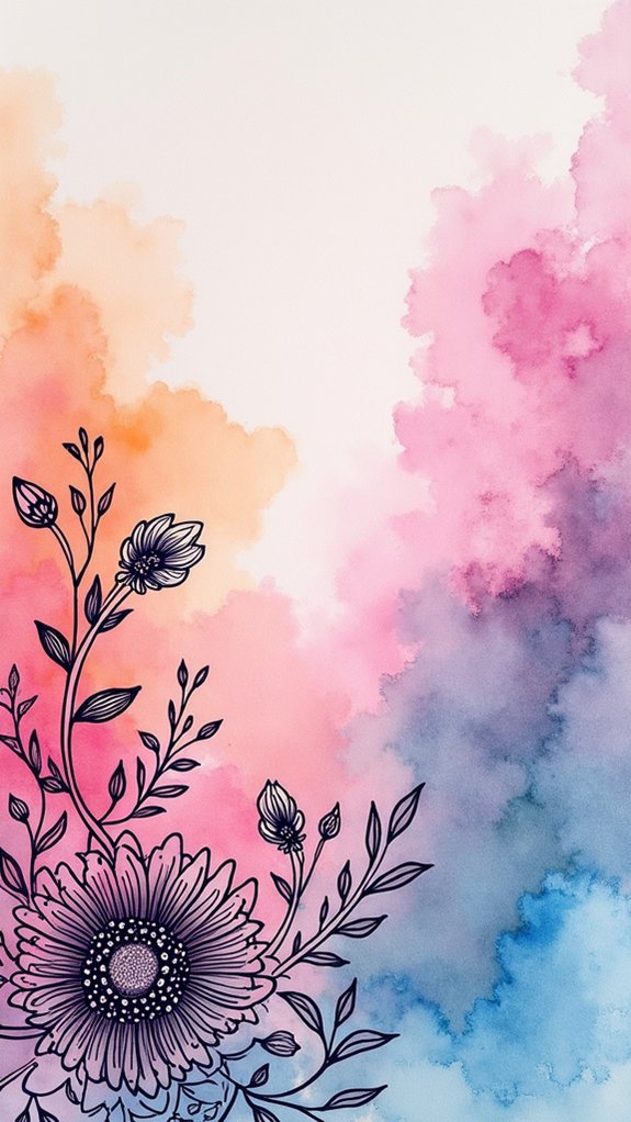
Loose Floral and Leaf Designs
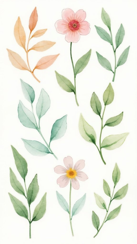
Letting watercolors run wild isn’t just for splotchy textures and surprise patterns—it works like magic for loose floral and leaf designs, too! Instead of carefully outlining every petal, artists can grab floral inspiration sources like real bouquets, garden photos, or even doodle from memory.
Using color blending techniques is where the fun begins: mixing quinacridone gold deep with a splash of phthalo blue creates totally unexpected, lively results. Leaf shape variations can be as wild or as chill as you want—oval, pointy, round, or even heart-shaped.
On top of that, adding squiggly lines or playful marks right over the watercolor gives everything a touch of whimsy. It’s all about having fun, making brilliant blends, and letting those flowers and leaves shine!
Negative Space Imagination
- Fill negative space with unpredictable shapes, then doodle patterns inside them.
- Use bold or textured colors around your subject to unify the piece.
- Let your hand roam and see what silly, abstract surprises emerge!
It’s all about seeing “nothing” as a goldmine of ideas!
Puddle and Bloom Experiments
Splash some water onto your page and watch the magic unfold—puddle and bloom experiments turn any artwork into a wild science project, watercolor style!
The basic idea is simple: get your paper good and wet, then drop in your favorite colors. Watch as they swirl, spread, and collide, forming soft edges and wild, blobby shapes. This is where color blending techniques truly come alive, since each color dances around in watery puddles, mixing in totally unpredictable ways.
Try experimenting with water control strategies—more water gives larger, softer blooms, while a little bit creates tiny, powerful explosions of color. Splattering or dripping even more paint brings a whole new level of excitement, showing off wild pigment interaction dynamics.
No two experiments ever turn out the same!
Thicker Lines for Emphasis
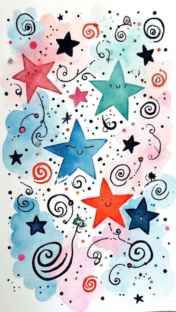
After all the wild, swirling chaos of puddle and bloom experiments, there’s something super satisfying about grabbing a pen and putting down some bold, thick lines.
It’s like giving your doodle watercolor art a secret weapon—suddenly, your shapes jump out and shout for attention! By playing with line weight variation, artists can guide the viewer’s eyes right where they want, creating a strong focal point definition and giving more punch to key features.
Using a waterproof pen is a game-changer, too. No smudgy disasters here!
- Thicker lines help sections “pop,” creating visual drama.
- Varying line thickness brings cool contrast and extra depth.
- Strong outlines tie different sections together for cohesive design elements.
It’s proof that sometimes, you just need to go bold!
Surprise Doodles Over Wet Paint
Imagine dragging a pen right through a soggy splash of color, watching the ink twist and mix in totally unexpected ways—it’s almost like the doodle is alive and deciding its own path!
With surprise doodles over wet paint, anything can happen. The magic starts with choosing cool doodle techniques—think spirals, zigzags, or even random squiggles.
As your ink flow glides on that still-wet watercolor, the lines might blur or make wild patterns, showing off some real spontaneous creativity. Use a waterproof pen like a Uniball if you want your lines sharp and crisp, but try a regular pen for wiggly surprises.
Playing with different colors in your doodles can help the whole thing gel together. Don’t worry about perfection—just have fun with it!
Frequently Asked Questions
What Is the Easiest Thing to Paint in Watercolors?
When considering the easiest thing to paint in watercolors, one often gravitates toward simple nature forms, abstract shapes, or geometric patterns. These options require minimal detail, allowing beginners to explore color blending, texture, and creative expression effortlessly.
What Is the Easiest Animal to Watercolor?
The Current Question explores which animal is most approachable for watercolor techniques. Cute animal sketches, such as fish, are considered easiest due to their simple shape outlines, vibrant colors, and the forgiving nature of basic watercolor blending methods.
What Is Doodle Art for Beginners?
Doodle art for beginners involves exploring simple doodle techniques using basic beginner supplies like waterproof pens and sketchbooks. Inspiration sources include patterns, nature, or daily objects, encouraging creativity and relaxation through spontaneous, free-form designs without worrying about perfection.
What Are Three Common Mistakes That People Make When Using Watercolor?
Common mistakes when using watercolor include poor brush control leading to unintentional smudging, improper color mixing causing muddy hues, and neglecting essential watercolor techniques, such as allowing layers to dry, which affects clarity and the vibrancy of finished artworks.
Conclusion
So, that’s twelve awesome doodle watercolor ideas! Seriously, who knew blobs and squiggles could look so cool? Whether you’re playing with splatters, going wild with negative space, or layering colors like a total art wizard, there’s always something new to try. Grab your paints, release some messy magic, and don’t worry if your cat decides to “help.” Remember, it’s about having fun—and sometimes, the messiest masterpieces are the best ones to brag about!
Leave a Reply