Alcohol markers offer endless creative possibilities through various blending techniques. Try blending to white for luminous effects, perfect for mandalas and sunsets. Experiment with dark-to-light gradients to add dimension, or light-to-dark progression for smoother control. Simultaneous coloring maximizes wet blending potential, while cross-family color mixing creates dynamic artwork. Don’t forget to repeat key colors strategically throughout your piece! Even budget-friendly markers can yield stunning results when you master these simple but effective approaches.
Key Takeaways
- Create ethereal mandalas using white-to-color blending techniques for luminous, dreamy patterns that captivate viewers.
- Apply dark-to-light gradients in landscape scenes to add dimension and prevent muddy effects in your illustrations.
- Experiment with “wet-on-wet” technique for dynamic color interactions by applying a second marker while the first is still damp.
- Strategically place and repeat key colors in at least three spots to create triangular visual pathways throughout your artwork.
- Combine alcohol markers with white gel pens to add highlights and finishing touches that make focal points pop.
Blending to White: Creating Luminous Effects in Marker Art
When artists want to make their alcohol marker artwork truly shine, blending colors to white is a game-changer! This technique works magic in creating beautiful mandala designs where the white paper actually amplifies the vibrancy of every color used. It’s like giving your artwork a secret superpower!
Artists can apply this trick in different sections of their piece, making certain elements pop while maintaining a cohesive look. The contrast between colored areas and white spaces helps emphasize tiny details that might otherwise go unnoticed.
The strategic dance between color and white creates visual magic, highlighting intricate details while preserving artistic harmony.
Imagine drawing a sunset where the brightest parts gradually fade to white—talk about eye-catching!
This blending technique gives artwork a dreamy, ethereal quality that’s hard to achieve otherwise. The result? A dynamic, luminous piece that practically glows off the page!
Cross-Family Color Blending for Dynamic Artwork
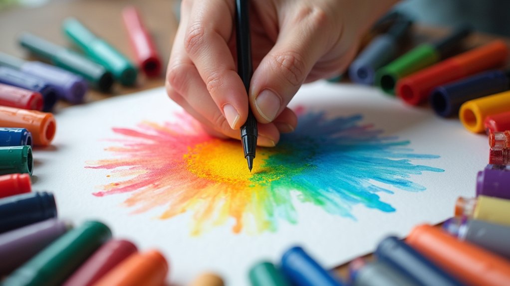
Almost every alcohol marker artist starts by blending similar colors together, but cross-family color blending takes your artwork to a whole new level!
Imagine shifting from yellow to yellow-orange and boldly jumping to red-violet in the same blend. Crazy, right? But so cool!
In mandalas, try using the center circle to showcase a surprising yellow to yellow-green blend. This break from traditional rules adds serious visual excitement to your piece!
When trying cross-family color blending, use “bridge colors” between non-adjacent hues. This trick helps create smoother shifts that still pop with energy.
The best part? This technique trains your artistic brain to experiment more!
You’ll discover vibrant, unexpected color combinations that add depth and make your marker art stand out from the crowd.
Dark-to-Light Gradients: Adding Dimension to Your Illustrations
Creating dark-to-light gradients with alcohol markers can transform flat illustrations into three-dimensional masterpieces with incredible depth.
Artists often struggle with blending darker shades upward, but starting with saturated colors at the bottom and gradually introducing lighter hues creates stunning shadow effects that pop off the page.
Blending Challenges Overcome
Many artists struggle with dark-to-light gradients, but mastering this technique opens up incredible possibilities for dimension in alcohol marker art. The most common blending challenges overcome by experienced artists include avoiding the dreaded “muddy effect” when colors mix unexpectedly. Yikes!
Instead of diving straight into dark colors (a rookie mistake!), try building up layers gradually. Start lighter than you think you need, then slowly add darker tones. This gives you way more control!
Some artists flip their traditional approach completely, experimenting with placing lighter colors at the top of illustrations and darker ones at the bottom. This clever trick instantly adds pop and depth to even simple drawings.
Dynamic Shadow Effects
Dynamic shadow effects transform flat marker drawings into artwork that practically jumps off the page! Creating these eye-catching dimensions starts with a simple trick: dark-to-light gradients.
Begin with darker colors at the base of shapes and gradually blend to lighter shades at the top. This technique makes objects appear 3D and gives the illusion that elements are tucked under one another.
For super smooth shifts, try using a middle tone between your darkest and lightest colors—it works like magic! Mix up color families too; try blending blues with violets for shadows that look rich and interesting.
When practicing, focus on keeping dark areas properly shadowed while letting those light areas stay bright and glowy. With a little practice, your markers will create shadows so realistic, you’ll want to reach out and touch them!
Layering for Depth
Every powerful alcohol marker illustration begins with the art of layering from dark to light. Artists strategically place darker colors at the base of shapes first, creating that wow-factor dimension that makes artwork pop off the page!
As you gradually blend lighter shades over these dark foundations, your illustrations transform from flat to fantastically three-dimensional.
Want to level up your marker magic? Try the sandwich method: start with a middle tone between your darkest and lightest colors—it’s like adding the secret sauce to your color recipe! This connects the gap between extremes and creates super smooth shifts that’ll make your friends ask, “How did you DO that?!”
Practice this technique daily, and you’ll soon understand how colors talk to each other, making your artwork deeper, richer, and way more impressive!
Light-to-Dark Progression: Controlling Marker Intensity
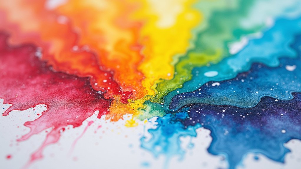
Artists can achieve better control over their marker work by starting with light colors and gradually building to darker shades.
This light-to-dark progression helps avoid those dreaded blotchy marks that happen when you accidentally go too dark too quickly.
With practice, artists can create smooth, beautiful gradients that make their illustrations pop with dimension and depth.
Controlling Darkness Levels
Mastering the delicate balance between light and dark tones reveals a whole new dimension in alcohol marker art. Artists who build their shades gradually gain incredible control over darkness intensity, creating smooth gradients that pop right off the page!
Just like working with a color wheel, this progressive approach allows for exploration within color families without committing to intense darkness too soon.
Try this cool trick: place light and dark shades side by side to see how they interact. When you start light and slowly add darker tones, those boring flat shapes suddenly look 3D and super realistic!
Keep your marker pressure consistent—it’s the secret weapon for smooth blending. Who knew that being patient with your darkness levels could transform simple drawings into jaw-dropping artwork that makes your friends say “Whoa, how’d you do that?!”
Gradual Shading Practice
Now that you understand how to control darkness levels, it’s time to put those skills into practice! Gradual shading allows artists to gradually build intensity, experimenting with different tones before committing to darker shades.
Start with your lightest color and layer progressively darker shades while the ink remains damp. This creates that smooth, professional-looking gradient that makes artwork pop! Try creating a side-by-side comparison of gradients to see how subtle shifts create amazing depth.
Remember to identify your light source first—this simple step makes all the difference in realistic shading. The shadows should fall opposite to where light hits your subject!
Regular practice won’t just improve your blending; it’ll boost your confidence too! Soon you’ll be creating dramatic shadows and highlights that make your marker art jump off the page.
Simultaneous Coloring: Maximizing Wet Blending Potential
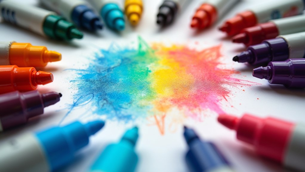
Why do some alcohol marker artists achieve those dreamy, seamless color shifts while others struggle with harsh lines and patchy results? The secret often lies in simultaneous coloring, a technique that’s total game-changer for wet blending!
The difference between magical blends and amateur marker art often comes down to one simple technique: simultaneous coloring.
Instead of coloring your entire drawing one section at a time, try working on similar areas together. When you color those two swirly shapes at once, the ink stays wet longer, giving you more time to create those gorgeous, smooth gradations. No more annoying dried edges!
Plus, you won’t waste precious seconds switching back and forth between markers, which can totally interrupt your creative flow.
This approach works amazingly well for detailed designs like mandalas, where you want everything to flow together beautifully. Your colors will thank you with vibrant, harmonious results!
Color Repetition: Establishing Visual Harmony in Complex Designs
When creating complex designs with alcohol markers, strategic color placement becomes essential to guide the viewer’s eye through the artwork.
Artists can establish visual harmony by repeating key colors throughout their piece, creating a rhythmic pattern that feels intentional rather than random.
This color repetition acts like a visual thread, connecting different elements of the design while ensuring the final artwork feels balanced and cohesive, even when incorporating numerous details or patterns.
Strategic Color Placement
Creating visual harmony through color repetition transforms complex alcohol marker artwork from chaotic to cohesive. When you’re coloring, make sure to place your chosen hues in strategic locations throughout your piece.
Think of it like hiding treasures for the viewer’s eyes to discover!
Strategic color placement isn’t random—it’s a powerful technique that guides viewers through your artwork. For example, if you’ve used a vibrant orange in the upper corner, repeating that same orange in a smaller area below creates an invisible path for the eye to follow.
This connection feels satisfying and intentional!
Try mapping out your color plan before diving in. This simple step prevents that “Wait, what was I doing?” moment when you’re halfway through a complex piece!
Rhythmic Pattern Building
Skilled artists frequently build visual rhythm in their alcohol marker artwork through intentional color repetition. This technique creates a visual dance across the page, guiding viewers’ eyes through the composition while keeping everything feeling connected.
By strategically repeating colors—sometimes at full intensity, other times in lighter shades—artists establish harmony even in super detailed designs.
- Place your main color in at least three spots across your artwork, creating triangular pathways that lead the eye naturally through the composition.
- Vary the size of color repetitions—use large areas of a color in focal points and smaller touches in supporting elements.
- Echo your repeated colors in different values (lighter/darker) to maintain the rhythm without making the design feel boring or too predictable.
Mandala Marker Magic: Radial Blending Techniques
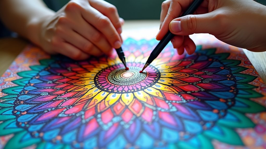
The dazzling world of mandala art opens up with radial blending techniques that transform ordinary designs into extraordinary visual experiences. Artists can create stunning luminescent effects by blending from vibrant colors to white, making patterns pop with life!
Try experimenting with different color families—imagine shifting from sunny yellows through fiery oranges to mysterious red-violets.
Dive into the rainbow spectrum and watch your mandala transform as colors dance from golden sunshine to passionate flames to enigmatic purple depths!
To add jaw-dropping dimension to your mandala, blend lighter shades at the top and darker ones at the bottom. This clever trick makes some elements appear tucked under others, like they’re playing hide-and-seek!
For smooth blending, color similar areas at the same time while the ink’s still damp. Start light and gradually darken as you go—this way, you can chicken out before things get too dark! It’s marker magic at its finest.
Paper Selection: Finding the Perfect Surface for Marker Blending
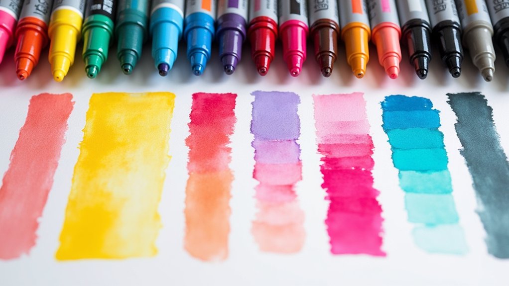
Now that you’ve mastered those mesmerizing mandala techniques, your markers need the perfect playground!
Finding the right piece of paper can make or break your alcohol marker masterpieces, especially when it comes to blending. Thicker papers (around 165 GSM) typically outperform flimsy printer paper, which tends to soak through and create a blotchy mess.
- Test different sketchbooks – Born Sketchbook fans swear by its amazing blend-ability and minimal bleed-through.
- Experiment with paper weights – Heavier papers let your markers glide and blend without creating puddles on your desk.
- Consider texture – Some artists love a bit of tooth for special effects, while others prefer smooth surfaces for seamless gradient shifts.
Budget-Friendly Marker Options That Deliver Professional Results
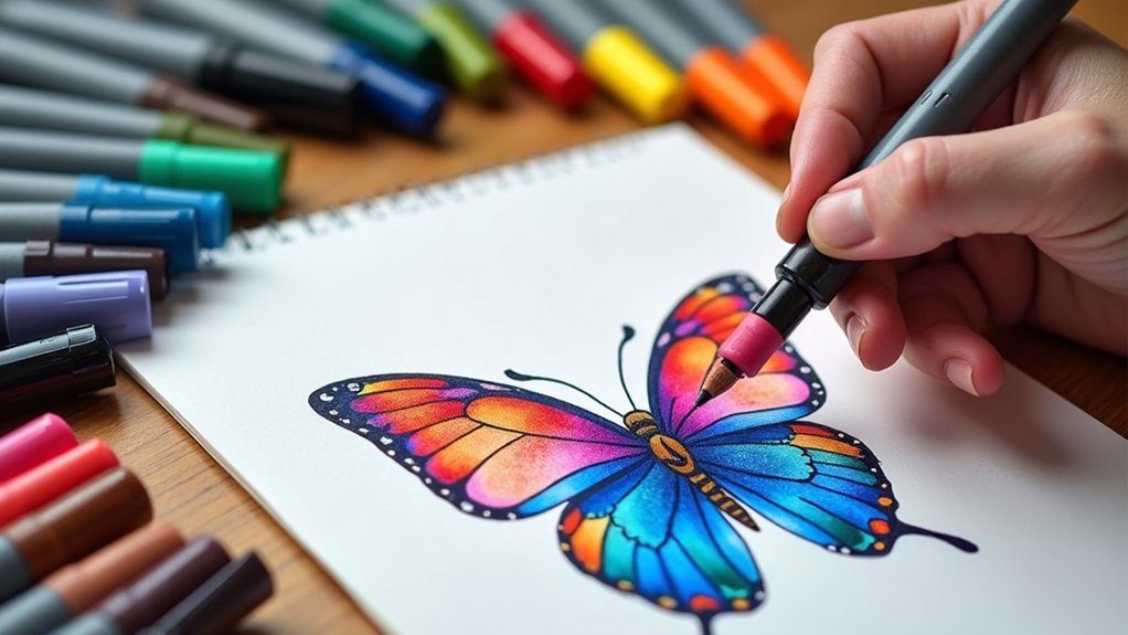
Who says you need to empty your wallet for gorgeous marker art? Brands like Artex and Prismacolor Premiere offer amazing quality without the eye-popping price tags of luxury markers.
Many artists are shocked to discover that their budget-friendly creations look just as stunning as those made with expensive tools!
The secret isn’t always in the marker—it’s in the technique. By mastering blending and color application, even inexpensive markers can create jaw-dropping results.
Try exploring different tip styles, especially pastel markers that blend like a dream and cost way less than premium options.
Mixed Media Approaches: Combining Markers With Other Art Supplies
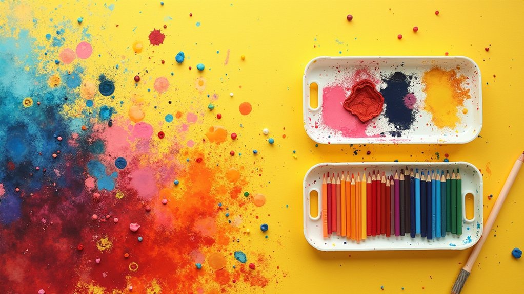
While alcohol markers alone create stunning artwork, combining them with other art supplies reveals a whole new world of creative possibilities!
Artists can blend together different mediums to enhance the vibrancy and depth of their illustrations, creating multi-dimensional pieces that truly pop off the page. The magic happens when markers serve as just one layer in a rich artistic sandwich!
- Start with watercolors as a dreamy base layer, then add marker details on top – the colors will look super vibrant against the soft background!
- Layer colored pencils over dried marker work to add texture, highlights, and shadows that give your art amazing dimension.
- Finish with gel pens for sparkly accents, white highlights, or teeny-tiny details that markers can’t achieve!
Three-Value Shading System for Realistic Marker Renderings
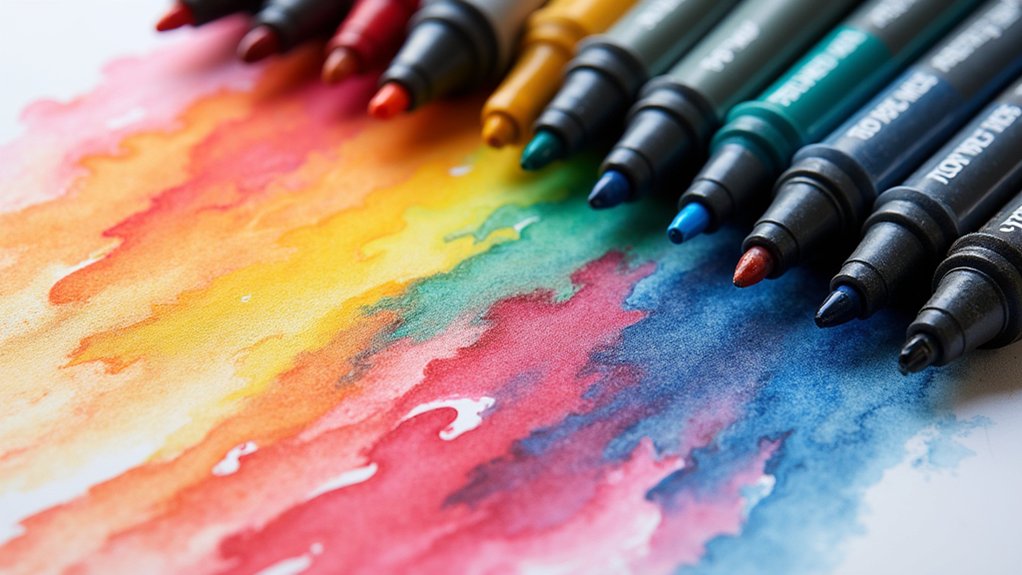
Creating realistic artwork with alcohol markers becomes much easier when artists understand the three-value shading system. This clever technique uses just three marker shades—light, medium, and dark—to create impressive depth and dimension that makes art pop off the page!
Finding the light source direction is the first essential step. Where’s the sun or lamp in your scene? Once that’s settled, artists can map out where highlights should shine and shadows should lurk.
Light dictates everything. Identify your sun or lamp first, then the highlights and shadows will naturally follow.
Start with the lightest color for sun-kissed areas, then layer in medium tones where partial shadows fall, and finish with dark values in the deepest shadow zones. When these three values blend smoothly together, magic happens!
The result? Artwork that looks surprisingly realistic and three-dimensional—all from just three marker colors!
Pastel Marker Techniques for Beginners: Building Confidence in Blending
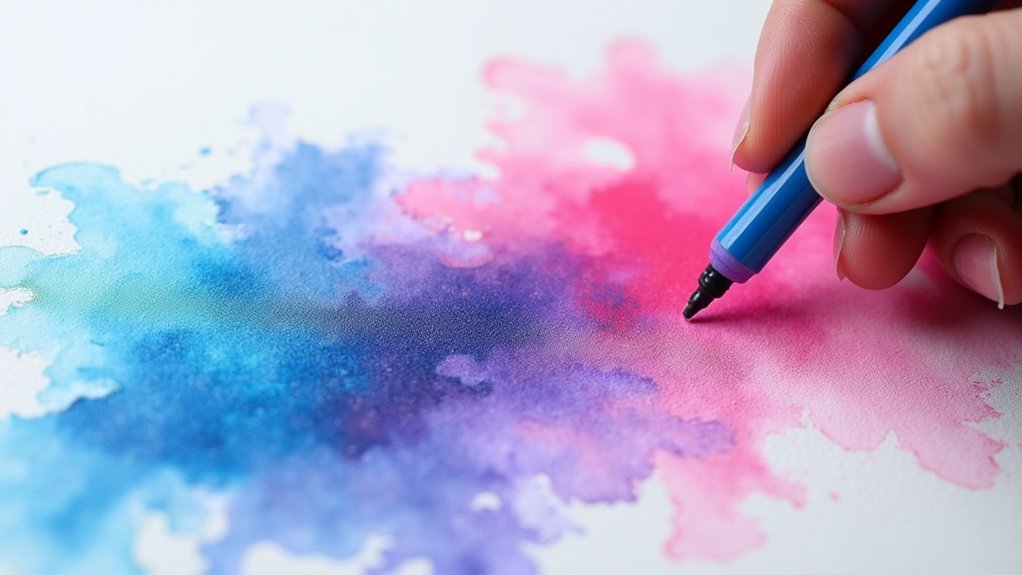
Diving into pastel alcohol markers feels like discovering a friendly oasis in the sometimes intimidating world of marker art!
Pastel markers offer gentler tones that forgive mistakes and encourage experimentation, making them perfect for newcomers. Their lighter pigments naturally create softer gradients, helping beginners master the art of blending without frustration.
- Start by layering two similar pastel colors (like light pink and peach), overlapping them slightly in the middle to see how they naturally blend together.
- Practice the “wet-on-wet” technique by quickly adding a second pastel marker while your first color is still damp.
- Create depth by adding tiny touches of darker shades to your pastel base colors, watching how they spread and transform your work.
Frequently Asked Questions
How to Blend Colors Using Alcohol Markers?
Artists achieve smooth shifts through color layering, starting with lighter shades before applying darker ones. They work on similar areas simultaneously while the ink remains damp for seamless blending effects.
How to Get Better at Coloring With Alcohol Markers?
Improving marker coloring skills requires understanding Color Theory fundamentals. Artists should practice controlled layering, consistent pressure application, and strategic color placement while developing awareness of complementary and analogous relationships between hues.
How Well Do Alcohol Markers Blend?
Alcohol markers blend exceptionally well when used correctly. Artists may encounter blending challenges with non-adjacent colors, but incorporating intermediary hues and using appropriate paper greatly enhances their seamless gradient potential.
How to Color Large Areas With Alcohol Markers?
Large Area Techniques require rapid application to maintain wetness for blending. Artists employ circular motions or sweeping strokes to prevent streaking, while systematically coloring similar sections for consistency and efficiency.
Conclusion
Alcohol markers offer endless creative possibilities for artists of all levels. By mastering blending techniques, exploring color combinations, and trying different approaches, anyone can create stunning artwork that pops off the page. Whether you’re working with budget-friendly options or professional supplies, these twelve techniques will help transform your marker art from flat to fabulous. Grab your markers, let your imagination run wild, and watch as your colorful creations come to life!
Leave a Reply