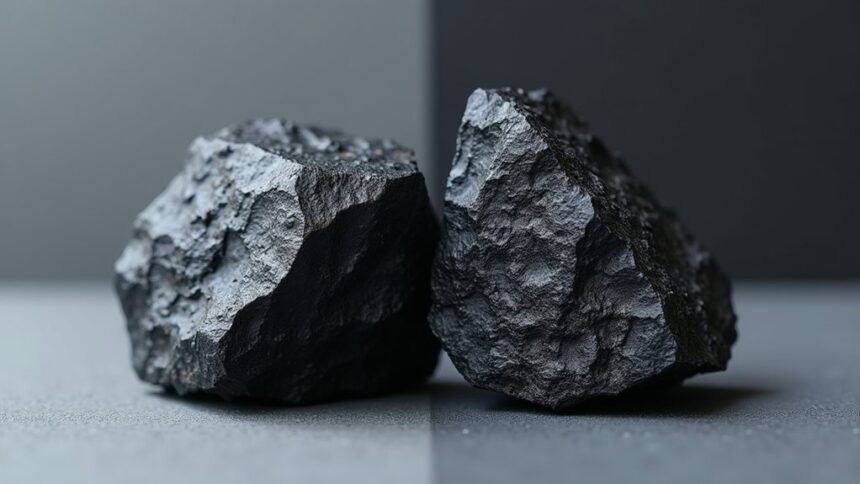
Anthracite isn’t just black—it’s a sophisticated dark gray with bluish or purplish undertones. While black absorbs all light, anthracite reflects subtle amounts, giving it dimension and depth that pure black lacks. This charcoal-like hue appears softer in bright settings but deepens in dim light, creating a mysterious glow. Designers love anthracite for its forgiving nature, modern feel, and ability to enhance other colors without overwhelming them. The difference becomes crystal clear once you know what to look for.
Key Takeaways
- Anthracite displays bluish or purplish undertones while black is a pure color with no undertones.
- Anthracite reflects subtle amounts of light creating dimension, whereas black absorbs almost all light wavelengths.
- Under varying lighting conditions, anthracite transforms from soft grey to nearly black.
- Anthracite enhances the vibrancy of other colors in design, while black creates stark contrasts.
- Anthracite (hex code #393d47) conveys sophistication and balance in spaces where black might feel overwhelming.
Second-Level Headings
How exactly do these two dark shades differ when we look closely? Anthracite isn’t just a fancy name for black—it’s a whole different color experience! With its bluish or purplish undertones, anthracite brings a sophisticated touch that plain black simply can’t match.
Think of it like this: black is the serious older sibling, while anthracite is the cool cousin who knows how to have fun but still look amazing!
Black brings the drama, while anthracite adds sophistication with a playful edge that elevates any design space.
In design, the subtlety of anthracite enhances the vibrancy of other colors, creating a balanced aesthetic that feels modern without shouting for attention.
Black, on the other hand, makes a dramatic statement—it’s bold and unapologetic. The choice between them really depends on whether you want the quiet sophistication of anthracite or the powerful impact of true black.
Understanding Anthracite: Origins and Chromatic Properties
The rich history of anthracite stretches back centuries, rooted in the Greek word “anthrakítēs” which perfectly describes its coal-like appearance.
This distinctive hue, with its hex code #393d47, isn’t simply black but rather the darkest possible gray with subtle bluish-purple undertones that give spaces incredible depth.
- The color breathes sophistication into any room without the harshness of true black
- Its gray properties create a visual softness that feels both modern and timeless
- Anthracite’s versatility shines when paired with complementary colors like mustard or blush
- The high carbon origins of its namesake mineral reflect in its deep, rich appearance
Unlike pure black, anthracite’s unique properties make it more forgiving and adaptable in design applications.
The Science Behind Black: Pure Absorption vs. Undertones
Black’s unique position on the color spectrum exists because it absorbs nearly all wavelengths of visible light, while anthracite reflects subtle amounts, revealing its hidden undertones.
When examined closely, these differences become obvious – pure black creates a flat, light-swallowing void, but anthracite offers dimension with its hints of blue or purple.
This scientific distinction explains why, under varying lighting conditions, anthracite transforms dramatically while black maintains its constant, mysterious darkness.
Light Absorption Properties
When light hits a surface, the way it gets absorbed or reflected determines what color we see, and this principle is key to understanding the difference between anthracite and black.
While black absorbs all light waves, anthracite’s bluish undertones create a unique reflective quality, transforming it from a flat color into something with sophisticated depth.
- The submetallic luster of anthracite dances with light, giving rooms a mysterious glow that pure black simply can’t match!
- Under changing light conditions, anthracite shifts like a chameleon, sometimes appearing as a deep gray rather than black!
- The softer light absorption creates spaces that feel elegant without the harshness of total blackness!
- When paired with other colors, anthracite’s unique character adapts and responds, creating a more balanced atmosphere that feels alive!
Visible Spectrum Analysis
Diving into the scientific analysis of these colors reveals fascinating distinctions that explain why anthracite isn’t simply “almost black.”
Visible light contains a rainbow of wavelengths, from vibrant violets to radiant reds, which interact differently with these two color choices.
When light hits a pure black surface, something amazing happens—it disappears completely! Black gobbles up the entire visible spectrum (that’s 380-750 nanometers), reflecting absolutely nothing back to our eyes.
Anthracite, however, is sneakier with light. Thanks to its high carbon content, it reflects tiny bits of the spectrum, particularly cool blue and purple undertones.
This subtle difference creates a huge impact on perception. Black delivers dramatic depth without variation, while anthracite’s hidden hues bring unexpected complexity that shifts with lighting conditions, making it the chameleon of dark colors!
Undertone Perception Differences
Why do some dark colors pop with personality while others seem to disappear into the shadows? The answer lies in their undertones.
Anthracite grey isn’t just a lighter black—it’s alive with subtle bluish and purplish hues that create visual interest. Unlike pure black, which absorbs all light, anthracite reflects tiny amounts, changing its character as lighting conditions shift.
- Anthracite creates balance in a space, preventing the heaviness that pure black often introduces.
- The cool undertones in anthracite evoke sophistication without feeling cold or intimidating.
- Your emotional responses to anthracite tend to be more positive and welcoming.
- Anthracite’s shifting hues add dimension to a dark shade, making rooms feel more dynamic.
This undertone magic is why designers often choose anthracite when they want darkness with personality!
Visual Comparison: How to Distinguish Anthracite From Black
Though many people consider them nearly identical at first glance, anthracite and black have distinct visual characteristics that become apparent with careful observation.
The anthracite grey reveals itself in varying lighting conditions, showing cool blue or purple undertones that pure black simply doesn’t possess. Place them side by side in interior design settings, and you’ll notice anthracite’s softer presence conveying sophistication without the overwhelming intensity of black.
Try this test: pair both with bright colors! While black tends to create stark contrasts that sometimes overpower other hues, anthracite’s dark gray color plays nicely with vibrant companions, enhancing their appeal rather than competing.
Anthracite embraces brightness rather than fighting it, creating harmonious palettes where colors sing instead of shout.
This versatility makes anthracite a designer’s secret weapon for color combinations that feel rich and nuanced instead of harsh and dramatic.
Design Applications: When to Choose Anthracite Over Black
When should designers and homeowners reach for anthracite instead of black? Anthracite grey offers a sophisticated touch that creates depth and dimension without the heaviness of pure black. This neutral shade brings a cozy atmosphere to low-light areas while maintaining visual interest, making it ideal for contemporary spaces where black might feel too stark or dominant.
- For personal spaces like bedrooms and living rooms where calm and elegance are essential for creating a serene environment.
- When pairing with natural materials like wood and stone, where anthracite creates harmony rather than contrast.
- In spaces with limited natural light where black would absorb too much light and feel oppressive.
- When creating a backdrop for colorful accessories or artwork that need a sophisticated foundation without being overwhelmed.
Psychological Impact: Emotional Responses to Each Shade
The emotional atmosphere created by anthracite offers comfort and serenity, while black delivers intensity that can sometimes overwhelm a space.
Our brains process these colors differently, with anthracite’s softer gray tones triggering feelings of stability and focus, perfect for creative workspaces.
When choosing between these shades, remember that perception plays a huge role in mood—anthracite feels welcoming and sophisticated, while black might appear elegant but can sometimes create a cold or formal environment.
Comfort Vs Intensity
Perception shapes how we respond to different colors in our surroundings, often without us even realizing it. The contrast between anthracite and black represents a fundamental choice between comfort and intensity in our living spaces.
Anthracite’s subtle blue undertones create a sense of calmness and sophistication, while black’s colorless nature can dominate a room with dramatic intensity.
- Anthracite wraps a space in elegant stability, like a cozy blanket that still looks super fancy.
- Black commands attention, shouting “Look at me!” while anthracite whispers with quiet confidence.
- Rooms with anthracite feel modern yet comfortable, letting other colors shine with vibrant personality.
- Black spaces create bold emotional atmospheres that can feel either powerful or overwhelming, depending on how they’re balanced.
Perception Alters Mood
Colors frequently influence our emotional states without our conscious awareness, creating powerful psychological responses that shape our daily experiences. Research shows that anthracite grey triggers feelings of stability and calm, making it perfect for spaces where focus matters.
Unlike black, which can feel dramatic or overwhelming, anthracite’s subtle depth creates warmth and intimacy.
What’s fascinating is how perception of these colors shifts with lighting! Anthracite transforms throughout the day, appearing as a soft grey in bright light and nearly black in dim settings. This dynamic quality affects our moods differently as hours pass.
While black might create feelings of heaviness in a room, anthracite grey promotes serenity and concentration. People often describe feeling more assured and comfortable in anthracite spaces, without the intensity that pure black sometimes brings.
Frequently Asked Questions
What Is the Difference Between Black and Anthracite Color?
Anthracite presents blue-purple undertones in color perception while black absorbs all light. This shades comparison affects design applications, material selection, interior decor, fashion choices, and creates different lighting effects in spaces.
Is Anthracite Darker Than Black?
No, anthracite is not darker than black. In color perception, black represents complete absence of light, making it the darkest possible color for interior decor, fashion trends, and design applications.
Is Anthracite More Grey or Black?
Anthracite shades fall between gray and black, with color perception identifying it as a deep charcoal. In interior design and fashion trends, light reflection reveals its gray undertones, influencing paint choices and psychological effects.
What Color Is Close to Anthracite?
Anthracite alternatives include charcoal, graphite, slate, and obsidian. These color psychology choices impact design applications from interior trends to outdoor aesthetics. Paint finishes, fabric choices, and material comparisons vary with lighting effects, influencing fashion implications.
Conclusion
While black and anthracite might seem identical at first glance, they’re actually unique colors with different personalities. Anthracite offers a softer, more sophisticated alternative to pure black, with its subtle gray undertones and depth. Understanding these differences helps anyone make smarter choices in fashion, home design, or art. Next time you’re picking between these two dark shades, remember: anthracite isn’t just black with a fancy name—it’s a whole different visual experience!


Leave a Reply