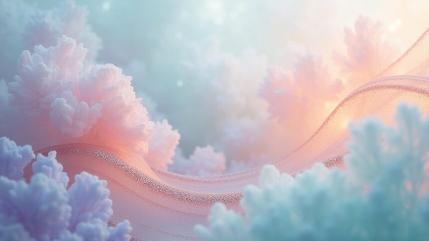
Ethereal art captivates with its dreamlike quality, using soft pastels to create peaceful, otherworldly vibes. Artists often blend mermaidcore’s iridescent scales, celestial themes with whisper-soft star patterns, and fairy core’s enchanted woodland palettes. These delicate color schemes—seafoam gradients, moonlit blues, and gentle pinks—evoke nostalgia and reduce stress. Digital tools like Coolors and Procreate make creating ethereal palettes easy for beginners. The magic of these dreamy concepts awaits in every subtle hue and shimmer.
Key Takeaways
- Combine whisper-soft pastels with dreamy tones to create celestial-inspired ethereal art that evokes floating among stars.
- Implement seafoam gradients using codes like #A8E6CE and #B2EBF2 to capture tranquil underwater scenes with depth.
- Layer soft blues, gentle greens and warm beige tones enhanced by natural light for ethereal home decor.
- Incorporate fairy core elements through woodland moss gradients and moonlit canopy hues in enchanted forest aesthetics.
- Use digital tools like Coolors, Adobe Color and Procreate to develop harmonious ethereal color palettes with magical glows.
The Essence of Ethereal Art and Its Dreamy Appeal
When we gaze upon ethereal art, we’re instantly transported to a dreamlike domain where reality and imagination blur together. The essence of ethereal art lies in its delicate nature, where soft pastels create an atmosphere of tranquility that seems to float beyond our physical domain.
Artists who embrace this style often select a pastel color palette that includes whisper-soft pinks, cloud-like blues, and mint greens that barely kiss the canvas. These color schemes work together to establish a sense of balance that feels both calming and uplifting at once.
The magic happens when light interacts with these gentle hues, making them dance and shimmer like sunlight through morning mist. Nature-inspired colors dominate ethereal compositions, connecting viewers to peaceful memories of dawn skies, spring flowers, and misty mountains.
Mastering Mermaidcore: Ocean-Inspired Color Palettes
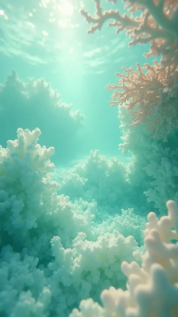
Mermaidcore art thrives on the magical blend of iridescent scale hues that shimmer like treasures beneath the waves.
Artists can create depth through seafoam gradient techniques, layering soft mints (#A8E6CF) and dreamy corals (#FFABAB) that melt into one another like sunset filtering through ocean water.
The most enchanting mermaidcore pieces capture underwater light effects—those ghostly beams that dance through currents and transform ordinary scenes into something from another world.
Iridescent Scale Hues
The enchanting world of iridescent scale hues draws artists and dreamers into a shimmering underwater fantasy.
These mesmerizing colors—soft blues, dreamy greens, and gentle purples—capture the magic of mermaid tails glistening beneath the waves. Artists love using pastel colors like #A4D8E1 (aqua) and #D0B7E6 (lavender) to create tranquil, ocean-inspired masterpieces that practically sparkle off the page!
Adding metallic finishes or cool gradient effects can take these scale patterns to the next level, making artwork that seems to change colors as you move around it—just like real fish scales!
These magical combinations aren’t just for paintings, either. Designers use iridescent scale hues in everything from bedroom decorations to websites, creating spaces that feel like you’re swimming through a dreamy underwater kingdom. Who wouldn’t want to plunge into that?
Seafoam Gradient Techniques
Diving into the magical world of seafoam gradients opens up endless possibilities for creating mermaid-inspired masterpieces!
Artists combine soft greens and blues to capture the tranquil essence of ocean waves, creating a soothing visual experience that’s totally dreamy. Using specific color codes like #A8E6CE (a gentle seafoam green) and #B2EBF2 (a soft blue) helps nail that perfect underwater vibe.
The ethereal feel of seafoam gradients makes them perfect for beach-themed rooms or ocean art. By layering different shades, artists create depth that pulls viewers into their aquatic wonderland!
These calming color blends work amazingly in digital designs, fabrics, and even brand logos, resulting in an inviting aesthetic that’s both fresh and on-trend. Who knew ocean colors could be so versatile?
Underwater Light Effects
While seafoam gradients capture the color essence of ocean waves, another magical element brings mermaidcore aesthetics to life—the enchanting dance of light beneath the water’s surface!
Underwater light creates dreamy, ethereal effects that transform ordinary scenes into enchanted worlds. Artists can recreate this magic using soft pastel blues layered with translucent washes that mimic sunlight filtering through water. The key is blending iridescent highlights with earthy tones like sandy beige to create depth and movement.
Try combining hex code #A1D6D9 (soft aqua) with touches of lavender for that magical underwater glow!
For the most realistic effect, remember that underwater light isn’t static—it ripples, flickers, and sparkles! Adding shimmering metallics or translucent overlays creates that gorgeous light-dancing-on-water vibe that makes mermaidcore designs so enchanting and mysterious.
Who wouldn’t want their art to shimmer like hidden treasure?
Celestial Dreams: Capturing Cosmic Beauty in Art
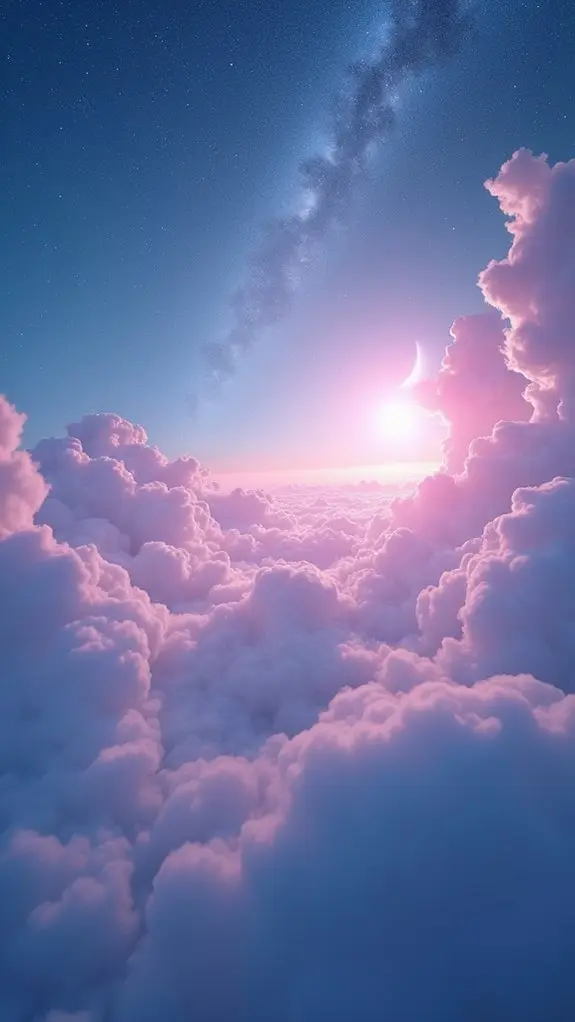
Imagination soars beyond the limits of our world when artists capture the magic of celestial dreams. The color palette features whisper-soft pastels and dreamy tones that evoke a sense of floating among the stars. Artists create a harmonious blend of #ffebd2 (think moonlit clouds) and #f9d5d5 (like dawn breaking over distant planets), often accented with soft blue starlight.
To really nail the cosmic vibe, artists add starry skies, glowing moons, and wispy cloud formations that seem to dance across the canvas. The right lighting makes all the difference—it brings those ethereal colors to life!
Many artists also connect with online communities to share their celestial creations, picking up cool new techniques that make viewers feel like they’re drifting through the cosmos.
Fairy Core Elements: Enchanted Forest Color Schemes
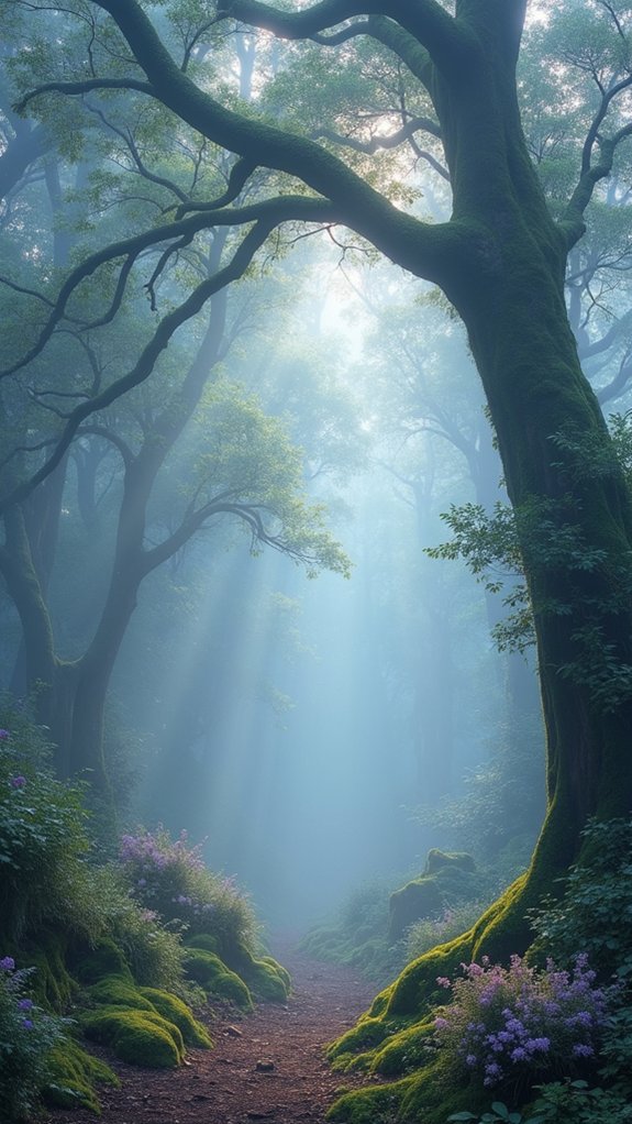
Artists exploring the fairy core aesthetic often experiment with woodland moss gradients that blend muted greens like #82977e with earthy browns, creating a magical forest floor feel.
These natural palettes pair beautifully with moonlit canopy hues—soft grays and subtle blues that mimic the glow of moonlight filtering through leaves.
When combined with floral patterns and organic textures, these color schemes transport viewers straight into an enchanted domain where fairies might flutter between mushroom circles and ancient trees.
Woodland Moss Gradients
The gentle magic of woodland moss gradients transforms ordinary designs into portals to enchanted realms. These color palettes blend rich earthy greens with muted yellow-greens to evoke a sense of walking through a sunlit forest floor. When used in artwork or room decor, these hues create a calming atmosphere that connects viewers to nature’s tranquility.
| Moss Gradient Uses | Emotional Effect | Best Pairings |
|---|---|---|
| Digital art backgrounds | Promotes serenity | Soft pastels |
| Room accent walls | Enhances wellbeing | Muted earth tones |
| Fairy-themed crafts | Creates wonder | Natural textures |
Designers often enhance woodland moss gradients with subtle texture patterns that mimic forest elements. The combination of deep moss green (#2B9348) with softer yellow-green (#E9C46A) feels like stumbling upon a secret forest clearing bathed in gentle sunlight!
Moonlit Canopy Hues
Moving beyond the lush forest floor, magical visions await in the upper spheres of fairy territories. The enchanted canopies, bathed in moonlight, showcase a dreamy palette of soft greens (#82977e), warm neutrals, and ethereal blue tones that dance between branches like secret whispers.
Artists seeking fairy core inspiration often blend these woodland hues with delicate pastel colors—lavender, blush pink, and mint—creating compositions that capture the tranquil magic of midnight forests.
These color combinations aren’t just pretty; they tell stories! A splash of mossy green beside a muted brown instantly transports viewers to a fairy gathering under ancient trees.
The best enchanted canopy paintings layer these colors with gentle gradients, mimicking how moonbeams filter through leaves, turning ordinary forest scenes into doorways to magical domains.
Pastel Perfection: Creating Depth With Soft Color Variations
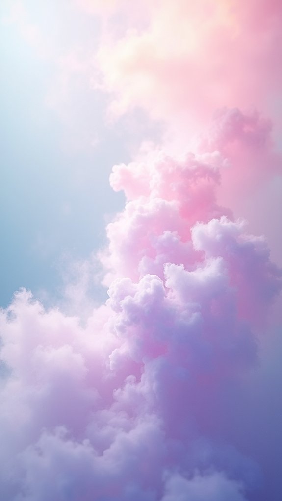
When soft, hazy colors blend together like morning mist, they create a world of pastel perfection that captivates the eye and soothes the soul. These gentle tones—from whisper-soft pinks to dreamy blues—evoke a sense of tranquility that transforms any artwork into an ethereal masterpiece.
Artists achieve stunning depth by layering pastels with subtle variations in lightness. Imagine combining #FFADAD (rosy blush) with #FFD6A5 (apricot dream) and watching how they create a harmonious blend that feels almost magical!
These delicate combinations aren’t just pretty—they’re powerful communicators of emotion. The secret to pastel perfection lies in playing with saturation levels. A slightly darker lavender paired with the palest mint can create fascinating dimension that makes viewers feel like they’re floating through a cotton candy sky!
The Psychology of Dreamy Color Combinations

Dreamy color combinations work like magic on our brains, often triggering feelings of peace and comfort when we see soft blues and gentle pinks together.
Artists who understand this secret power can use these ethereal palettes to make viewers feel nostalgic, relaxed, or even happier just by looking at their work.
The right mix of misty lavenders, baby blues, and blush pinks doesn’t just look pretty—it actually speaks to something deep inside us, creating an emotional connection that makes the artwork more powerful and memorable.
Calming Hues Impact
Why do certain colors make us feel like we’re floating on a cloud? Science reveals that calming hues affect our brains in fascinating ways! Soft blues and gentle pinks aren’t just pretty—they actively reduce stress levels and create peaceful vibes in any space.
Pastel colors work like magic on our emotions, triggering feelings of innocence and tranquility. When designers combine ethereal color palettes—like muted greens with warm beiges—they’re actually crafting environments that boost our emotional comfort. It’s like getting a hug from your walls!
Light matters too! Bright, natural sunshine makes these dreamy colors pop and enhances their soothing powers.
And here’s something cool—these colors might remind you of childhood memories, which is why they feel so comforting and special to you!
Mood-Enhancing Color Associations
The magic of color combinations extends far beyond simple aesthetics into the realm of human psychology. When soft pastels and muted tones appear together in an ethereal palette, they don’t just look pretty—they actually trigger emotional responses in our brains!
Research shows that gentle blues create a sense of calmness, while warm pinks foster feelings of comfort and safety. These dreamy combinations work like invisible mood-boosters, especially in well-lit spaces where their subtle qualities really shine.
When artists and designers use harmonious color relationships, like keeping everything in the same color family, they’re secretly helping your brain feel more peaceful and organized. It’s no accident that brands often choose these soothing shades—they know you’ll stick around longer when surrounded by colors that make you feel good!
Translating Ethereal Aesthetics Into Home Decor
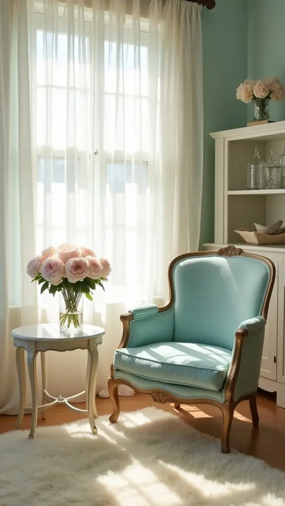
Bringing ethereal beauty into your home starts with understanding the delicate balance of light, color, and texture that creates that dreamy, floating feeling.
Ethereal aesthetics embrace soft blues, gentle greens, and warm beige tones that seem to capture sunlight and hold it. Natural light becomes your best friend, dancing through sheer curtains and highlighting delicate details throughout your space.
Here’s how to achieve this heavenly look:
- Choose furniture with light, airy frames that seem to float rather than weigh down a room.
- Layer different lighting sources—ceiling, table lamps, and candles—to create a magical glow when evening falls.
- Mix textures like smooth ceramics, fluffy pillows, and silky fabrics to create depth without heaviness.
Digital Tools for Designing Your Own Ethereal Palettes
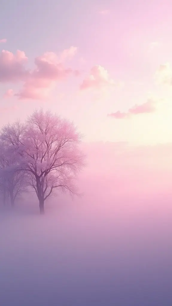
Creating ethereal color palettes becomes magical when digital tools enter the picture, turning dreams into visual reality with just a few clicks. Apps like Procreate and Canva make experimenting with dreamy color combinations super easy, even for beginners!
Color palette generators such as Coolors are game-changers for anyone wanting to design ethereal spaces. Just hit the spacebar, and boom—instant harmony in soft, airy hues!
Adobe Color takes this even further, letting users fine-tune their dreamy schemes based on specific vibes they’re chasing.
For serious interior design enthusiasts, mood board applications like Milanote help bring everything together. Users can arrange colors, textures, and inspirations in one gorgeous digital space, making it way easier to visualize that perfect ethereal room before committing to paint or fabrics.
Seasonal Inspirations for Ethereal Color Stories
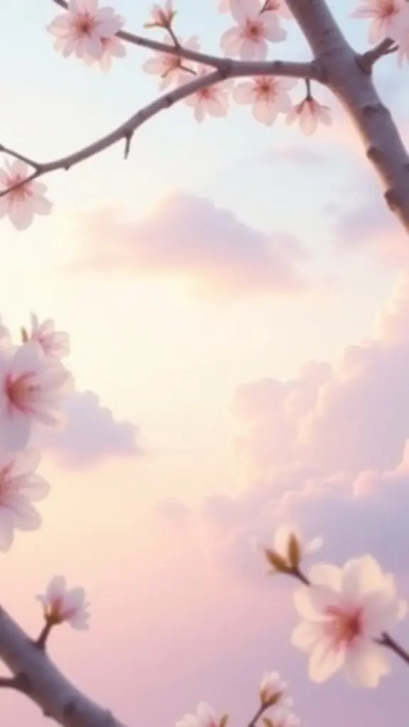
Seasons change the ethereal world around us, gifting artists with endless color inspiration throughout the year. Each season offers its own magical palette that can transform artwork into dreamlike experiences.
The gentle blues of winter skies and warm yellows of summer sunshine create perfect backdrops for ethereal creations.
- Spring’s Awakening – Embrace soft greens of new leaves and delicate pink blossoms that whisper stories of renewal and hope.
- Summer’s Brilliance – Capture vibrant hues of azure oceans and golden sunsets that practically radiate warmth from the canvas.
- Autumn’s Embrace – Mix burnt oranges with earthy browns to create that cozy, magical feeling when leaves dance in the wind.
These seasonal shifts don’t just keep artwork fresh—they connect deeply with viewers by echoing the natural rhythms we all experience.
Blending Texture and Light With Delicate Color Schemes
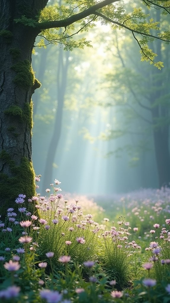
Beyond the seasonal color palettes lies a magical domain where texture meets light in ethereal art. Delicate color schemes come alive when artists thoughtfully blend soft greens and warm pastels with varying materials. It’s like watching a sunset through sheer curtains—totally dreamy!
| Material | Effect | Best Lighting |
|---|---|---|
| Velvet | Absorbs light | Soft lamps |
| Glass | Reflects colors | Natural sunlight |
| Linen | Creates depth | Diffused light |
When textured fabrics catch just the right lighting, they transform ordinary spaces into enchanted territories. Artists who work with delicate palettes know that lacey shadows can dance across pale blues, while fuzzy textures make lavender tones pop with unexpected dimension. The secret? Layering different materials that catch light in unique, magical ways!
Frequently Asked Questions
What Is the Most Ethereal Color?
Celestial shades like pale lavender are often considered most ethereal. Soft gradients of pastel hues evoke otherworldly serenity, while tranquil tones such as #E0F7FA create delicate, light-filled atmospheres.
What Are Considered Dreamy Colors?
Dreamy colors encompass soft hues like lavender, blush pink, and powder blue. Pastel palettes featuring muted tones of mint, peach, and celestial shades create tranquil, ethereal atmospheres in design and artistic expressions.
What Colors Represent Ethereal?
Ethereal colors encompass soft pastels like blush and lavender, celestial hues such as misty blue, iridescent shades with subtle shimmer, and gentle neutrals including ivory and pale beige.
What Is the Prettiest Color Combo?
The prettiest color combinations often feature gentle pastel hues, warm sunset tones, calming ocean shades, or delicate floral palettes. Beauty in color is subjective and varies with individual preference.
Conclusion
Ethereal art opens a doorway to dreamy worlds where colors dance like whispers of magic. Whether you’re drawing mermaids, painting cosmic skies, or designing fairy gardens, these delicate palettes bring your imagination to life. Don’t be afraid to mix textures, play with light, or create your own digital wonderland! With these ethereal ideas in your artistic toolkit, you’re ready to transform ordinary spaces into something truly enchanting.
Leave a Reply