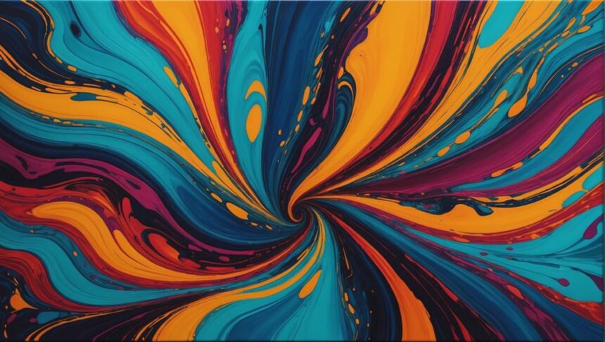
Enhancing colors in fluid art is like setting off fireworks on canvas! Start by choosing high-pigmented paints from brands like Phthalo and Amsterdam to guarantee your colors pop. Use contrasting and complementary shades, like blue and orange, for striking effects. Layering lighter colors first and adding darker hues on top helps in creating enchanting depth. Don’t forget the magic of a white base to amplify brightness! Avoid overmixing to keep your colors vibrant and distinct. Experiment with different pouring methods, whether it’s a mesmerizing ring pour or a thrilling flip cup. Ready to boost your fluid art game?
Key Takeaways
- Select high-pigmented paints from brands like Phthalo, Amsterdam, and Windsor & Newton for vibrant, impactful results.
- Use contrasting and complementary colors like Phthalo Blue and Cadmium Orange to enhance visual impact.
- Layer lighter colors first to create smooth gradients and brighter results.
- A white base amplifies color brightness, making them appear more vivid and striking.
Selecting High-Pigmented Colors
Choosing high-pigmented colors, such as those from renowned brands like Phthalo, Amsterdam, and Windsor & Newton, is essential for achieving vibrant and eye-catching results in fluid art. These high-quality pigments guarantee that your artwork pops with intensity and brilliance, capturing attention and evoking strong emotional responses.
Understanding color psychology plays a key role in selecting your palette. For instance, vibrant reds can convey passion and excitement, while cool blues might evoke calmness and serenity. This knowledge helps you make deliberate choices that align with the feelings you want to express in your art.
Personal expression is another critical factor. Your choice of colors should reflect your unique style and emotions. By experimenting with different hues and combinations, you can create pieces that are distinctly yours. Don’t shy away from unconventional color pairings; sometimes, the most unexpected combinations can produce the most striking results.
Remember to take into account how your chosen colors interact with each other and with a white base. Layering these pigments thoughtfully can enhance their brightness and create a dynamic composition. Avoid dull colors, as they can muddy your piece and detract from its overall impact.
Recommended Paint Brands
Selecting the right paint brands is vital for achieving the desired vibrancy and fluidity in your artwork. When it comes to fluid art, the choice of paint can make or break your masterpiece.
Brand comparisons show that Phthalo paints are renowned for their high pigmentation and vibrant results, making them a favorite among artists. Amsterdam paints stand out for their extensive color range and excellent flow characteristics, which are essential for smooth pours and intricate layering techniques.
Windsor & Newton offers professional-grade acrylics that maintain vibrancy even after multiple layers, guaranteeing your work doesn’t dull over time.
When selecting paint brands, it’s important to check paint viscosity and consistency to confirm they are suitable for pouring techniques. High viscosity paints may require thinning agents, while low viscosity paints are often ready to pour straight from the bottle.
Investing in high-quality, pigmented paints from reputable brands can greatly enhance the overall impact and depth of your fluid art compositions. By choosing the right paints, you can achieve striking colors and smooth changes, elevating your art to new heights.
Utilizing Contrasting Colors
How can the strategic use of contrasting colors enhance the visual impact and vibrancy of fluid art compositions? The answer lies in the interplay of color psychology and visual balance. Complementary color pairs, such as Phthalo Blue and Cadmium Orange, can create eye-catching contrasts that make certain elements of your artwork stand out. By layering these high-pigmented colors, you can define shapes and add depth, resulting in a more dynamic and engaging piece.
Here’s a quick guide to some effective color contrasts:
| Primary Color | Contrasting Color |
|---|---|
| Phthalo Blue | Cadmium Orange |
| Alizarin Crimson | Viridian Green |
| Ultramarine Blue | Burnt Sienna |
Experimenting with different intensities and saturations of these colors can lead to unique and surprising results. The key is to use contrasting colors to draw attention to specific areas, making them pop against the background. However, it’s essential to avoid dull or muted hues, as they can diminish the overall impact and vibrancy of your artwork.
Understanding color psychology helps in making informed choices that enhance visual balance, ensuring your fluid art compositions remain intriguing and dynamic. The right use of contrasting colors can transform an ordinary piece into an extraordinary work of art.
Avoiding Dull Shades
To maintain the vibrancy of your fluid art, it is essential to use high-pigment colors from reputable brands like Phthalo, Amsterdam, or Windsor & Newton. These brands offer rich, intense colors that will keep your artwork lively and eye-catching.
Avoiding dull shades is vital in fluid art. Here are some tips to help you achieve that:
- Choose High-Pigment Colors: Opt for high-quality pigments that don’t lose their vibrancy when mixed. Brands like Phthalo, Amsterdam, and Windsor & Newton are known for their rich colors.
- Understand Color Theory: Use contrasting colors to create depth and visual interest. This approach helps avoid the flatness that can come with monochromatic palettes.
- Mind Your Layers: Be mindful of how colors interact when layered. Complementary colors can enhance each other’s vibrancy rather than creating muddy mixtures.
- Avoid Overmixing: Overmixing paints can lead to dull, blended shades. Aim for distinct and bold colors by mixing just enough to combine but not enough to lose individuality.
Experiment with different combinations and layering techniques to find what works best for your style. Testing before committing to a final pour can reveal unexpectedly vibrant outcomes, ensuring your art remains visually balanced and dynamic.
Understanding Color Interactions
Understanding color interactions can transform your fluid art from ordinary to extraordinary.
Complementary colors can make your artwork pop, while careful layering techniques can enhance vibrancy and prevent muddiness.
Additionally, knowing how colors interact with a white base can help you achieve stunning effects and depth.
Complementary Color Dynamics
Complementary colors, positioned directly opposite each other on the color wheel, are fundamental to creating vibrant and dynamic contrasts in fluid art. This principle of color theory is essential for any artist looking to enhance their artistic expression. When these colors are used together, they can make each other appear brighter and more vivid, adding an eye-catching element to your artwork.
To effectively utilize complementary colors in fluid art, consider the following tips:
- Strategic Placement: Arrange complementary colors next to each other to maximize their contrasting effects, making your piece more dynamic and engaging.
- Ratio Experimentation: Mix varying amounts of complementary colors to achieve unique shades and depths, allowing for personalized and innovative outcomes.
- Avoiding Muddy Colors: Be cautious when blending complementary colors directly, as this can result in neutral grays or browns that may dull your composition.
- Layering Techniques: Pour complementary colors in layers to intensify their brightness and maintain color integrity, enhancing the overall vibrancy of your artwork.
Understanding how complementary colors interact when poured together is vital for achieving the desired effects in your fluid art. Experimenting with these dynamics will not only enrich your artistic expression but also raise the quality of your creations.
Layering for Vibrancy
Layering colors effectively in fluid art can greatly enhance the vibrancy and depth of the final piece. By utilizing thoughtful layering techniques, artists can manipulate color interactions to create visually striking compositions. Starting with lighter colors helps to establish softer edges and a brighter overall appearance. This method is complemented by incorporating high pigmented colors like those from Phthalo or Amsterdam, which can reveal unexpected, vibrant interactions when layered.
One vital aspect of layering is to use complementary colors. This strategy not only enhances vibrancy but also generates dynamic contrasts, making the artwork more engaging from a color psychology perspective. Additionally, avoiding overmixing during the layering process guarantees that the distinct hues remain intact, preventing muddy and dull results.
Documenting the outcomes of different layering techniques can provide valuable insights into how various colors react with one another, aiding in refining one’s approach for future projects. The following table summarizes key points to take into account:
| Layering Technique | Color Impact | Tips for Success |
|---|---|---|
| Start with Lighter Colors | Softer edges, brighter results | Use lighter shades as base layers |
| Use Complementary Colors | Dynamic contrasts, enhanced vibrancy | Pair colors opposite on the color wheel |
| Avoid Overmixing | Maintains distinct hues | Allow each layer to settle before adding another |
Interaction With White
Utilizing a white base in fluid art serves as a powerful technique to enhance the brightness and vibrancy of poured colors, making them stand out with greater clarity. This method is a game-changer for artists aiming to raise their work. Understanding how colors interact with white can profoundly impact the final result, blending the science of color psychology with the freedom of artistic expression.
Here are some key points to reflect upon:
- Brightness Boost: White acts like a spotlight, highlighting colors and making them appear more vivid. This is especially useful when you want your artwork to pop.
- Softened Edges: Layering lighter colors over a white base can make shifts smoother and softer, giving your piece a dreamy, cohesive look.
- Unexpected Results: Different pigments react uniquely to white. Some colors might become more intense, while others might lose their punch, so always test first.
- Documentation: Keep track of how colors behave on a white base. This helps refine your technique and predict outcomes better in future projects.
Starting With a White Base
Beginning with a white base in fluid art greatly enhances the vibrancy and brightness of the colors applied, creating a more striking and visually appealing final piece. One of the main white base benefits is its ability to amplify color brightness enhancement. By providing a clean, reflective surface, a white base allows light to bounce off the colors, making them appear more luminous and dynamic.
Additionally, a white base helps soften the edges of the colors layered on top, resulting in smoother shifts and gradients within the artwork. This creates a seamless flow of colors, which is particularly appealing in fluid art. The contrast between different hues is also heightened, making complementary colors stand out more dramatically, adding depth and dimension to the piece.
Moreover, using high-quality white paint is vital, as it guarantees the pigmentation level is sufficient to achieve the desired brightness and clarity of the colors applied afterward. A well-prepared white base sets the stage for the subsequent layers, allowing each color to shine to its full potential and contributing to the overall aesthetic and impact of the fluid art piece.
Layering Lighter Colors First
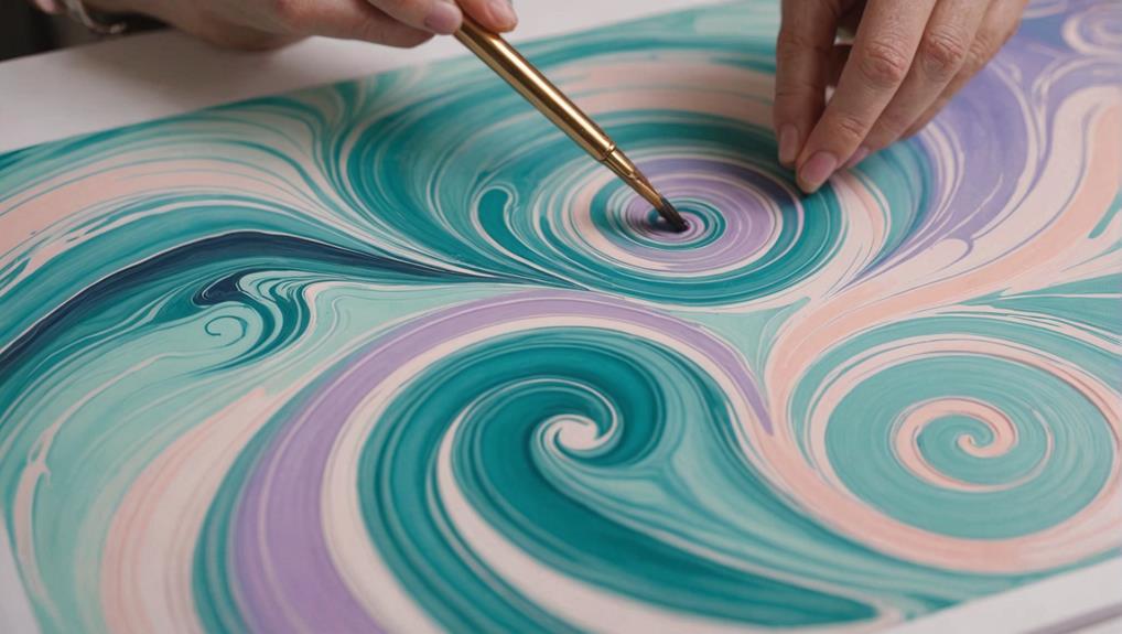
Layering lighter colors first in fluid art plays an essential role in naturally softening edges, making shifts smoother and more harmonious.
This technique also enhances color contrast, bringing out the vibrancy of each hue and adding depth to the overall piece.
Softening Edges Naturally
Creating subtle shifts and minimizing harsh contrasts can be effectively achieved by applying lighter colors as the foundational layers in fluid art. This technique allows for a soft gradient, ensuring a smoother shift between hues and reducing harsh edges in your masterpiece.
By starting with a white or light base, you can enhance the vibrancy of the subsequent colors, making them pop and appear more luminous.
Light colors have a unique ability to blend seamlessly with darker shades, which is essential for achieving that perfect balance without muddying your artwork.
Here are some benefits of layering lighter colors first:
- Smooth Color Blending: Light colors create a soft gradient that allows darker hues to blend more seamlessly, preventing abrupt shifts.
- Enhanced Vibrancy: A light base can make subsequent colors stand out more, giving your piece a dynamic and luminous quality.
- Depth and Dimension: Lighter initial layers act as a buffer, creating depth and making darker colors more prominent without overwhelming the composition.
- Creative Exploration: Experimenting with different combinations of light colors can yield unique and unexpected results, adding a dynamic touch to your artwork.
Incorporating these techniques can transform your fluid art into a visually engaging experience.
Enhancing Color Contrast
Employing a strategy that starts with lighter colors can greatly enhance the contrast and vibrancy of fluid art compositions. Imagine starting with a white base; it acts like a spotlight, amplifying the brightness of lighter colors. When you pour darker colors afterward, they pop vividly, creating a dynamic contrast that grabs your attention. This layering technique is key in color psychology, as it plays with our perceptions and emotions, making the art more impactful.
Layering lighter colors first creates softer edges around the darker ones, enhancing their vibrancy. This technique guarantees each layer stands out, avoiding the muddiness that comes from overmixing. Think of it like building a sandwich – you want each ingredient to be distinct and delicious, not a blended mess.
Experimenting with complementary colors can also produce striking effects. Imagine the drama of a bright orange against a deep blue – it’s eye-catching and full of depth!
Keeping a journal of your results helps refine your techniques, guaranteeing you can recreate and enhance these contrasts in future projects. So, grab your colors and start layering – your artwork will thank you for it!
Specific Pouring Orders
To achieve ideal results in fluid art, carefully consider the order in which paints are poured. The sequence in which you introduce colors can greatly affect the final piece, especially when employing various pouring techniques and aiming for harmonious color blending.
For a vibrant finish, start with a white base coat. This enhances brightness and makes subsequent colors pop.
When layering paints, follow these guidelines:
- Lighter Hues First: Begin with lighter colors to create a soft shift. This prevents darker tones from overpowering the composition.
- Ring Pour Technique: Use a consistent circular motion, layering colors from lighter to darker. This maintains clarity and creates a patterned effect.
- Flip Cup Pours: Layer your colors with lighter ones on top and darker ones on the bottom. This guarantees a better interaction during the pour.
- Dirty Pour Method: Experiment by mixing different colors in the cup before pouring. This creates unique blends and adds depth to your artwork.
Using a Torch Effectively
Using a torch in fluid art is like uncovering hidden treasures, as it helps reveal hidden colors and create fascinating cell patterns.
By heating the paint, air bubbles rise to the surface, letting vibrant colors intermingle and form dynamic, eye-catching reactions.
To make the most of this technique, keep the torch moving in a sweeping motion to evenly distribute heat, ensuring you bring out the best in your masterpiece without scorching it.
Revealing Hidden Layers
A torch can be instrumental in fluid art, as it efficiently releases trapped air bubbles and reveals the intricate layers beneath the surface. This technique not only uncovers hidden details but also enhances color blending, making your artwork more intricate and vivid. Proper use of a torch is essential for achieving the best results.
Here are four key tips for using a torch effectively in fluid art:
- Distance Matters: Hold the torch at a safe distance, about 6-12 inches from the surface. This helps avoid scorching the paint or damaging the canvas.
- Sweeping Motion: Move the torch in a sweeping motion rather than holding it in one spot. This prevents overheating and guarantees even heat distribution.
- Timing is Key: Apply the torch shortly after pouring, while the paint is still wet. This timing allows for the best results in revealing hidden layers and enhancing color vibrancy.
- Heat Effects: The heat causes pigments to expand, often resulting in unique cells and patterns. These effects enhance the overall visual appeal of your fluid art.
Enhancing Color Reactions
Effectively utilizing a torch can greatly enhance color reactions in fluid art, resulting in vibrant and dynamic compositions. Imagine this: you’ve just poured your paint, and it’s still wet and glistening. Now comes the fun part.
By carefully applying heat with a torch, you can reveal hidden cells and amazing textures. Aim your torch about 6-12 inches above the surface, moving it in a sweeping motion. This guarantees the heat is evenly distributed, avoiding any one area from overheating or bubbling excessively.
The magic happens because the heat makes the paint expand, creating those fascinating patterns that make fluid art so mesmerizing. Timing is everything, though. You want to torch shortly after pouring to catch the paint while it’s still fluid. This not only enhances the color reactions but also maintains visual harmony in your artwork.
Think of it like color psychology at play; the way colors interact can evoke different emotions and responses.
And remember, safety first! Always keep a fire extinguisher nearby and never leave your torch unattended. So, grab your torch and get ready to reveal a whole new level of creativity in your fluid art.
Exploring Pouring Methods
Experimenting with various pouring methods, such as the ring pour or flip cup, allows artists to achieve unique patterns and dynamic color interactions in fluid art. These experimenting techniques open up a world of creative possibilities, making each artwork an adventure in color and form. Pouring variations can greatly influence the final outcome, making it essential to understand and practice different methods.
Here are some popular pouring methods:
- Ring Pour: This technique involves pouring paint in concentric circles, resulting in mesmerizing, layered rings of color.
- Flip Cup: For a dramatic effect, this method involves flipping a cup filled with paint onto the canvas and lifting it swiftly to release the colors.
- Dirty Pour: All colors are mixed in a single cup and then poured onto the canvas, creating unpredictable and exciting color blends.
- Swipe Technique: After pouring, a tool is used to swipe across the paint, blending colors and creating intricate, feathered patterns.
Each method brings its own set of unique challenges and rewards. By experimenting with these techniques, artists can discover new ways to enhance the vibrancy and depth of their fluid art, making each piece truly one-of-a-kind.
Thoughtful Color Layering
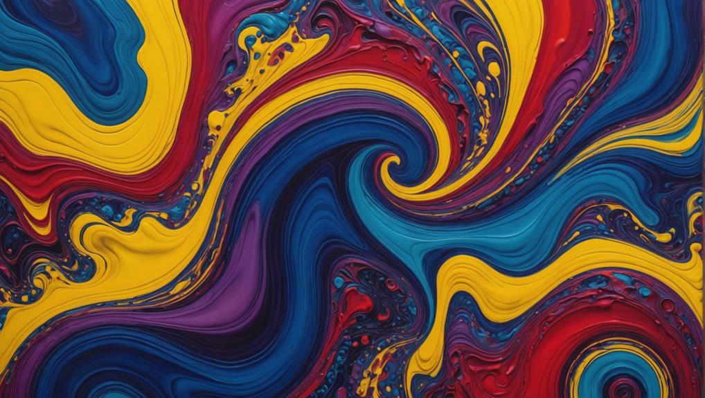
Thoughtful color layering is a vital technique in fluid art that involves strategically placing colors to maximize their visual impact and depth. At its core, this practice harnesses color psychology to evoke emotions and create visual harmony. By layering techniques, artists can avoid blending colors into dull shades, instead enhancing their vibrancy.
Start with lighter colors at the bottom to maintain brightness; this allows darker hues to float on top, creating striking contrast. The key is to avoid overmixing, as this can lead to muddy results. Keep distinct color boundaries to enhance visual interest and guarantee each color stands out.
Experiment with different pouring techniques, like ring pours or flip cups, to observe how colors interact when layered. Each method can yield unique results, revealing the interplay between colors.
Documenting your color combinations and layering strategies is essential. It helps refine your technique and provides insights into how different colors react with each other and the base layer.
Using Complementary Colors
Utilizing complementary colors in fluid art can greatly enhance the vibrancy and visual appeal of your creations.
Complementary color schemes, based on artistic color theory, involve pairing colors that are opposite each other on the color wheel. This technique can create striking contrasts that make each hue stand out more prominently, adding depth and visual interest to your artwork.
Here are four tips to effectively use complementary colors in your fluid art:
- Identify Complementary Pairs: Start by identifying color pairs like blue and orange, red and green, or yellow and purple. These combinations naturally enhance each other’s intensity.
- Layer with Care: When layering complementary colors, be cautious not to overmix. Overmixing can lead to muddy or dull results, which detract from the intended vibrancy.
- Experiment with Combinations: Play around with different complementary color combinations. This experimentation can lead to unique interactions and unexpected effects when the colors are poured and layered.
- Incorporate Metallics: Adding metallic versions of complementary colors, such as gold with purple or copper with blue, can further enhance the visual appeal, adding an extra layer of shine and dimension to your artwork.
Preventing Overmixing
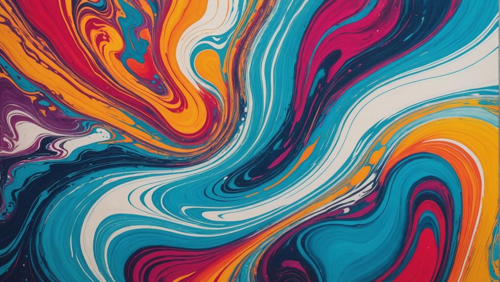
To prevent overmixing in fluid art, it is vital to gently combine your paint mixtures to preserve their distinct hues. Overmixing often leads to muddy colors, which can diminish the vibrancy and impact of your artwork.
One effective mixing technique involves using a palette knife or stir stick, applying slow, deliberate motions to avoid blending pigments too thoroughly. This helps in color maintenance, guaranteeing each hue remains clear and vibrant. Additionally, maintaining a consistent pouring medium ratio is essential to achieving the desired viscosity without compromising color integrity. Testing your colors on a separate surface before pouring can further assure that your intended vibrancy is maintained.
Another strategy to prevent overmixing is utilizing pouring techniques that allow for layering. For instance, a ring pour can help keep colors distinct by layering them in concentric circles. By carefully managing these mixing techniques, you can achieve stunning, vivid results in your fluid art.
Here’s a quick reference table to help you keep track:
| Technique | Tool Used | Benefit |
|---|---|---|
| Gentle Mixing | Palette Knife | Maintains distinct hues |
| Consistent Ratio | Stir Stick | Guarantees proper viscosity |
| Layered Pouring | Pouring Medium | Keeps colors separate |
Frequently Asked Questions
How Can I Make My Art More Colourful?
To make your art more colorful, apply color theory principles and use vibrant pigments from reputable brands. Layer lighter colors first and experiment with contrasting hues and metallics to create depth and unique visual effects.
How to Layer Colors for Acrylic Pouring?
When layering colors for acrylic pouring, employ color layering techniques such as starting with lighter shades and using complementary colors. Adjust paint viscosity to guarantee smooth shifts and prevent colors from overwhelming each other.
What Color Combinations Are Best for Fluid Art?
To achieve striking fluid art, apply color theory by using complementary hues like blue and orange or red and green. This approach enhances contrast and depth, creating visually engaging compositions that captivate and hold the viewer’s attention.
How Do You Increase the Fluidity of Acrylic Paint?
To increase the fluidity of acrylic paint, utilize acrylic mediums like Liquitex Pouring Medium or Floetrol. These help maintain color vibrancy and consistency, essential for effective pouring techniques. Silicone oil can also enhance flow and create dynamic cells.
Conclusion
Enhancing colors in fluid art requires an understanding of several key techniques, including selecting high-pigmented paints, utilizing contrasting and complementary colors, and avoiding dull shades.
Mastery of pouring methods, thoughtful color layering, and preventing overmixing are also essential.
By integrating these strategies, artists can achieve vibrant and dynamic results in their fluid art creations, elevating their work to new levels of visual impact.
Leave a Reply