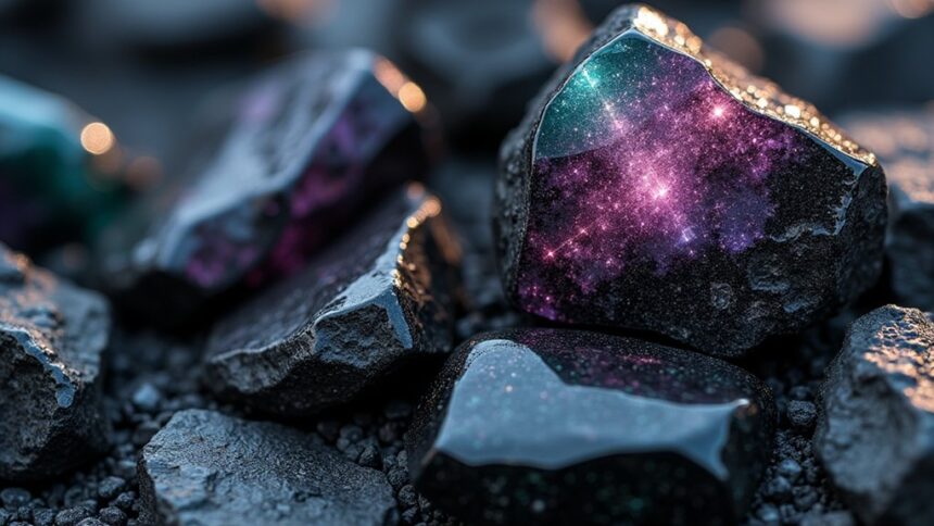
Obsidian color, named after Roman explorer Obsius, brings dramatic depth to any palette with its mysterious black-gray tones. This volcanic hue creates sophisticated spaces when paired with soft ivory, vibrant gold, mint, or lavender accents. Designers love obsidian for its ability to promote focus while adding elegance to both interiors and fashion pieces. Just avoid pairing it with dark browns, blacks, or navy blues that might diminish its striking impact. The right obsidian combinations will transform your entire design approach.
Key Takeaways
- Obsidian’s deep black volcanic color creates a sophisticated base that pairs beautifully with soft ivory, gold, mint, and lavender.
- Avoid combining obsidian with dark browns, navy, dark green, or gray to maintain its visual impact and depth.
- In interior design, balance obsidian with warm-toned furniture and metallic accents for an elegant atmosphere.
- Obsidian promotes focused thought and introspection while adding dramatic elegance to any design palette.
- Use volcanic hues strategically as accents or statement pieces in both casual and formal fashion settings.
The Origins and Characteristics of Obsidian Color
Darkness itself seems to have been captured in the color known as obsidian. This deep, mysterious black shade, with its subtle gray hints, mimics the volcanic glass it’s named after.
Obsidian gets its name from a Roman explorer named Obsius, who first discovered the material—talk about having a cool legacy! With a super low lightness of just 4% and barely-there saturation of 5%, obsidian brings serious intensity to any palette.
Throughout history, people used obsidian for everything from tools to jewelry. The color brings a touch of sophistication to designs while symbolizing strength and protection.
When you use obsidian in your projects, you’re tapping into its power to promote introspection—it makes other colors pop while encouraging deep thinking!
Psychological Impact of Volcanic Hues in Design
While obsidian glass forms in nature’s fiery depths, its color creates equally powerful reactions in our minds. This deep hue isn’t just beautiful—it actually changes how we feel and think! In design settings, obsidian color promotes focused thought and introspection, making it perfect for spaces where you need to concentrate or relax.
The psychological impact of volcanic colors like obsidian is pretty amazing. Their low light and subtle intensity create calmness, while simultaneously adding elegance to any design. Fancy brands love using obsidian because it makes products seem more sophisticated and important.
When paired with lighter contrast colors, these dark volcanic hues make dramatic visual statements that grab attention. Designers who understand these emotional responses can use obsidian strategically, creating exactly the feeling they want their audience to experience!
Complementary Colors That Enhance Obsidian’s Depth
The magical power of obsidian truly emerges when paired with the right colors that make its mysterious depths shine even brighter. The key to creating a harmonious visual effect lies in selecting complementary colors that create stunning contrast without overwhelming obsidian’s natural richness.
| Color Name | Hex Code | Effect | Best Uses |
|---|---|---|---|
| Soft Ivory | #FFFFF0 | Creates dramatic contrast | Backgrounds, accents |
| Vibrant Gold | #FFD700 | Enhances depth perception | Highlights, jewelry |
| Mint | #98FF98 | Provides crisp, cool balance | Accessories, trim work |
| Lavender | #E6E6FA | Adds gentle sophistication | Textiles, subtle details |
Designers should avoid pairing obsidian with dark browns or blacks in their color palette, as these similar tones muddy the visual impact rather than highlighting obsidian’s spectacular volcanic qualities.
Avoiding Color Conflicts With Dark Volcanic Tones
Creating visual harmony with obsidian requires careful attention to potential color conflicts that might diminish its natural beauty.
When working with these deep hues, designers should steer clear of black (#000000), which blends too closely with obsidian, causing definition to disappear in your palette.
Dark brown (#654321) creates an uncomfortable clash with obsidian’s cool undertones, while navy (#000080) competes for attention, disrupting the sophisticated visual appeal you’re aiming for.
Watch out for dark green (#006400) too—it often overpowers obsidian’s subtle charm!
And who knew gray could be such a troublemaker? At (#808080), it transforms your exciting dark volcanic tones into a boring, flat design that puts viewers to sleep.
Instead, choose colors that enhance obsidian’s depth without fighting for the spotlight!
Practical Applications of Obsidian in Interior and Fashion Design
Designers release obsidian’s transformative power when incorporating its deep, volcanic tones into living spaces and wardrobes. This mysterious color creates a sophisticated atmosphere in interior design while adding visual depth to rooms that might otherwise feel flat.
When paired with warm-toned furniture or metallic accents like gold, obsidian prevents spaces from feeling cold or unwelcoming.
In fashion, this deep hue works magic in both casual and formal settings! A sleek obsidian jacket can make anyone look instantly put-together, while accessories in this shade add elegance without trying too hard.
The key to working with such a dark color palette is contrast—designers strategically balance obsidian with lighter shades to create modern, eye-catching combinations that pop.
Whether in your home or closet, obsidian delivers drama and style that’s impossible to ignore!
Creating Balanced Color Schemes With Obsidian as an Anchor
Many successful designers consider obsidian a perfect foundation for balanced color schemes that truly captivate the eye! This deeply mysterious #0a0909 shade creates magic when paired with the right companions. For stunning visual contrast, try light teal against obsidian’s darkness—it pops like fireworks on a midnight sky!
| Approach | Color Combinations | Effect |
|---|---|---|
| Monochromatic | Various obsidian tints | Sophisticated elegance |
| Warm Neutrals | Obsidian + ivory/gold | Luxurious balance |
| Accent Colors | Obsidian + sage/lavender | Soothing interest |
When designing with this volcanic hue, remember that readability matters! Maintain a contrast ratio of at least 4.5:1 between obsidian and text. This guarantees your design remains accessible while still looking totally awesome! A balanced obsidian palette feels both bold and refined—like wearing a perfectly tailored tuxedo to a rock concert!
Frequently Asked Questions
What Color Is Obsidian?
Obsidian’s color embodies a profound black with subtle gray undertones, formed in volcanic formations. Its mineral composition creates a gemstone with cultural significance in interior design, reflecting psychological depth in natural occurrences throughout history.
What Color Is Obsidian Close To?
Obsidian gemstone resembles onyx and jet black, with deep blacks characteristic of volcanic glass. Its glossy finishes and reflective qualities complement earthy tones while creating elegant contrasts in dark palettes featuring natural minerals and shiny surfaces.
What Color Goes With Obsidian?
Complementary colors like ivory, gold, sage, lavender, and mint pair beautifully with obsidian. These color pairings draw from nature inspirations, interior decor trends, and color psychology to create balanced, seasonally versatile mood boards.
What Color Is Obsidian Similar To?
Obsidian, with its distinctive texture and volcanic formation, resembles onyx, charcoal, ebony, and jet black. These varieties share obsidian’s symbolism of strength, geological properties, and historical uses in art and healing practices.
Conclusion
Obsidian’s mysterious volcanic depth offers endless possibilities for designers and everyday creators alike. By understanding its psychological impact, complementary partners, and practical applications, anyone can harness this powerful hue with confidence. Whether as a bold statement or subtle accent, obsidian brings dramatic intensity without overwhelming your space. So grab your color wheel, trust your instincts, and let this ancient volcanic glass transform your palette into something truly extraordinary!


Leave a Reply