Retro art brings back the cool vibes of bygone eras through distinct color palettes and vintage aesthetics. Artists can explore 50s Beetle Blues with deep teals and mustard yellows, create Cuban-inspired illustrations with warm oranges, or design pixel art with neon arcade colors. Other nostalgic ideas include Persian rug patterns, psychedelic flower power, and moody cocktail illustrations. These vintage techniques transform ordinary projects into time-traveling visual stories that capture the heart of different decades.
Key Takeaways
- Use the “Beetle Blues” palette with deep teals (#112C33), mustard yellows (#A7963C), and off-whites (#F1EFE2) for authentic retro designs.
- Incorporate geometric shapes, atomic starbursts, and bold zigzags popular in the 1950s to enhance vintage artwork.
- Experiment with film-inspired color grading using subtle yellows and browns to mimic aged film stock effects.
- Create texture through mixed media storytelling by layering fabric scraps, old buttons, and vintage ephemera.
- Combine pixelation techniques with contrasting dark tones and pastel shades to evoke nostalgia for vintage media experiences.
Embracing the Beetle Blues: 50s-Inspired Art Techniques
While the golden era of the 1950s might seem like ancient history to today’s kids, its vibrant artistic style lives on through the enchanting Beetle Blues color palette. This collection of vintage colors—featuring deep teals like #112C33, mustard yellows like #A7963C, and creamy off-whites like #F1EFE2—creates the perfect retro vibe for art projects.
Want to capture that 50s feel? Try layering these colors with textured materials to add dimension!
Layering is key! Mix textures with Beetle Blues colors for that authentic mid-century depth and character.
Artists can experiment with geometric shapes and playful patterns that were super popular back then. Imagine combining those rich, muted tones with some bold zigzags or atomic starbursts—totally rad!
For an extra authentic touch, pair your Beetle Blues artwork with some chunky, rounded lettering. The result? A perfectly nostalgic masterpiece that looks like it rolled straight out of your grandparents’ photo album!
Persian Rug Patterns: Weaving Vintage Textile Designs
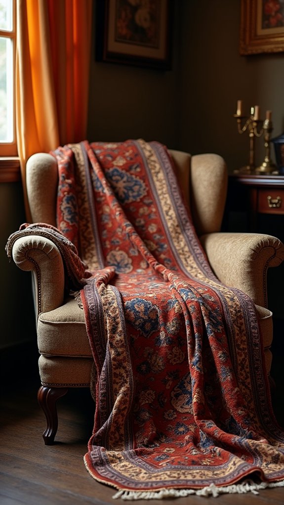
When stepping into the world of Persian rug patterns, artists discover an absolute treasure trove of inspiration that dates back thousands of years!
These intricate designs, with their geometric shapes and floral motifs, tell stories of ancient cultures while offering gorgeous vintage color palettes of deep reds, blues, and golds.
Each handwoven masterpiece represents months—sometimes years—of painstaking craftsmanship.
- Try recreating medallion patterns in your artwork to symbolize protection and prosperity, just like Persian artisans did centuries ago!
- Experiment with natural dye techniques to achieve those rich, warm tones that make vintage rugs so special.
- Mix floral and geometric elements in your designs to create that perfect balance between structure and organic beauty that Persian rugs are famous for.
Havana Nights: Creating Cuban-Inspired Retro Illustrations
Artists seeking to capture the energy of Cuba can start with the “Havana” color palette, featuring warm oranges (#f04720), golden yellows (#f4c273), and deep purples (#9f4282) that mirror the island’s sunset-bathed streets.
The vintage feel comes alive when classic Cuban architecture, old-school convertible cars, and tropical palm trees are sketched with bold, flowing lines reminiscent of 1950s advertisements.
These illustrations pop when cultural motifs like traditional musical instruments, dancing figures, and ornate ironwork are included, giving viewers a nostalgic glimpse into Cuba’s vibrant past.
Vibrant Tropical Palette
Colors explode with life in the Havana-inspired tropical palette, turning ordinary retro illustrations into scenes that practically dance off the page.
This vibrant tropical palette uses rich oranges (#f04720), soft yellows (#f4c273), and light creams (#f7e8c4) to capture Cuba’s sunny essence. Artists can create stunning retro color palettes by adding bold pinks (#dd9bc6) and deep magentas (#9f4282) for amazing depth and contrast.
These color combinations work magic in three key ways:
- They instantly transport viewers to warm, tropical destinations
- They create a perfect balance between nostalgic vibes and fresh, contemporary design
- They pair beautifully with organic shapes and playful motifs that scream “fun in the sun!”
Whether for digital art or print projects, these Havana hues bring summer warmth year-round!
Classic Havana Architecture
The streets of Havana tell stories through their buildings—each façade a vibrant postcard from another time. Artists capturing this Cuban charm use vintage colors that mirror the city’s sun-drenched personality and colonial roots. The faded pastels and warm tones create a sense of nostalgia that transports viewers straight to Old Havana’s bustling streets!
| Building Type | Vintage Colors | Illustration Technique |
|---|---|---|
| Colonial Mansion | #f7e8c4 (Cream) | Faded watercolor wash |
| Art Deco Theater | #dd9bc6 (Lavender) | Bold graphic outlines |
| Capitolio | #f4c273 (Gold) | Detailed architectural lines |
| Seaside Malecón | #f04720 (Terracotta) | Sunset gradient effects |
| Street Cafés | #9ad4d6 (Teal) | Textured brush strokes |
When illustrating Classic Havana architecture, don’t forget the intricate wrought ironwork and ornate balconies that give these buildings their unique character!
Vintage Cultural Motifs
When the sun sets over Havana, a wonderland of vintage cultural magic comes alive! Artists capturing this vibrant scene often embrace vintage colors like the fiery #f04720 orange and mellow #f4c273 yellow that mirror Cuba’s warm spirit.
These illustrations transport viewers straight to the lively streets where music flows and vintage cars cruise past colorful buildings.
To create authentic Cuban-inspired retro art:
- Mix geometric patterns with tropical motifs, especially dancing figures and palm leaves that celebrate Havana’s rhythm.
- Incorporate vintage typography alongside warm, earthy tones to achieve that perfect 1950s nostalgic feel.
- Balance bright hues with deeper colors like #9f4282 pink to create the visual contrasts that define Cuban nightlife scenes.
These visual elements together capture not just Havana’s look, but its soul—energetic, joyful, and timelessly cool!
Flower Power: Psychedelic Art From the Summer of Love
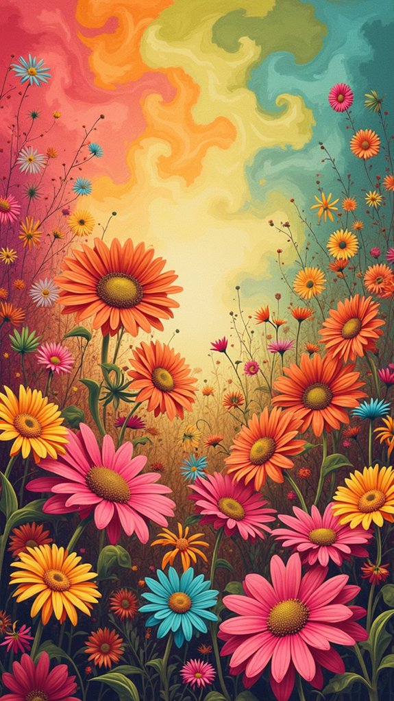
Vibrant psychedelic art exploded across America during the iconic Summer of Love in 1967, capturing the spirit of a generation seeking peace and revolution.
Artists embraced wildly experimental color palettes featuring electric pinks, sunshine yellows, and trippy blues that seemed to pulse with energy. These eye-popping combinations weren’t random—they reflected the mind-expanding experiences of the counterculture movement!
The psychedelic palette wasn’t just art—it was revolution visualized through mind-bending colors that captured an awakening consciousness.
Flower Power aesthetics borrowed heavily from nature, with swirling patterns resembling unfurling petals and cosmic vines.
Artists like Peter Max became legendary for their dreamy, surreal creations that broke all the rules of traditional art. Their posters and album covers featured impossible vistas where flowers might sprout human faces or butterflies could carry peace symbols across rainbow skies—a perfect visual representation of a generation that wanted to turn the establishment upside down.
Thrift Market Treasures: Upcycled Vintage Art Projects
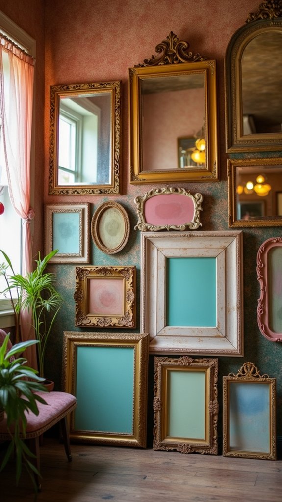
Thrift stores overflow with old picture frames that, with a fresh coat of paint in retro colors like #EA572A orange or #0B3F30 forest green, can transform into statement pieces for displaying vintage photos or artwork.
Artists create stunning collages by combining yellowed newspaper clippings, old magazine cutouts, and thrifted ephemera, arranging these fragments to tell visual stories of bygone eras.
These upcycled projects not only give new life to forgotten treasures but also connect us to the past through tangible, hands-on creativity that’s both eco-friendly and personally meaningful.
Upcycled Frames Reimagined
Many creative DIYers have discovered the hidden potential of old picture frames gathering dust in thrift stores and attics across the country.
These forgotten treasures can be transformed into stunning art pieces by applying vintage color palettes inspired by retro designs like the Thrift Market scheme, which perfectly captures that nostalgic feel with its warm oranges and deep greens.
What makes these upcycled frames special:
- They tell a story through layers of mixed media—fabric scraps, old buttons, and pressed flowers add texture and personal meaning.
- They celebrate sustainability by giving new life to discarded items while honoring vintage aesthetics.
- They create conversation pieces that blend yesterday’s charm with today’s creativity, especially when paired with 60s or 70s-inspired artwork.
Retro Collage Techniques
Dozens of forgotten treasures wait in thrift stores to become stunning retro collages that capture the essence of bygone eras. Magazines with faded pages, quirky postcards, and fabric scraps can transform into unique art pieces that tell stories from the past.
Artists mix these materials using techniques like layering and tearing to create depth that practically jumps off the page!
The magic happens when retro colors come into play—think earthy 70s browns (#EBD5B8) or electric 60s pastels that make viewers feel nostalgic instantly. Upcycling old book covers or photographs adds personal meaning to these collages.
Morning Espresso: Coffee-Toned Sepia Photography

When artists long for a touch of nostalgia in their work, the “Morning Espresso” color palette offers a perfect solution. This rich coffee-toned collection features warm hues from deep browns (#332a1a) to creamy neutrals (#efdcd3), perfectly capturing the cozy feel of vintage photography.
The color palette takes ordinary images and transforms them into timeless pieces that feel like they’ve been pulled from your grandparents’ photo album!
- Use sepia techniques to soften modern digital photos, giving them that classic, aged appearance.
- Layer the palette’s rusty red (#aa574b) with earthy browns to create depth in coffee shop scenes.
- Incorporate creamy highlights (#efdcd3) to balance darker tones, mimicking the look of aged photographs.
These dreamy, coffee-inspired colors work beautifully for branding, wall art, or any project needing that perfect nostalgic touch.
Honey-Dipped Aesthetics: Warm Analog Photo Effects
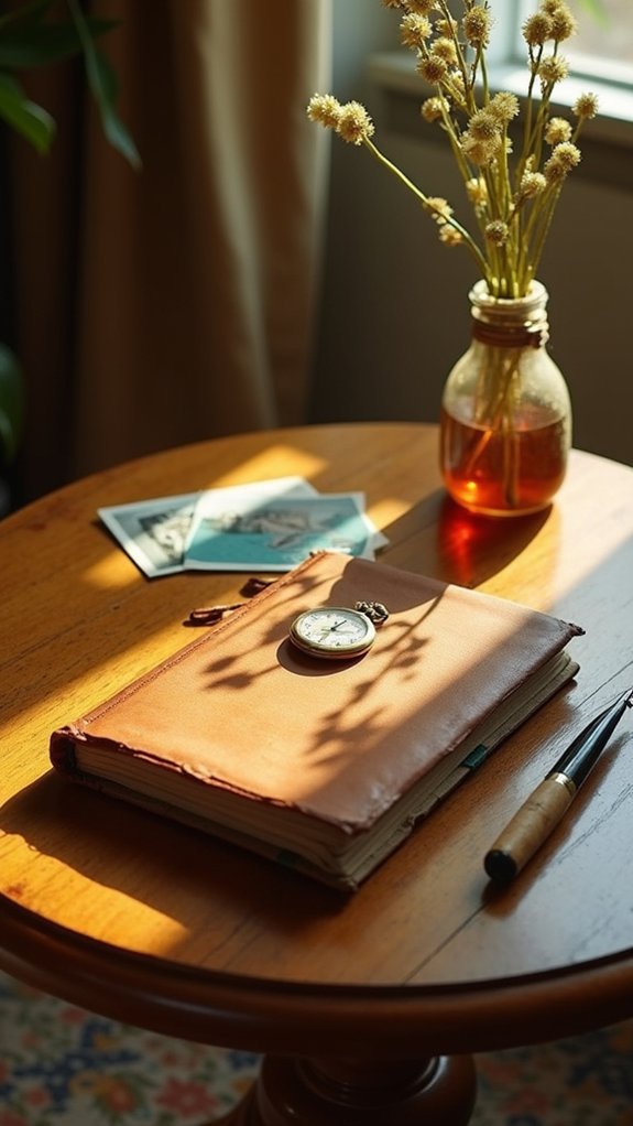
Photographers seeking to capture that dreamy vintage look often turn to film-inspired color grading, which transforms ordinary digital images into warm, honey-soaked memories.
The subtle yellows and browns mimic the effects of aged film stock, creating a visual experience that feels like peeking into someone’s cherished family album from decades past.
These golden hour-inspired effects tap into our collective nostalgia, making even brand-new photos feel like treasured heirlooms with stories to tell.
Film-Inspired Color Grading
The golden glow of honey-dipped color grading transforms ordinary photos into nostalgic treasures that feel like they’ve been pulled from your grandparents’ photo albums.
This film-inspired technique uses warm yellows, soft browns, and creamy vintage colors that make images look cozy and old-fashioned. By tweaking contrast and dialing back saturation, photographers can recreate that classic film look that digital cameras just can’t capture naturally.
- Add some grain – Sprinkling in texture makes digital photos feel more authentic, like they’ve lived a life before landing in your hands.
- Embrace light leaks – Those accidental streaks of light that would “ruin” photos actually add dreamy character!
- Soften the contrast – Real film doesn’t have those harsh digital edges, so gentle shadows create that timeless feeling.
Golden Hour Nostalgia
Magic happens when sunlight drips like honey across a scene, transforming ordinary moments into treasured memories. This enchanting aesthetic, known as Golden Hour Nostalgia, embraces warm analog photo effects that transport viewers to a bygone era. Artists can recreate this honey-dipped look using vintage color palettes full of amber, russet, and golden tones like #e8b877.
| Element | Technique | Effect |
|---|---|---|
| Light | Soft diffusion | Creates dreamy atmosphere |
| Color | Warm overlays | Evokes emotional response |
| Texture | Film grain | Adds authentic vintage feel |
The beauty of Golden Hour Nostalgia lies in its ability to make even ordinary scenes feel extraordinary. By adding light leaks, grain, and those cozy #dd802c tones, artists can wrap their creations in the same warm glow that makes us feel so nostalgic about summer evenings from childhood.
Rodeo Drive Glamour: Hollywood’s Golden Age Art
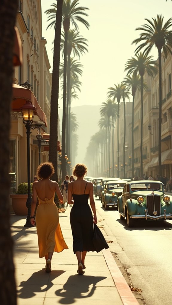
When Hollywood’s Golden Age graced Rodeo Drive with its timeless charm, an entire art movement was born.
The distinctive color schemes featuring soft pastels like #f4debe alongside rich earth tones such as #bfa082 and #4d675a perfectly capture the era’s sophisticated glamour. These hues bring to life the lavish lifestyle of film stars, creating art that feels both nostalgic and opulent.
The delicate dance of #f4debe pastels with #bfa082 and #4d675a earth tones evokes Hollywood’s golden essence—timeless, luxurious, unmistakably iconic.
- Create contrast – Mix muted backgrounds with bold accent colors to make your vintage Hollywood scenes pop with that classic cinematic quality.
- Include iconic elements – Vintage cars, glamorous parties, and famous landmarks tell the story of Rodeo Drive’s heyday.
- Play with textures – Incorporate rich fabrics and materials in your art to mirror the luxurious aesthetic that defined this glamorous period.
Groovin’ Around Town: 70s Urban Sketch Techniques
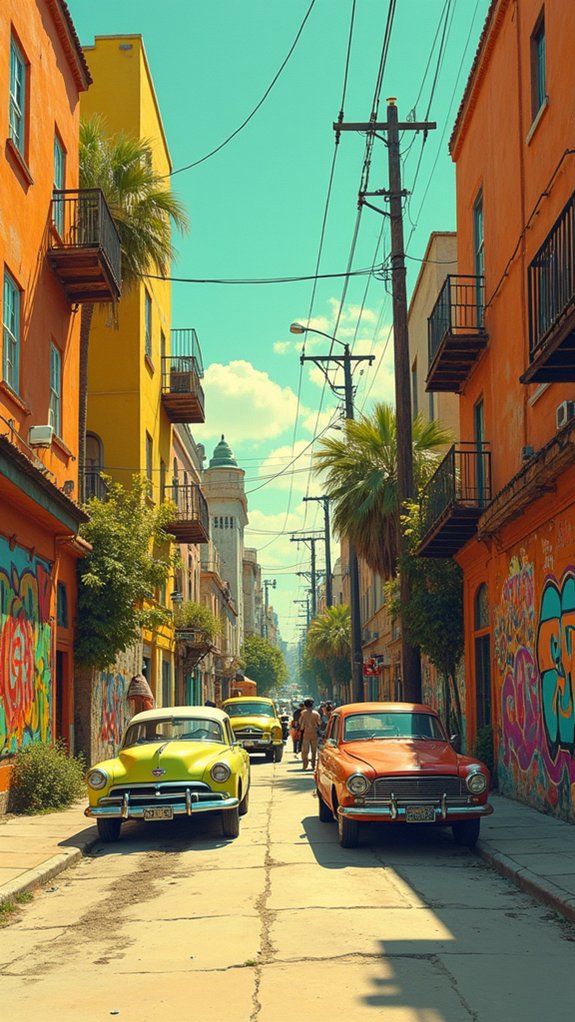
Vibrant funk and soulful style dominated urban scenery during the 1970s, creating a perfect playground for artists seeking to capture city life with authentic flair.
Bold color palettes featuring fiery reds (#D94223) and mellow yellows (#EEB367) bring sketches to life, instantly transporting viewers back to this groovy era.
Artists can mix geometric patterns with flowing, organic lines to reflect the decade’s unique design sensibilities.
Try combining traditional sketching techniques with collage elements—stuff in magazine cutouts, fabric scraps, or even record covers for that extra 70s punch!
Don’t forget to include elements of street culture, like funky graffiti and pop art influences.
The best urban sketches capture people hanging out in parks, dancing at block parties, or protesting for change—showing the real, vibrant community vibes that made 70s city life so unforgettable.
Sunshine Yellows: Creating Sun-Faded Poster Art
The golden hues of sunshine yellows transport artists back to the dreamy days of vintage advertising and concert posters. These warm tones like #FFD292 and #DDBD8E create that perfect sun-kissed aesthetic that feels both nostalgic and uplifting.
When paired with muted pastels such as #CEA17B, these sunshine yellows can transform ordinary designs into time-worn treasures.
To achieve that authentic sun-faded look:
- Layer different yellow shades with subtle texture overlays to mimic paper aging in sunlight
- Blend in complementary warm neutrals that soften the overall appearance
- Add watercolor effects or grainy textures to replicate the imperfections of vintage printing
Every splash of sunshine yellow tells a story of bygone eras, capturing that magical feeling of memories slightly blurred by time.
On the Telly: TV-Inspired Retro Digital Glitch Art
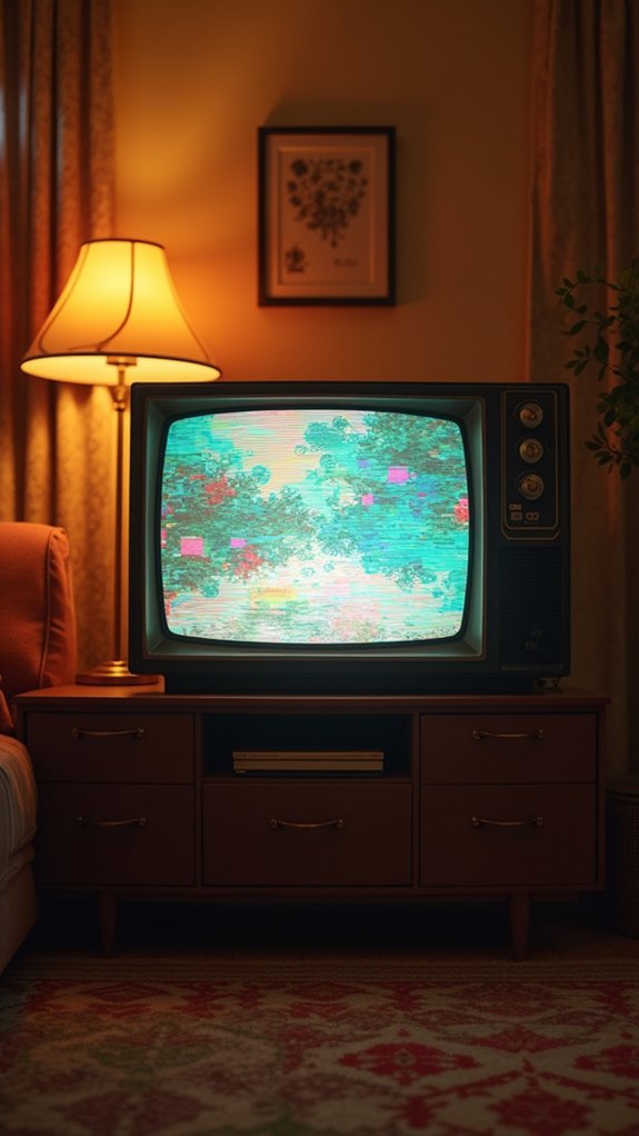
Screens from yesteryear come alive in the fascinating world of TV-inspired retro digital glitch art. The “On the Telly” palette brings this nostalgic aesthetic to life with its perfectly chosen hex codes: deep #161514, rusty #b85c3c, peachy #e5af7d, creamy #fff6e9, and minty #9bceb5.
These colors don’t just look cool—they transport viewers back to the days when TV sets crackled with static and shows occasionally went wonky!
Artists love adding pixelation, fuzzy static, and those weird color bars that popped up when stations went off-air. The magic happens when dark tones crash against pastel shades, creating that unmistakable digital hiccup we all remember.
Kids today might not get it, but anyone who grew up wiggling antennas will feel instantly connected to this quirky, glitchy blast from the past!
Nightcap Noir: Moody Vintage Cocktail Illustrations
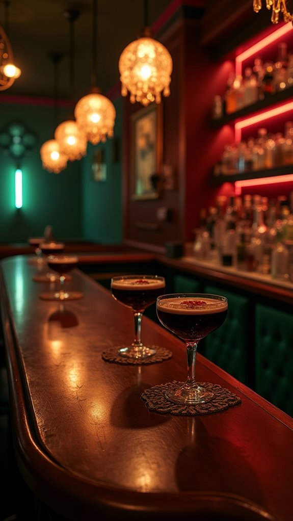
Dimly lit and mysterious as an old jazz club, Nightcap Noir brings cocktail art to life with its sultry palette of smoky burgundies and creamy neutrals.
The “Nightcap” color scheme—featuring moody hues like #f7f7f9, #f9dac5, #f3824b, #d11802, and #421006—creates the perfect backdrop for these vintage-inspired illustrations, evoking the hush of a 1940s speakeasy.
- Use high contrast between dark burgundies (#421006) and light creams (#f7f7f9) to make your moody vintage cocktail illustrations pop with dramatic flair.
- Add retro glassware details like etched coupes or crystal tumblers to transport viewers to a bygone era.
- Incorporate garnish elements—think twisted orange peels or maraschino cherries—that bring rich splashes of color to your nightcap noir scene.
California Dreamin’: West Coast Retro Landscapes

Sun-drenched highways and dreamy coastal silhouettes define the California Dreamin’ palette, whisking artists back to the golden era of West Coast wanderlust. The warm HEX codes like #b78763 capture that perfect sunset glow, while softer shades like #f6dbbc and #f9f7f1 mirror beach sands and foamy waves.
These colors aren’t just pretty—they’re time machines! When artists splash these earthy tones across their canvases, viewers can practically hear the Beach Boys playing in the background.
Palm trees, old-school convertibles, and surfers catching waves come alive through these vintage hues.
Want your art to feel like a 1970s postcard? This palette delivers all the nostalgia of roadside diners, beachfront motels, and endless summer vibes that made California the dreamland of generations past.
Shaka Surf Culture: Beach-Inspired Vintage Graphics
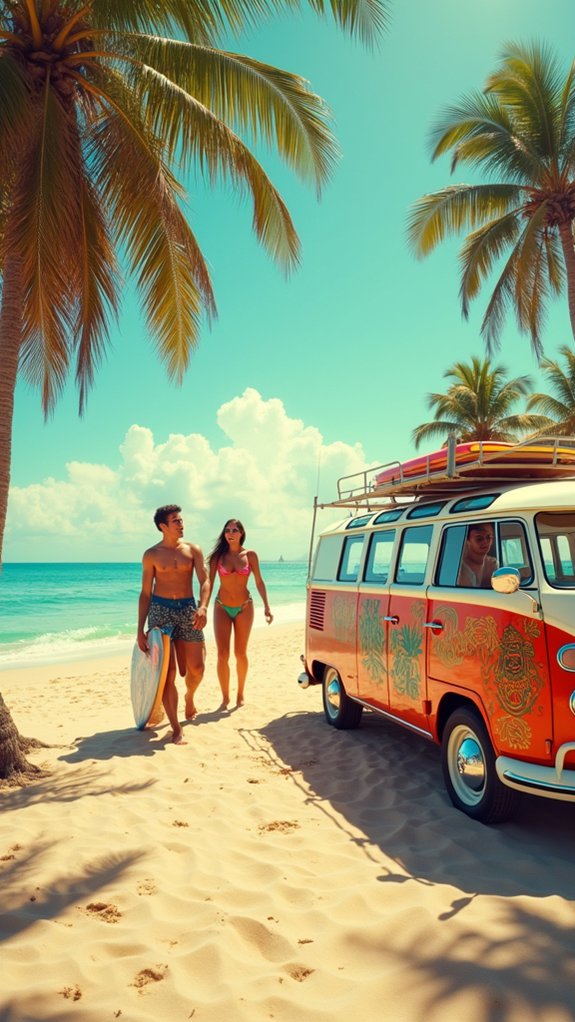
Every epic beach graphic from the golden days of surf culture tells a story of salt-soaked adventures and endless summer vibes.
The iconic Shaka symbol—that laid-back hand gesture with thumb and pinky extended—remains at the heart of these beach-inspired vintage graphics, representing friendship and the carefree surfer lifestyle.
Artists today are reviving these nostalgic designs with faded colors, retro typography, and playful illustrations that capture the essence of 70s surf posters.
- Use distressed textures and the classic Shaka color scheme (like deep blue #001c4b and soft green #9eb291) to instantly transport viewers to vintage surf shops
- Incorporate palm trees, rolling waves, and surfboards to create an authentic beach atmosphere
- Add quirky hand-drawn lettering that mimics the wobbly, fun style of original surf advertisements
Arcade Aesthetics: 8-Bit Pixel Art With Neon Palettes
Pixelated characters dancing across screens in vibrant neon hues capture the magic of arcade gaming‘s golden era.
The electric blues, hot pinks, and lime greens that light up 8-bit artwork transport artists and viewers back to the days of quarter-operated machines and high score competitions.
These neon-soaked color schemes don’t just look cool—they tell stories of technological limitations transformed into a distinctive art style that continues to influence digital creators today.
Pixelated Neon Nostalgia
The dazzling world of neon-infused pixel art transports viewers back to the golden age of arcades, where blocky heroes and villains battled across glowing screens.
Pixelated neon nostalgia combines vibrant color schemes like bright yellow (#f0f14e) and vivid pink (#ff5f85) with the charming simplicity of 8-bit pixel art, creating a visual time machine to the 1980s gaming scene.
This eye-catching aesthetic pops with energy while maintaining retro authenticity through:
- Limited color palettes that maximize contrast between neon colors
- Blocky, simplified shapes that capture the essence of early video game graphics
- Playful themes featuring arcade cabinets, retro consoles, and glowing cityscapes
The marriage of pixelated graphics and neon hues offers artists a fun way to celebrate gaming history while creating artwork that feels both nostalgic and surprisingly modern.
Retro Gaming Colors
Color plays a magical role in bringing 8-bit worlds to life, transforming simple pixels into enchanting digital universes. Those bold, vibrant hues from classic arcade games of the ’80s and ’90s still make our hearts race today! Electric blue, hot pink, and lime green weren’t just pretty choices—they were necessary because of the limited technology back then.
| Console Era | Popular Colors | Mood Created |
|---|---|---|
| Early Arcade | Red, Yellow, White | Exciting, Urgent |
| NES/Famicom | Blues, Reds, Black | Adventurous |
| SEGA | Electric Blue, Green | Cool, Dynamic |
Game designers were super clever, using high-contrast colors to make characters pop against backgrounds. These eye-catching combinations weren’t just for show—they helped players spot enemies quickly and navigate through pixelated worlds!
Frequently Asked Questions
How Do I Prevent Retro Art From Looking Cliché or Overdone?
Cliché avoidance requires artists to subvert expectations through unexpected color combinations, contemporary subject matter integration, and personal narrative elements rather than relying solely on period-specific visual stereotypes and tropes.
What Digital Tools Best Recreate Authentic Vintage Textures?
Digital textures in vintage art reproduction benefit from tools like Procreate’s grain brushes, Photoshop’s texture overlays, True Grit Texture Supply plugins, and Affinity Photo’s adjustable noise filters for authentic period aesthetics.
Can Retro Aesthetics Work in Minimalist or Abstract Art?
Retro aesthetics blend seamlessly with minimalist fusion approaches. Abstract compositions benefit from vintage elements through simplified forms, classic color palettes, and carefully chosen nostalgic motifs that create emotional resonance through restraint.
How Do I Source Authentic Vintage Reference Materials?
Authentic vintage reference materials can be found in flea markets, vintage marketplaces, thrift stores, estate sales, library archives, online databases, and auction houses. Digital collections also offer scans of period advertisements and magazines.
Are Retro Art Techniques Suitable for Commercial Design Projects?
Retro art techniques offer significant commercial viability for design projects, resonating with diverse audiences through nostalgia while remaining adaptable across various industry applications, packaging designs, and contemporary marketing campaigns.
Conclusion
Retro art continues to inspire today’s creators, offering a colorful escape into the past. From the sleek lines of 50s design to the pixelated charm of arcade games, these vintage styles bring warmth and character to modern spaces. Whether you’re diving into psychedelic patterns or Cuban-inspired illustrations, exploring nostalgic aesthetics isn’t just fun—it’s a way to connect with history while creating something totally your own. Grab those retro color palettes and start time-traveling!
Leave a Reply