Transform your home into a seasonal wonderland with the dazzling world of fluid art! Imagine swirling pastel pinks and mint greens for spring, or rich burnt oranges and deep browns for autumn, creating explosive canvases that catch everyone's eye. Make each piece pop with cells and unique textures using just the right blend of paint and Floetrol. The swiping technique can add a whimsical touch, like something Tim Burton would adore. Balancing colors and shapes raises your art to pro levels. Immerse yourself in online art communities for endless tips and inspiration. Stay tuned to explore the magic further!
Key Takeaways
- Use seasonal color palettes like pastels for spring, bright hues for summer, and earthy tones for autumn to match the decor theme.
- Experiment with swiping techniques to create abstract designs, enhancing seasonal themes with strategic color placement.
- Incorporate whimsical design elements inspired by Tim Burton and Dr. Seuss for a playful and unique seasonal touch.
- Adjust paint consistency using a mix of 1 part paint to 2 parts Floetrol, ensuring smooth flow and cell formation.
Essential Materials and Supplies
To begin a fluid art project for seasonal décor, it is essential to gather high-quality materials and supplies. Start with an 8×10 inch canvas, a popular size for testing and experimentation.
Canvas preparation is vital; make sure to cover the edges thoroughly to avoid any mishaps during the painting process. This attention to detail helps your artwork look polished and professional.
When it comes to paint, quality is key. Recommended brands include Deco Art Americana Decor metallics, Artist Loft, and Liquitex. Achieving the right paint consistency is also important. Typically, you'll mix one part paint with two parts Floetrol, adjusting with water as needed.
Remember, different colors might need different consistency levels—green and black at level 2, and red and gold at level 3.
Proper paint storage can't be overlooked either. Store your paints in airtight containers to keep them from drying out. This will save you from the frustration of finding clumpy or unusable paint when inspiration strikes.
Choosing the Right Colors
Selecting the right colors for your fluid art project not only enhances the visual appeal but also sets the tone for your seasonal decor. Color psychology plays a significant role in this process, allowing artists to evoke specific emotions and moods. For instance, incorporating contrasting shades like emerald green and Mars black can create depth and visual interest. Similarly, using metallics such as Deco Art Americana Decor metallics in red and old gold can add a festive shimmer to your pieces.
When choosing colors, consider the seasonal themes you want to represent. Spring might call for pastel hues, while autumn could benefit from warm, earthy tones. Mixing ratios are also essential; a recommended ratio of 1 part paint to 2 parts Floetrol guarantees the right consistency. Greens and blacks should be at level 2, while reds and golds are ideal at level 3 for perfect flow.
To achieve a harmonious design, use odd numbers in your color choices and placement. This principle often results in a more aesthetically pleasing composition. Experiment with layering colors and swiping techniques, adjusting your palette as necessary to achieve the desired harmony.
| Color | Usage | Effect |
|---|---|---|
| Emerald Green | Contrasting Shade | Adds Depth |
| Mars Black | Contrasting Shade | Enhances Visual Interest |
| Old Gold | Metallic Accent | Adds Festive Shimmer |
Techniques for Seasonal Designs
Mastering various fluid art techniques can greatly enhance your seasonal decor, adding both depth and intrigue to your designs.
Embracing seasonal themes through fluid art can be both fun and visually striking. One effective technique is the swiping method, where you use a putty knife to create abstract designs. This method is excellent for seasonal themes, as it allows for dynamic and whimsical patterns reminiscent of festive decor.
When crafting your seasonal designs, consider experimenting with a mix of colors like emerald green, metallic red, old gold, and Mars black. Adjusting the paint consistency with Floetrol and water will guarantee ideal flow, allowing your creation to come to life on the canvas.
Strategic color placement and the use of odd numbers for design elements can achieve a harmonious balance, which is vital for seasonal themes. For instance, drawing design inspiration from playful artists like Tim Burton and Dr. Seuss can infuse a sense of whimsy and fun into your decor.
Creating Stunning Cells
Creating stunning cells in fluid art can be an exciting process that hinges on a few key techniques.
The swiping technique, where you use a putty knife to skillfully blend paint, is essential for achieving those eye-catching cell structures.
Additionally, getting your paint consistency just right—typically one part paint to two parts Floetrol, with some water for adjustment—can make a huge difference, especially with darker and lighter colors.
Swiping Technique Essentials
Understanding the swiping technique's fundamentals is vital for artists looking to achieve intricate blending and stunning cell formation in their fluid art. Swipe variations and technique nuances play a significant role in creating unique and enchanting designs.
Fundamentally, the swiping technique involves applying paint with a putty knife, which helps blend colors and form beautiful cells, especially when working with black and Deco Art paints.
For best results, it is important to maintain a proper mixing ratio, typically 1 part paint to 2 parts Floetrol. Adjusting the consistency of each color is essential—keep green and black at level 2, while red and gold should be at level 3. This attention to detail guarantees that the paint flows smoothly and creates the desired effects.
Before beginning, make sure your base coat is well-covered, particularly along the edges, to avoid any disruptions during the swiping process.
Experimenting with different swipe variations and incorporating accessories like skewers can add intricate details, such as stars and ornaments, to your artwork. Balancing colors and using odd numbers in your composition can also enhance the design's aesthetic appeal, resulting in whimsical and harmonious pieces perfect for seasonal décor.
Paint Consistency Tips
Achieving stunning cell formation in fluid art hinges on mastering paint consistency, which can be fine-tuned with the right mixing ratios and adjustments. A tried-and-true method involves mixing 1 part paint with 2 parts Floetrol, then adjusting with water to get the perfect flow. For darker colors like black and green, aim for a consistency level around 2. Metallic colors, such as red and gold, work best at a consistency level of 3.
When tweaking paint viscosity adjustments, it's essential to use quality materials. Deco Art Americana Decor metallics, for instance, can greatly enhance your cell formation and the overall look of your artwork.
Next, let's talk about color layering techniques. Layering your colors strategically, especially in odd numbers, not only creates a balanced and visually appealing piece but also encourages the formation of distinct cells.
Don't forget to experiment with the swiping technique using putty knives. This method allows for dynamic blending and helps cells pop across your canvas.
With these tips, you'll be well on your way to creating fluid art that dazzles and delights, perfect for any seasonal décor.
Swiping for Unique Effects
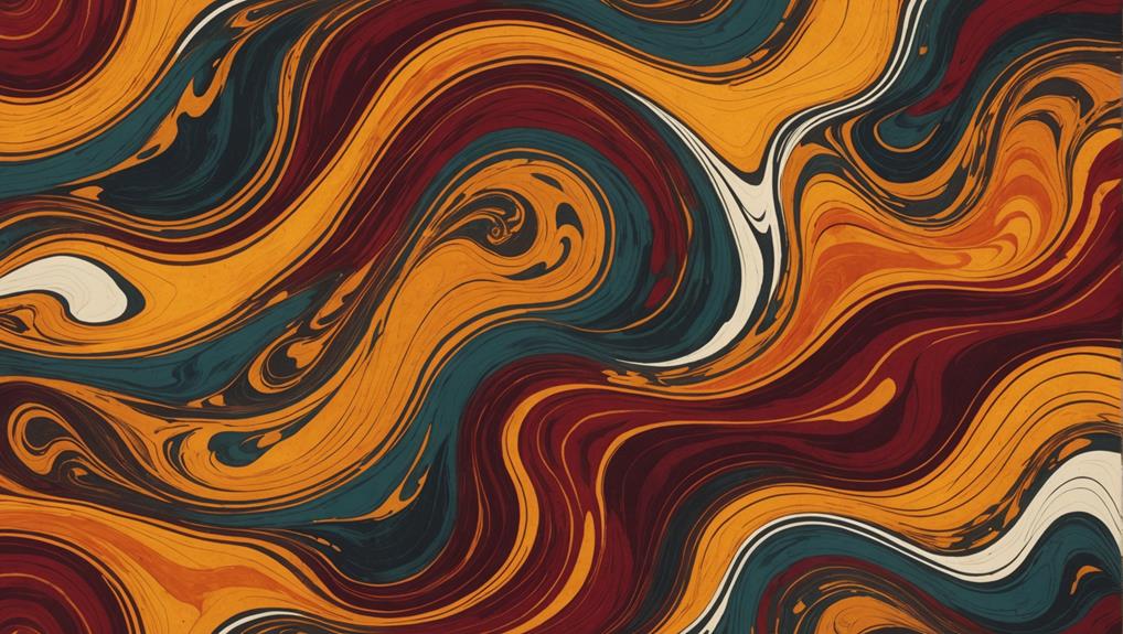
Swiping is an exciting fluid art technique that can turn your seasonal décor into a stunning visual experience.
By using a putty knife to spread paint, you can create amazing textures and effects, enhancing cell formation, especially when combining black paint with Deco Art metallics.
For the best results, try blending colors in odd numbers and adjust the initial paint drizzle to control the flow, making your artwork truly one-of-a-kind.
Swipe Technique Basics
Mastering the swipe technique in fluid art can transform simple paint applications into intricate and dynamic patterns. This method involves using a putty knife to drag paint across the canvas, creating stunning textures and designs. To achieve the best results, you need to understand swipe variations and the significance of color layering.
Start by mixing your paint with Floetrol in a ratio of 1 part paint to 2 parts Floetrol. Adjust the consistency with water—using level 2 for green and black, and level 3 for red and gold. Once your paint is ready, drizzle it heavily on one side of the canvas, especially if you're using black alongside Deco Art paints. This heavier application will guide your swiping motion and guarantee better blending.
Strategic color placement is essential. Arrange your colors in odd numbers to create a balanced and harmonious composition. As you swipe the putty knife across the canvas, you'll notice how different swipe variations can result in unique effects. Don't be afraid to experiment—each swipe can lead to unexpected and beautiful results.
Enhancing Cell Formation
To raise the complexity of your fluid art, focusing on enhancing cell formation during the swipe technique can yield remarkably unique effects.
Mastering cell development strategies involves understanding paint interaction dynamics and making precise adjustments during the creative process.
To improve cell formation while swiping, consider these key steps:
- Paint Selection: Use a combination of Deco Art paints and Mars black. These colors interact well, creating dynamic effects that enhance cell development.
- Consistency Adjustment: Adjust the consistency of your paint mixture. Aim for a level 2 for green and black paints and level 3 for metallics like red and gold to optimize cell formation during the swipe.
- Application Technique: When applying paint, start with a heavier drizzle on one side. This encourages movement and blending, which can lead to more pronounced cells.
- Swiping Tool: Utilize a putty knife for the swiping technique. Make certain you cover the edges of the canvas thoroughly to prevent any unwanted issues during the drying process.
Continuous experimentation with the placement and amount of paint will yield unique results.
Observations show that cells may increase over time, enhancing the overall composition and adding a dynamic, evolving quality to your fluid art.
Color Blending Tips
Achieving unique effects through color blending in fluid art requires strategic manipulation of paint consistency and application techniques. To begin, mix your paint with one part paint to two parts Floetrol, adjusting the consistency with water as needed. This base mixture is fundamental for smooth swiping techniques, which can produce stunning dynamic blends and patterns.
Now, let's talk tools. A putty knife is fantastic for swiping; it allows you to apply paint in a controlled manner. Start with a heavier drizzle of your chosen paint color on one side of your canvas. When you swipe, this encourages natural blending, creating an organic look that's both vibrant and intriguing. Adding Deco Art paints and a touch of Mars black can facilitate ideal cell creation, elevating your design with beautiful visual effects.
Color psychology plays a vital role in your blending techniques. Bold, contrasting colors can evoke excitement, while softer, analogous hues can create a calming effect. Also, consider using odd numbers in your design elements for enhanced aesthetic appeal and balance.
Adding Whimsical Elements
Incorporating whimsical elements into your fluid art can transform seasonal décor into playful and imaginative displays. By drawing inspiration from artists like Tim Burton and Dr. Seuss, you can infuse your artwork with a sense of wonder and creativity. Whimsical patterns and playful shapes are essential for achieving this effect.
Here are some ideas to guide you:
- Whimsical Patterns: Integrate swirls and curls into your design using skewers for fine detailing. This adds an intricate touch that enhances the whimsical theme.
- Playful Shapes: Experiment with abstract forms such as stylized Christmas trees or fanciful ornaments. Utilize techniques like swiping with a putty knife to create unique textural effects that augment the overall aesthetic.
- Color Choices: Bright, contrasting colors like emerald green and metallic red can evoke a festive and cheerful atmosphere. These hues are particularly effective in making your whimsical elements stand out.
- Odd Numbers: Use an odd number of elements, such as stars or ornaments, to create a visually appealing and balanced composition. Odd numbers are naturally more dynamic and engaging to the eye.
Balancing Your Composition
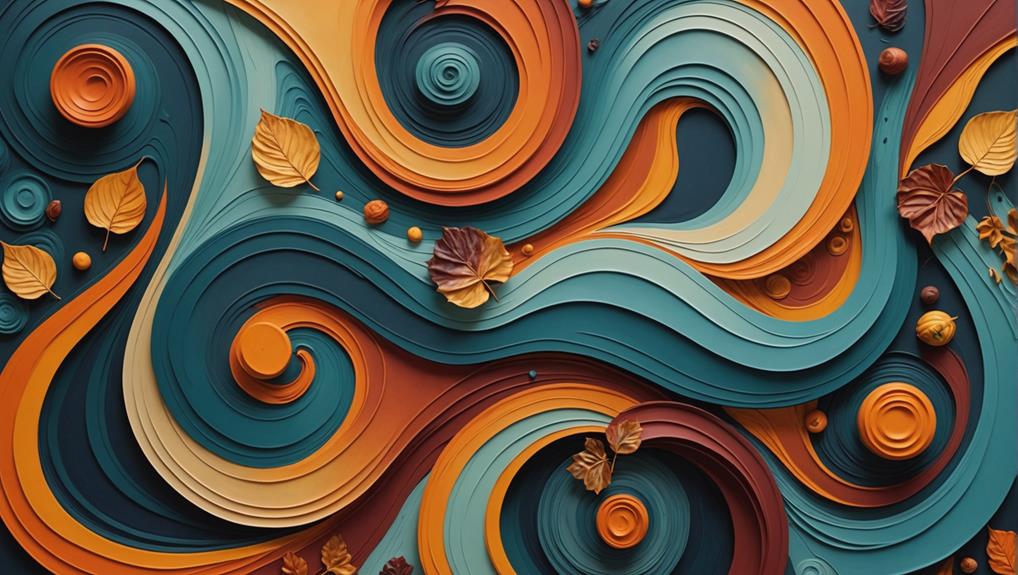
Balancing your composition in fluid art requires a thoughtful arrangement of colors, shapes, and elements to create a harmonious and visually engaging piece. To achieve this, one effective composition technique is to strategically place colors in odd numbers. This creates visual interest and guarantees harmony throughout the piece.
When working on your design, regularly assess the color placement to guarantee no single area feels overly heavy or unbalanced. Incorporating varying sizes of shapes and elements, like stars and ornaments, can enhance the visual dynamics and prevent the design from becoming monotonous.
Using contrasting colors, such as metallics against darker shades, can help draw attention to focal points while maintaining an overall equilibrium in the artwork. Another key to attaining visual harmony is to regularly step back and view your composition from a distance. This allows you to identify any areas that may need adjustment to improve balance and flow.
Engaging With the Art Community
Engaging with the art community is essential for artists looking to share their work, gain inspiration, and foster collaborative growth.
Being part of an art community offers numerous benefits, from feedback on your work to discovering new techniques and materials. Here are some effective ways to engage with your fellow artists:
- Join Online Groups: Platforms like the 'Go Make Some Art' Facebook group are excellent for artists to share their creations, seek advice, and gather inspiration. Participating in these groups helps you stay connected and motivated.
- Encourage Interaction: By asking for likes, shares, and subscriptions on your social media or YouTube channels, you can expand your audience and connect with more people who appreciate your art. This interaction can lead to more opportunities for creative collaboration.
- Share Tools and Techniques: Engaging in discussions about your favorite tools and techniques fosters a collaborative environment. Sharing knowledge not only helps others but also enriches your own practice.
- Utilize Resource Links: Including links to resources, tutorials, and additional materials in your video descriptions can be invaluable for your audience. It provides them with access to further learning and inspiration, supporting their artistic journey.
Finding Inspiration and Resources
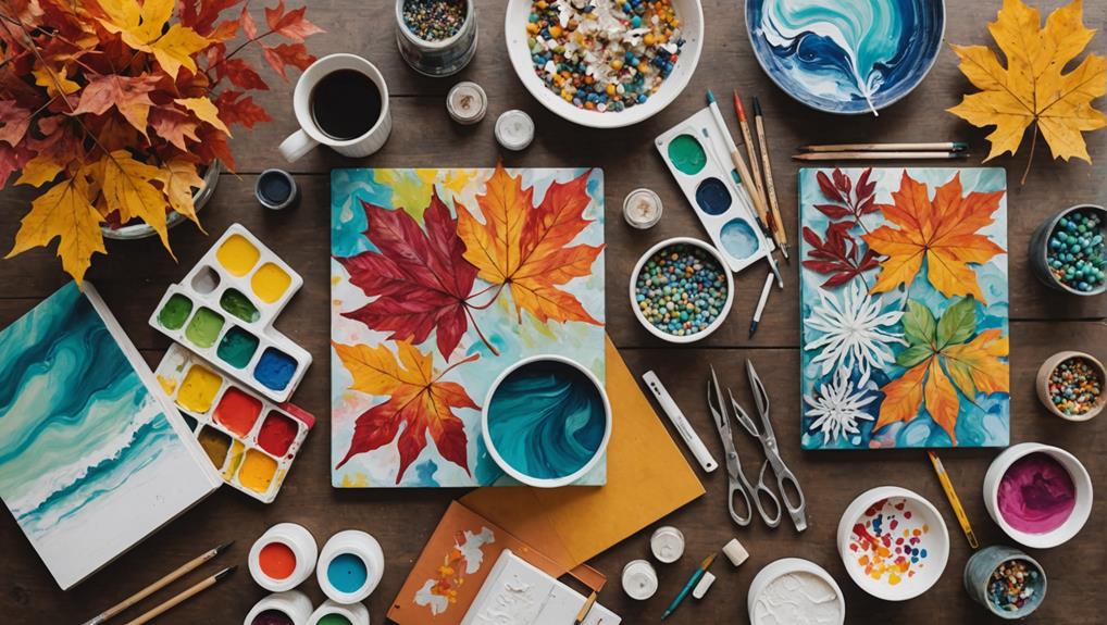
Finding inspiration and resources for your fluid art projects can be both exciting and rewarding.
Consider exploring 52 inspiration cards that detail various techniques, paint brands, and color palettes, which are perfect for creating cohesive seasonal décor.
Additionally, joining the 'Go Make Some Art' Facebook group allows you to share your work, gain insights from fellow artists, and access educational YouTube videos to further enhance your skills.
Fluid Art Techniques
Exploring various fluid art techniques can greatly enhance your creative repertoire, and numerous resources are available to guide and inspire your journey.
Understanding fluid art history can provide valuable context and inspiration for your projects.
Begin with proper canvas preparation to guarantee your artwork has a smooth, receptive surface.
One of the essential techniques involves using a mixing ratio of 1 part paint to 2 parts Floetrol, adjusting with water to achieve the desired consistency.
To investigate deeper into fluid art, consider the following resources:
- Technique Cards: These cards offer detailed information on paint brands, color choices, and consistency levels, complete with visual representations of completed paintings. They provide an excellent reference for both beginners and experienced artists.
- Community Engagement: Join groups like the 'Go Make Some Art' Facebook group, where you can share your creations, receive feedback, and draw inspiration from fellow artists.
- Whimsical Design Elements: Incorporate quirky elements inspired by artists like Tim Burton and Dr. Seuss. Odd numbers in compositions often create a pleasing balance.
- Additional Resources: Websites like GinaDeLuca.net and platforms like Amazon offer color palettes, tool recommendations, and more to enhance your fluid art practice.
Seasonal Color Palettes
Seasonal color palettes, such as those featuring emerald green, metallic red, old gold, and Mars black, can infuse fluid art projects with festive vibrancy and thematic coherence. By thoughtfully selecting these colors, artists can tap into the essence of seasonal themes, creating pieces that resonate on an emotional level, thanks to the principles of color psychology. These palettes can evoke warmth, nostalgia, and excitement, enhancing the overall impact of the artwork.
To help artists explore various seasonal themes and improve their skills, inspiration cards showcasing specific color combinations and techniques can be invaluable. These cards not only provide visual guidance but also spark creativity. Additionally, engaging with community resources, like the 'Go Make Some Art' Facebook group, offers more inspiration and support.
Here is a quick reference for some popular seasonal color palettes:
| Season | Primary Colors |
|---|---|
| Winter | Emerald Green, Mars Black, Metallic Red |
| Spring | Pastel Pink, Mint Green, Soft Yellow |
| Summer | Bright Blue, Sunny Yellow, Coral |
| Autumn | Old Gold, Burnt Orange, Deep Brown |
Utilizing quality materials, such as Deco Art Americana Decor metallics and Liquitex paints, guarantees vibrant, visually appealing results. Consistency levels are also essential; a recommended mixing ratio of 1 part paint to 2 parts Floetrol, adjusted with water, helps achieve ideal flow and stunning fluid art.
Exploring Color Palettes
Selecting the right combination of colors is essential in creating eye-catching fluid art that complements seasonal décor.
By understanding color theory and recognizing the emotional impact of different hues, you can craft pieces that resonate with the season's mood. For instance, vibrant contrasts like emerald green and metallic red can evoke festive cheer, while metallic hues such as old gold add depth and a special touch to your artwork.
Here are some key tips to help you explore color palettes for your seasonal fluid art projects:
- Contrast Colors: Using contrasting colors, like emerald green and metallic red, can make your art pop and create a dynamic effect.
- Metallic Hues: Incorporating metallics such as old gold can give your piece a festive sparkle and a sense of luxury.
- Mixing Ratios: For the best consistency, use a mixing ratio of 1 part paint to 2 parts Floetrol, adjusting with water as needed to achieve different effects.
- Balance and Harmony: Aim for a balanced palette by using an odd number of colors and placing them strategically to guarantee visual harmony.
For inspiration, you can check out pre-designed color palettes on resources like GinaDeLuca.net, which can spark new ideas and enhance your creative process.
Frequently Asked Questions
What Are Good Color Combinations for Paint Pouring?
Good color combinations for paint pouring, rooted in color theory, include emerald green with metallic red for vibrant seasonal palettes, and old gold with Mars black for a sophisticated look. Using odd numbers of shades enhances visual appeal.
What Paint Do You Use for Fluid Art?
For fluid art, high-quality acrylic mediums from brands like Deco Art Americana Decor, Artist Loft, and Liquitex are recommended. These paints are ideal for various pouring techniques, providing vibrant colors and excellent consistency for striking artwork.
What Paper Is Best for Fluid Art?
The best paper for fluid art is heavyweight, such as 300 lb watercolor or mixed media paper, which can handle paint weight and moisture. A smooth paper texture guarantees even flow and blending of colors.
What House Paint Is Best for Acrylic Pouring?
When selecting house paint types for acrylic pouring, choose high-quality latex paints with high acrylic content and finishes like satin or eggshell. Mix them with pouring mediums such as Floetrol to guarantee ideal fluidity and cell creation.
Conclusion
Fluid art offers a versatile and dynamic approach to seasonal décor.
By selecting appropriate materials and colors, experimenting with various techniques, and engaging with the art community, one can create unique and visually appealing pieces.
Mastery of cell creation and swiping techniques, combined with careful composition, further enhances the artistic outcome.
Continual exploration of color palettes and resources guarantees a fresh and inspired approach, making fluid art a valuable addition to seasonal decorating endeavors.

Leave a Reply