Creating unified sketchbook spreads transforms random doodles into visual stories that flow naturally. Artists can select a central motif as an anchor, then build related elements around it using consistent colors, line work, and patterns. Thoughtful arrangement creates a narrative path for viewers to follow, while strategic use of color guides the eye across the page. Maintaining some white space prevents crowding and lets each element breathe. These simple techniques turn scattered sketches into cohesive artistic expressions that reveal your unique creative journey.
Key Takeaways
- Create unified spreads with consistent color schemes, line work, and repeated patterns that transform random sketches into visual stories.
- Position a central motif as an anchor, then arrange related supporting elements around it to establish a clear theme.
- Apply composition principles like the Rule of Thirds, varying sketch sizes, and maintaining breathing room between elements.
- Use strategic color application and mixed media techniques to establish visual hierarchy and guide the viewer’s attention.
- Connect drawings through visual cues like arrows, similar colors, or repeated symbols to create a cohesive narrative flow.
Sketchbook Spread: Filling Pages With Unified Themes & Styles
While many artists struggle with blank pages, creating a unified sketchbook spread can transform scattered ideas into a visual story that flows naturally across the paper. Artists achieve this magic through consistent color schemes that guide viewers through the journey of each page.
It’s like creating a mini art exhibit that fits in your hands!
When sketches share similar line work or shading techniques, they become part of a larger conversation. Imagine arranging your drawings around an eye-catching centerpiece—suddenly your sketchbook becomes impossible to ignore!
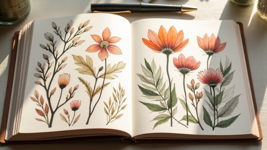
Repeated patterns or motifs, like a specific flower or geometric shape, tie everything together and make even simple doodles look intentional. Your sketchbook isn’t just a collection of random drawings; it’s a carefully orchestrated visual symphony!
Understanding the Power of Thematic Sketchbook Pages
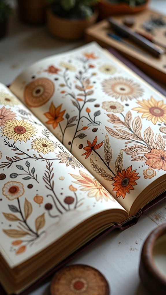
Thematic sketchbook pages hold a special kind of magic, turning random drawings into powerful visual stories that connect with viewers on a deeper level.
Artists can create these storytelling spreads by thoughtfully arranging their sketches, considering how each element flows into the next, and using consistent colors that pull everything together.
When layout principles like focal points, balance, and white space are applied to themed pages, the sketchbook transforms from a simple practice pad into an artistic journey that anyone can follow and enjoy.
Visual Storytelling Elements
Stories come alive on paper when artists create thematic sketchbook pages. These visual narratives don’t just happen by accident—they’re built using clever storytelling techniques that guide viewers through the artistic journey.
By incorporating text alongside drawings, artists provide context that deepens the meaning behind their sketches. A splash of “Once upon a time…” or a simple label can transform random doodles into chapters of a larger tale!
The magic really happens when artists use structured layouts to organize their ideas. Grid patterns, frames, and flowing arrangements help viewers’ eyes travel naturally across the page.
Color schemes tie everything together, while sequential sketches can show how ideas evolve over time. These visual storytelling elements transform ordinary sketchbook pages into enchanting stories that viewers can’t help but explore further.
Layout Design Principles
Behind every stunning sketchbook spread lies a set of powerful layout principles that artists use to bring their ideas to life. These principles organize sketches in a way that tells a story and leads the viewer through the page naturally. The Rule of Thirds, for example, helps create dynamic compositions that are way more interesting than just sticking everything in the center!
Trying a different layout can completely transform your sketchbook pages. You might use geometric shapes as frameworks, arrange sketches around a theme, or combine images with text for extra oomph.
When you thoughtfully place elements, the blank page becomes less intimidating and more of an exciting playground! Colors can tie everything together, while varying the size of sketches adds rhythm and flow to your visual story.
Selecting a Central Motif for Your Spread
The heart of any successful sketchbook spread begins with choosing the perfect central motif. This key element will anchor your page and give everything else purpose! Think about what really excites you—maybe it’s fluffy clouds, your pet lizard, or even your favorite sneakers.
| Motif Type | Examples | Why It Works |
|---|---|---|
| Nature | Trees, flowers, mountains | Endless variety, seasonal changes |
| Animals | Pets, wildlife, insects | Personal connection, interesting shapes |
| Objects | Guitars, teacups, books | Tell stories about your interests |
| Places | Buildings, street scenes | Capture memories, practice perspective |
| People | Portraits, figures, crowds | Express emotions, study anatomy |
Position your central motif where it’ll grab attention first, then let everything else on the page support it!
Creating Visual Harmony With Color Palettes
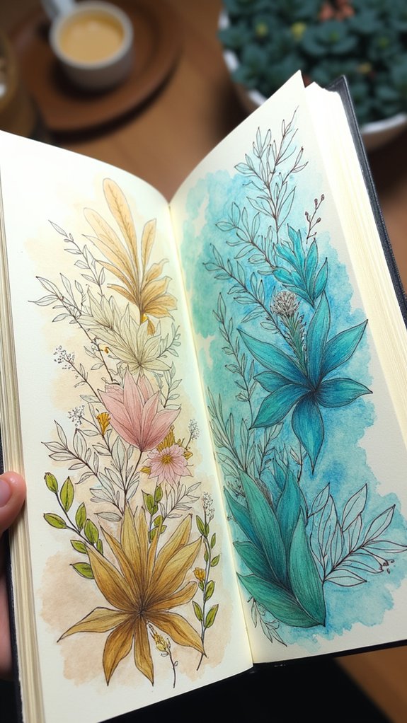
Selecting a Central Motif for Your Spread naturally leads to your next exciting decision: choosing colors that make your pages pop!
While each sketch might show something different, a consistent color palette ties everything together like magic. Limit yourself to 3-5 colors to create a unified look that won’t overwhelm your viewers.
Magic happens when you stick to 3-5 colors across your spread—different sketches instantly become a unified visual story.
Colors have superpowers! Reds and oranges energize your spread, while blues and greens bring calm vibes. Use your palette strategically by highlighting the most important parts of your sketches.
Want to add extra dimension? Try lighter and darker versions of your chosen colors.
The coolest sketchbooks use color as a secret weapon, guiding viewers’ eyes exactly where you want them to look. Your color choices can transform good sketches into an amazing, cohesive spread!
Establishing Flow Through Thoughtful Composition
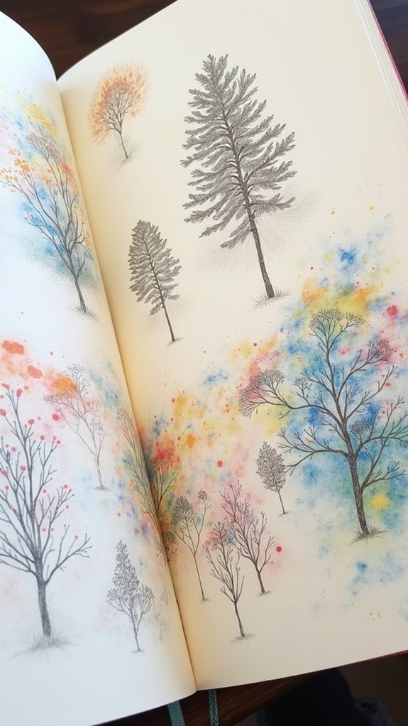
Every great sketchbook spread relies on thoughtful composition to guide viewers through your artistic journey! When arranging elements on a page, artists use specific techniques to create a path for the eye to follow. The Rule of Thirds—dividing your page into nine equal sections—helps position key elements where they’ll grab attention.
| Composition Strategy | What It Does | How To Try It |
|---|---|---|
| Rule of Thirds | Creates focus points | Place main subjects at intersection lines |
| Varied Shapes | Adds excitement | Mix circles, squares, and triangles |
| Negative Space | Gives breathing room | Leave some areas empty on purpose |
| Size Contrast | Directs attention | Make important things bigger |
Thoughtful composition isn’t just about making things look pretty—it’s about telling a story through your arrangement, making viewers explore every corner of your awesome spread!
Incorporating Text and Annotations Effectively
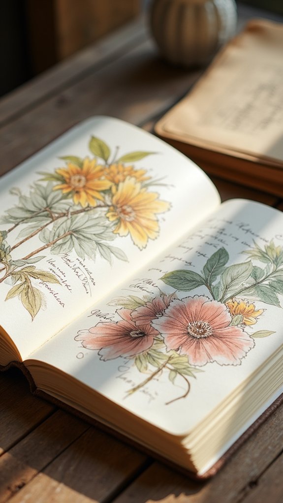
Creativity flourishes when words dance alongside images on your sketchbook pages!
Thoughtful integration of text with sketches creates a richer storytelling experience, giving viewers insight into your artistic process. When annotations and drawings work together, your spread becomes a complete visual conversation rather than disjointed elements.
Here are four ways to effectively incorporate text in your sketchbook:
- Position annotations in the empty spaces around sketches to create balance
- Try using different handwriting styles that complement your drawing style
- Keep text size and style consistent throughout the spread
- Use negative space strategically so text and images have room to breathe
Using Rectangles and Geometric Divisions
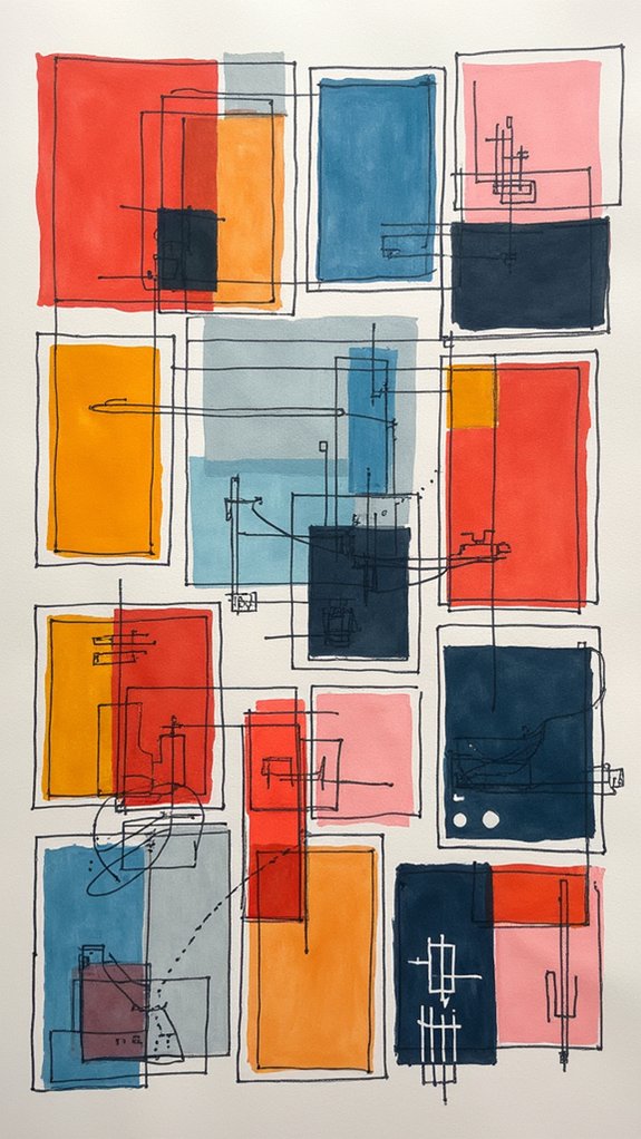
Geometric structure brings order to the creative chaos of a sketchbook page! Dividing your spread into rectangles creates a roadmap that guides both your artistic process and the viewer’s eye.
Kids love how these divisions can transform a blank page into an exciting comic-strip layout or a cool collection of mini-canvases!
Try varying the sizes of your rectangles – make some big for your main sketches and others smaller for quick doodles or notes. This mix keeps things super interesting!
The best part? These geometric divisions help group similar ideas together, like sorting your favorite trading cards.
Remember to leave some breathing room, though! Empty space between your rectangles prevents your page from looking like a jumbled mess and makes each drawing pop with amazing clarity.
Arranging Elements Around a Focal Point
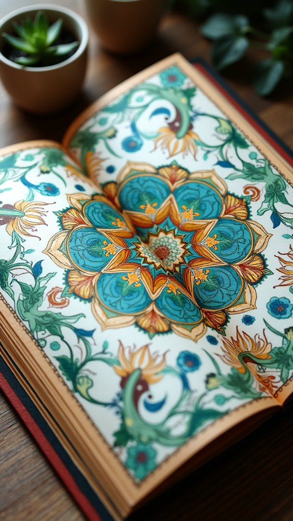
The magic of a enchanting sketchbook page often revolves around a strong focal point! When artists place a detailed drawing, map, or illustration at the center, it creates an anchor for the viewer’s eye to land on before exploring the rest of the page.
Small sketches arranged around this centerpiece work like supporting characters, adding depth and context to the main story without fighting for attention.
- Draw arrows or flowing lines from your focal point to guide viewers through your page journey.
- Place related small sketches at different angles to create visual interest and movement.
- Add text bubbles or labels near related elements to explain connections.
- Leave breathing room between elements—crowded pages overwhelm the eye!
Balancing Negative Space and Visual Weight
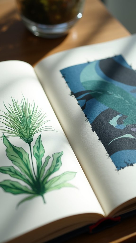
A beautiful sketchbook spread relies on the dance between what’s drawn and what’s left blank! When artists master balancing negative space, their work breathes with life and clarity, guiding viewers’ eyes exactly where they want them to go.
Empty areas aren’t wasted—they’re powerful tools that highlight your coolest sketches!
Think of your page like a seesaw: if you place a huge drawing on one side, you’ll need some smaller sketches or text on the other to keep things steady. Big sketches look amazing when they have room to shine, while crowded pages can feel chaotic and confusing.
Try placing your largest drawing near an empty area, then scatter smaller sketches throughout the page. This creates a natural flow that makes your sketchbook look professional and thoughtful!
Developing a Visual Narrative Across Pages
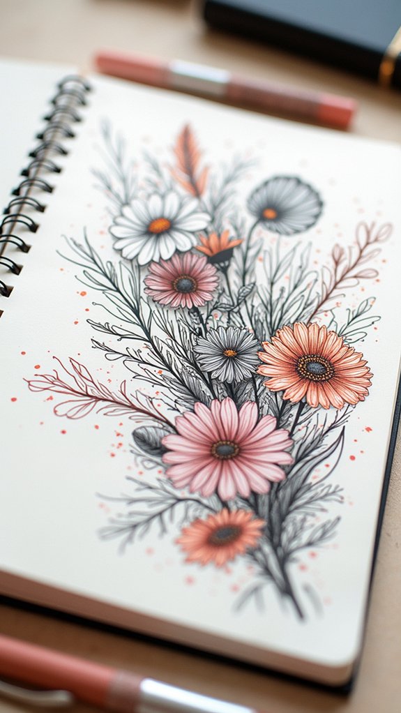
Creating a visual narrative across sketchbook pages transforms scattered drawings into a cohesive story that pulls viewers from one page to the next.
Artists can strengthen this narrative by repeating key motifs or symbols throughout their sketchbook, like a specific color or shape that appears in different contexts.
When working with facing pages, sketches that visually “talk” to each other through matching colors, complementary subjects, or connecting lines help build a seamless experience that feels like one unified thought rather than separate ideas.
Connect Visual Story Elements
Developing a visual narrative across pages transforms scattered sketches into a coherent journey for the viewer’s eye. Artists love seeing how their sketches connect to tell a story that flows naturally from one element to the next.
By linking related drawings with arrows, consistent colors, or repeated motifs, the entire spread becomes alive with meaning!
- Create a clear path using arrows or numbering to guide viewers through your visual story.
- Group related sketches together, making connections obvious through proximity.
- Use consistent colors or styles across different elements to unify the spread.
- Add small text notes that explain connections viewers might miss.
Think of each page as a map of your thoughts—each sketch a stepping stone leading to the next exciting idea!
Thread Thematic Motifs Throughout
Thematic motifs weave through powerful sketchbook spreads like golden threads in a tapestry, connecting each element into something greater than its parts. When artists repeat symbols, colors, or shapes across pages, they’re actually telling a story that pulls viewers deeper into their creative world.
Try using Mixed Media techniques to strengthen your themes—maybe watercolor backgrounds with ink details that appear on every page, or collage elements that echo throughout your spread.
It’s super cool when you spot the same tiny bird or cloud shape hiding in different corners of each sketch!
Arranging your work in a sequence helps too. Like chapters in a book, your sketches can show change or growth.
Add a few words that match your theme, and bam—you’ve created a sketchbook journey that totally makes sense!
Harmonize Facing Pages
Facing pages in a sketchbook transform into magical conversation partners when artists harmonize them correctly. Through thoughtful design choices, each spread becomes a unified scene rather than disconnected islands.
Creating visual bridges between pages helps viewers travel smoothly through your creative journey.
Try these techniques to make your pages sing together:
- Use a shared color palette across both pages to instantly connect them.
- Create balance with a large focal point on one page and several small thumbnails on the facing page.
- Repeat patterns or symbols on both sides to build visual rhythm.
- Design layouts where elements peek from one page to another, like a branch extending across the spine.
The conversation between pages doesn’t need to whisper—it can shout with excitement while maintaining a cohesive voice!
Utilizing Color to Guide the Viewer’s Eye
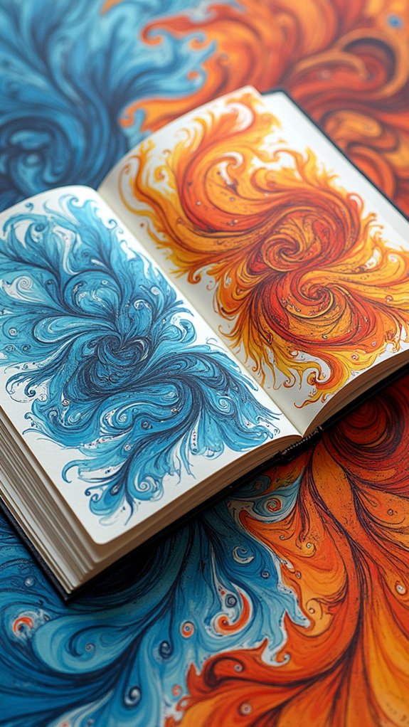
Colors leap off the page when strategically used, giving artists powerful tools to control where viewers look first. By creating a visual hierarchy through color, your sketchbook can guide someone through your artistic journey like a roadmap.
Adding text in vibrant hues near important sketches helps label and direct attention exactly where you want it!
Vibrant text becomes a visual spotlight, drawing eyes directly to your most significant creative moments.
A well-chosen color palette ties different drawings together, making your spread feel like one cohesive story rather than random doodles.
Try arranging colored pieces in circular patterns or gradients to keep eyes moving across the page. Balance is key—mixing colorful elements with black-and-white sketches creates awesome contrast that makes important details pop!
Selective splashes of color can highlight focal points and trigger emotional reactions, turning a simple sketchbook into a fascinating visual experience.
Mixing Media While Maintaining Consistency
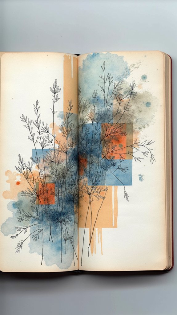
Blending different art materials creates magical effects in your sketchbook while keeping everything looking like it belongs together.
Artists who experiment with mixing media discover that harmony doesn’t mean using just one type of supply. Instead, consistency comes from thoughtful combinations that speak the same visual language.
- Choose a unified color palette that works across watercolors, markers, and colored pencils to create a cohesive look.
- Select one subject or theme for each spread, making sure all materials contribute to telling that story.
- Layer different media (like watercolor backgrounds with ink details) to build depth while maintaining visual harmony.
- Add texture elements like collage pieces or fabric scraps that complement your theme rather than fighting against it.
Regular practice helps develop your unique mixed-media style that remains recognizable across all your sketchbook pages.
Adding Personal Touches to Express Your Style
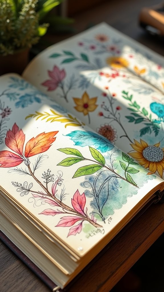
Once your mixed media techniques feel comfortable, the real magic happens with personal expression. Artists who fill their sketchbook with signature symbols or motifs create an instantly recognizable style that screams “this is ME!”
Try incorporating a recurring element—maybe a bird, geometric shape, or even your initials—throughout your pages.
Color choices speak volumes about personality! Pick palettes that make your heart sing, and use them consistently to tie different sketches together.
Don’t forget to jot down meaningful quotes or thoughts beside your artwork—these little notes tell your story and add emotional depth.
Organization doesn’t mean boring! Use consistent layouts like frames or grids, but spice them up with personal flair.
Add fabric scraps, pressed flowers, or photo snippets to transform ordinary sketches into textured, touchable treasures that feel uniquely yours.
Organizing Sketches in Sequential Timelines
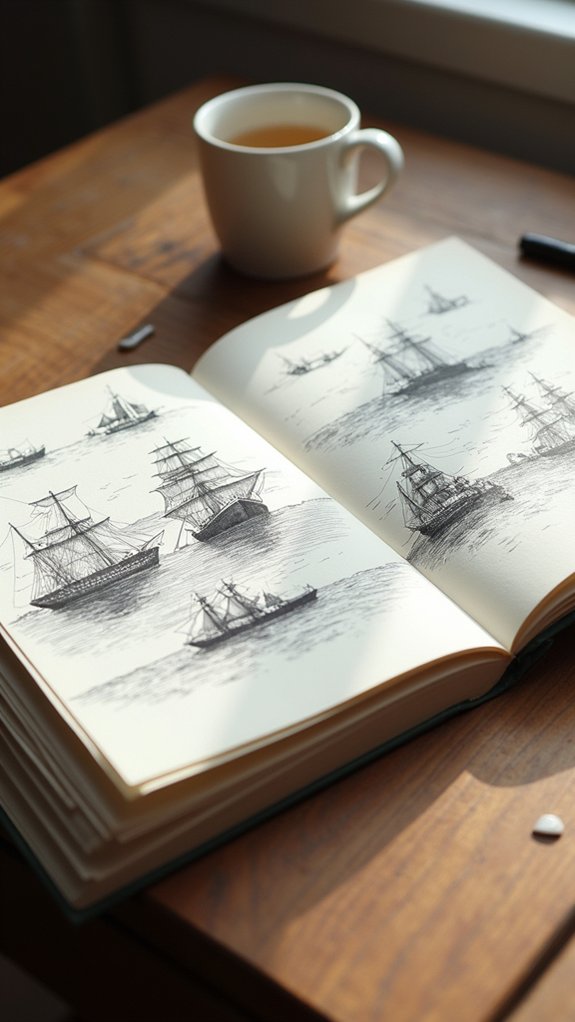
When do sketchbook pages transform from random drawings into visual storytelling? The magic happens when sketches are organized in sequential timelines, telling a clear story that viewers can follow from beginning to end.
This approach helps strengthen the point an artist is trying to make by creating a cohesive narrative flow.
To create effective sequential timelines in your sketchbook:
- Draw connecting arrows or lines between sketches to guide your viewer’s eye.
- Arrange your work in rows (horizontal or vertical) to emphasize chronological order.
- Add small notes or captions that explain what’s happening in each sketch.
- Use different colors for each timeline section to visually separate phases.
This organization turns simple sketches into powerful visual stories that engage viewers, inviting them along on your creative journey!
Frequently Asked Questions
How to Make a Good Sketchbook Spread?
Effective sketchbook spreads require visual cohesion through unified themes, balanced composition, and thoughtful integration of text. Designers arrange elements within geometric layouts while maintaining consistent color palettes across pages.
How to Fill up Sketchbook Pages?
Artists fill sketchbook pages through creative techniques: quick gesture drawings, themed collections, mixed media experiments, daily challenges, mind mapping, and deliberate practice with color theory and composition studies.
How to Fill Empty Space in Sketchbook?
Artists can fill empty sketchbook space using creative techniques like geometric shapes, environmental inspirations, written elements, repeated patterns, and mixed media applications to create cohesive, layered compositions with visual rhythm.
How Do I Make My GCSE Art Sketchbook Look Good?
A successful GCSE art sketchbook demonstrates creative techniques through cohesive color palettes, varied layouts, balanced text-image combinations, diverse mediums, and consistent documentation of artistic development throughout all pages.
Conclusion
Creating unified sketchbook spreads transforms random doodles into powerful visual stories. By choosing a theme, sticking to a color palette, and paying attention to how everything flows together, artists can make pages that really pop! Remember, your sketchbook is like your artistic playground—a place to experiment, make mistakes, and discover your unique style. So grab those supplies, pick a theme, and let your creativity run wild across those pages!

Leave a Reply