Watercolor magic happens when artists mix the right pigments. Start with quality primary colors like Cadmium Yellow, Quinacridone Rose, and French Ultramarine. Single-pigment paints create cleaner, more vibrant results than pre-mixed colors. Understanding warm and cool temperature biases helps create stunning greens, grays, and oranges. Try layering transparent pigments for depth, allowing each layer to dry completely. The real secret? Complementary colors make the most beautiful grays you’ve ever seen in your paintings.
Key Takeaways
- Use single-pigment paints like Cadmium Yellow, Quinacridone Rose, and French Ultramarine for cleaner, more vibrant color mixes.
- Understanding warm and cool color temperatures allows for creating everything from glowing oranges to vibrant greens.
- Mix complementary colors to create rich, harmonious grays that enhance depth in watercolor compositions.
- Layer transparent pigments gradually, starting with light colors, to achieve luminous effects in your paintings.
- Specialty pigments like Phthalo Blue and Green Gold are worth investing in for creating stunning foliage and atmospheric effects.
The Magic of Watercolor Pigment Combinations
The world of watercolor greens opens up like a lush forest when artists experiment with different pigment combinations. The simple act of mixing blue and yellow creates an entire spectrum of greens that can transform a painting from ordinary to extraordinary!
Cool-temperature combinations, like Phthalo Blue with Cadmium Yellow Light, produce vibrant, electric greens perfect for spring foliage, while warmer mixes yield more subdued, natural tones.
The dance of Phthalo Blue and Cadmium Yellow Light births electric greens that capture spring’s vibrant essence.
Many artists discover that color mixing their own greens creates a harmony throughout their artwork that premixed options can’t match. For those in a hurry, though, ready-made greens like Permanent Sap Green offer consistency and convenience.
The true magic happens when painters play with unexpected additions—a touch of red into Viridian, for instance, creates mysteriously muted greens that whisper of ancient woodlands rather than shout their presence.
Essential Pigments for Your Watercolor Palette
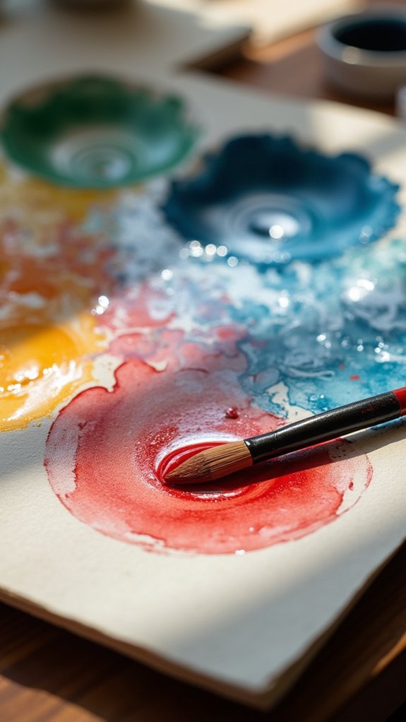
Assembling the perfect watercolor palette begins with essential primary colors that create the foundation for all your mixes.
Artists should invest in high-quality versions of red, yellow, and blue pigments that suit their painting style and color preferences.
Beyond these basics, certain specialty pigments like Quinacridone Gold or Prussian Blue can add magic to your artwork, giving it that special glow that makes viewers stop and stare.
Must-Have Primary Colors
Building a watercolor palette starts with selecting the right primary colors, those magical pigments that serve as the foundation for all your artistic creations. The must-have trio includes Cadmium Yellow (PY35), Quinacridone Rose (PR122), and French Ultramarine (PB29). These aren’t just random picks—they’re colour mixing powerhouses!
Artists should look for temperature variations in their primaries, pairing warm yellows with cool blues for amazing versatility. Single-pigment paints are definitely the way to go, keeping your mixes vibrant rather than muddy. Wouldn’t you rather have brilliant oranges than brown goop?
Limiting yourself to quality primaries actually reveals more potential, not less! When you understand each pigment’s unique properties—like transparency and lightfastness—you’ll create harmonious masterpieces that stand the test of time. How cool is that?
Specialty Pigments Worth Investing
Beyond primary colors lies a treasure trove of specialty pigments that can transform ordinary watercolor paintings into extraordinary works of art.
Professional-grade options like Phthalo Blue and Quinacridone Rose provide vibrant intensity that enhances any piece. Single pigment greens, such as Viridian, maintain color harmony while adding depth throughout a composition.
- Green Gold – This magical pigment creates glowing, sunlit foliage that seems to capture actual sunlight on your paper!
- Perylene Green – Dark, mysterious, and perfect for creating moody shadows that add incredible drama to scenery!
- Quinacridone Rose – The ultimate in transparency and vibrancy, making florals practically sing with life!
Investing in these specialty pigments guarantees your watercolor painting will maintain its beauty for generations, making every penny worthwhile for serious artists.
Creating Vibrant Secondary Colors From Primary Pigments
Understanding color bias fundamentals reveals the secret to mixing vibrant secondary colors from your primary pigments.
Artists can achieve dramatically different greens, oranges, and purples by paying attention to whether their yellow, red, and blue pigments lean warm or cool in temperature.
With just a limited palette of carefully selected primary colors, watercolorists can create a rainbow of lively secondary hues that bring their paintings to life.
Color Bias Fundamentals
When artists explore the fascinating world of color mixing, they quickly discover that not all primary colors behave the same way. This color bias—the warm or cool characteristics of each pigment—dramatically affects the vibrancy of secondary colors.
A warm yellow mixed with a cool blue creates a stunning green, while combining warm primaries of the same temperature family produces the most saturated results.
Understanding warm or cool bias helps watercolorists achieve spectacular results:
- Experimentation with different temperature combinations creates *emotional depth* in paintings, making skies feel vast or sunsets feel magical.
- Mastering complementary color neutralization adds *dramatic shadows* that make subjects pop off the page.
- Testing primary pigments reveals their *unique personality* and helps artists develop their signature palette.
Effects of Pigment Temperature
The magic of vibrant watercolor paintings often lies in the artist’s ability to harness pigment temperature. When artists mix primary colors with an understanding of their warm or cool bias, they reveal a rainbow of possibilities!
A warm yellow (like Cadmium Yellow Light) combined with cool blue creates zingy, electric greens that practically jump off the page.
Want purple that pops? Try pairing cool red (Quinacridone Rose) with warm blue for a royal treat. For oranges that sizzle, mix warm yellow with warm red—it’s like capturing sunset in a paint pan!
The temperature dance between pigments determines whether secondary colors will shout or whisper.
Smart artists use this knowledge to their advantage, creating harmonious compositions where colors play nicely together or deliberately clash for dramatic effect.
Who knew temperature could be so colorful?
Limited Palette Techniques
Many watercolor artists discover that less truly becomes more through limited palette techniques!
By selecting just three primary colors with complementary temperature biases—like warm yellow, warm red, and cool blue—painters can mix an impressive range of vibrant secondary colors.
This approach not only simplifies the artist’s toolkit but also creates beautiful results with natural color harmony throughout the finished piece.
- Mix warm yellow with warm red in varying proportions to create fiery oranges that practically glow on the paper!
- Combine cool blue with warm yellow to achieve greens ranging from springtime fresh to deep forest tones.
- Experiment with cool red and warm blue mixtures for purples that pop rather than turn muddy.
The limited palette approach trains artists to see color relationships better, helping them create more cohesive and expressive artwork.
Mixing Techniques for Achieving Natural Greens
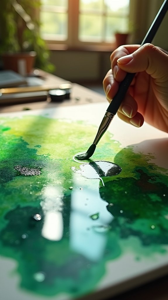
Natural green tones often elude watercolorists, leading to paintings with artificial-looking foliage that lacks depth and realism.
To create lifelike greens, artists should mix a small amount of blue with yellow pigments, paying attention to temperature bias. When French Ultramarine (a cooler blue) meets Indian Yellow, it creates muted, forest-like greens perfect for shadowy areas!
For vibrant spring foliage, try Phthalo Blue with Cadmium Yellow Light—it’s practically electric!
By experimenting with different blue-yellow combinations, painters gain a better understanding of how temperature affects their palette.
Want to add complexity? Toss in a tiny bit of red to desaturate those overly bright greens.
How Temperature Bias Affects Your Color Mixes

Why do some watercolor mixes sing with vibrant life while others fall flat and muddy? The secret often lies in temperature bias, the warm or cool qualities hiding in each pigment. When artists mix colors without considering these hidden temperatures, unexpected results can surprise even experienced painters.
- Feel the magic when cool Phthalo Blue meets cool Cadmium Yellow Light, creating electric greens that practically jump off your paper!
- Watch the transformation as warm blues combine with warm yellows, creating soft, earthy greens perfect for forest shadows.
- Experience the joy of controlling your palette by intentionally mixing complementary temperature biases for natural-looking foliage.
Understanding temperature bias gives artists a superpower – the ability to create exactly the green they imagine, from zingy lime to mysterious forest depths.
Crafting Beautiful Grays Through Complementary Pigments
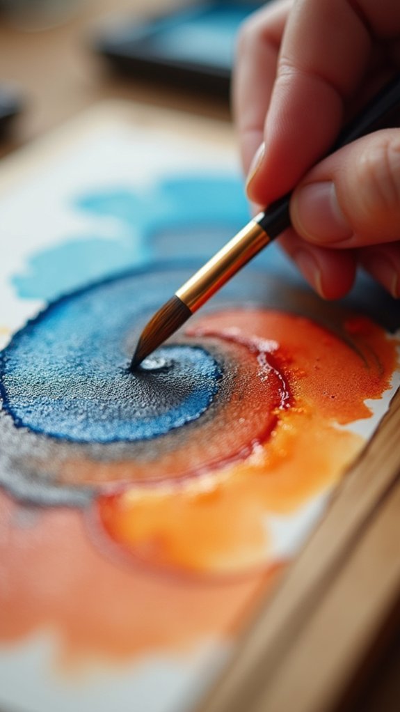
Discover the unexpected alchemy of complementary pigments when crafting the perfect gray for your watercolor paintings. When you’re tired of boring blacks, try mixing complementary colors instead – they create amazingly vibrant grays that make your artwork pop!
The all-star duo of Ultramarine Blue and Burnt Sienna produces a gorgeous, natural-looking gray that’s perfect for cloudy skies or mountain shadows.
Want something darker? Alizarin Crimson with Viridian Green creates a rich, mysterious gray that adds serious drama to any scene.
For lighter touches, try Cadmium Lemon with Violet – it makes a soft, glowing gray that’s perfect for misty mornings!
Remember to layer your paint gradually, letting each coat dry before adding more. This way, you’ll create depth that flat black just can’t match!
Single vs. Multi-Pigment Watercolors: When to Use Each

Have you ever wondered what makes some watercolors blend like a dream while others turn muddy? The answer often lies in whether you’re using single pigment watercolors or multi-pigment blends.
Single pigment watercolors contain just one colorant, making them predictable and reliable when mixing. They create vibrant, clean mixes that artists love for their consistency and transparency.
- Pure Joy – Watching two single pigments dance together on paper creates breathtaking, luminous blends that make your heart skip a beat!
- Frustration Buster – No more muddy messes when you understand which single pigments work harmoniously together!
- Color Confidence – Mastering single pigment mixing techniques gives you the power to create ANY color you can imagine!
Multi-pigment options, while convenient for beginners, can’t match the lightfastness and mixing clarity of their single pigment cousins.
Lightfastness Considerations When Mixing Custom Colors

As artists master the beauty of single pigment watercolors, another factor becomes equally important: lightfastness. This vital quality determines whether your gorgeous paint colors will stand the test of time or fade away like yesterday’s news!
Professional-grade pigments usually offer better lightfastness than their budget-friendly cousins. When mixing custom colors, remember this golden rule: your mixture is only as lightfast as its weakest ingredient. Yikes! One fugitive pigment can doom your masterpiece to a sad, faded future.
Smart artists check the ASTM ratings (ranging from excellent I to poor V) before mixing. This isn’t just about making pretty colors—it’s about creating artwork that stays vibrant for years, making collectors super happy and keeping your artistic legacy intact!
Layering Transparent Pigments for Depth and Luminosity
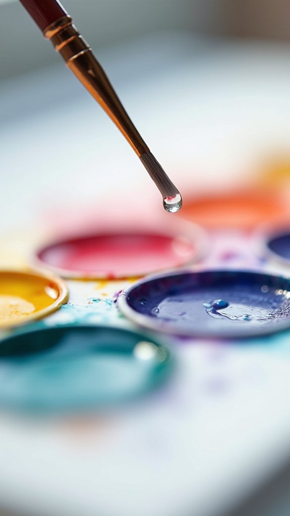
The magic of watercolor truly comes alive when transparent pigments dance together in delicate layers! Artists who master this technique can create artwork that seems to glow from within.
Mixing transparent pigments like Quinacridone Rose and Phthalo Blue produces incredibly vibrant results that can’t be achieved with opaque colors.
For stunning watercolor magic, try:
- Patience is key – always let each layer dry completely before adding the next one!
- Start with the lightest colors and gradually build up to darker tones for that jaw-dropping luminosity!
- Limit your palette to just 3-4 transparent pigments for the most harmonious, glowing results!
This layering technique gives paintings amazing depth that makes viewers feel like they could step right into your artwork!
My Favorite Pigment Combinations for Landscapes and Florals

Spectacular color combinations can transform an ordinary watercolor painting into a breathtaking masterpiece!
When mixing pigments for scenery, try Phthalo Blue with Cadmium Yellow Light to create super vibrant greens that look just like real leaves. Add a tiny bit of Burnt Sienna to make the greens look more natural and earthy.
For flowers with interesting shadows, watercolor artists love combining Viridian and Alizarin Crimson. This makes those perfect muted greens that give depth to floral paintings.
Want amazing purples for sunsets or flower petals? Mix Cobalt Blue with Cadmium Red!
Soft, dreamy fields of flowers come alive when Yellow Ochre meets Quinacridone Rose.
And for peaceful water scenes, nothing beats Cerulean Blue with a touch of Paynes Gray—it’s magical!
Frequently Asked Questions
What Watercolor Colors Go Well Together?
Effective color harmony often emerges from complementary colors paired together, such as blue with orange or yellow with violet, creating dynamic contrasts while warm-cool combinations yield nuanced, balanced compositions.
What Are Three Common Mistakes That People Make When Using Watercolor?
Three common watercolor techniques plagued by misconceptions include using excessive water causing diluted colors, improper color mixing resulting in muddy hues, and selecting unsuitable paper that affects paint absorption and control.
What Is the Golden Rule of Watercolor?
Watercolor’s golden rule emphasizes maintaining transparency by layering washes rather than using thick paint. Understanding color theory and pigment properties enables light to reflect through these transparent layers, creating luminosity.
What Do You Mix With Pigment to Make Watercolor?
Water is the primary medium mixed with pigments to create watercolor. Various mixing techniques affect transparency levels, while understanding pigment properties enables artists to control consistency and achieve desired color intensity.
Conclusion
Watercolor pigment mixing is an adventure that transforms simple paints into magical results. Every artist’s journey includes discovering favorite combinations and techniques that bring their vision to life. With practice, anyone can learn to create vibrant greens, luminous skies, and delicate florals that glow from within. Remember, there are no mistakes in watercolor—only happy accidents waiting to become something beautiful. Keep experimenting and let your colors dance!


Leave a Reply